Fabric Data Days starts November 4th!
Advance your Data & AI career with 50 days of live learning, dataviz contests, hands-on challenges, study groups & certifications and more!
Get registered- Power BI forums
- Get Help with Power BI
- Desktop
- Service
- Report Server
- Power Query
- Mobile Apps
- Developer
- DAX Commands and Tips
- Custom Visuals Development Discussion
- Health and Life Sciences
- Power BI Spanish forums
- Translated Spanish Desktop
- Training and Consulting
- Instructor Led Training
- Dashboard in a Day for Women, by Women
- Galleries
- Data Stories Gallery
- Themes Gallery
- Contests Gallery
- QuickViz Gallery
- Quick Measures Gallery
- Visual Calculations Gallery
- Notebook Gallery
- Translytical Task Flow Gallery
- TMDL Gallery
- R Script Showcase
- Webinars and Video Gallery
- Ideas
- Custom Visuals Ideas (read-only)
- Issues
- Issues
- Events
- Upcoming Events
Get Fabric Certified for FREE during Fabric Data Days. Don't miss your chance! Request now
- Power BI forums
- Forums
- Get Help with Power BI
- Desktop
- Help with a certain type of data transformation
- Subscribe to RSS Feed
- Mark Topic as New
- Mark Topic as Read
- Float this Topic for Current User
- Bookmark
- Subscribe
- Printer Friendly Page
- Mark as New
- Bookmark
- Subscribe
- Mute
- Subscribe to RSS Feed
- Permalink
- Report Inappropriate Content
Help with a certain type of data transformation
I have only worked with Power BI for a couple weeks now, but I've noticed a certain pattern of data transformation I need to do repeatedly. For example I might have time series data with columns: Date | Sales of product A in region X | Sales of product A in region Y | Sales of product B in region X | Sales of product B in region Y. Now I want to visualize sales accross different product types and regions. In order to do that I transform the data into the following form: Date | Product | Region | Sales, now I can easily create interactive visualizations. However, as the number of differerent labels, in this case products and regions, increases doing this manually in the Query editor becomes tedious. Is there a way to easily do this within Power BI? I did write a Python script to do this for me but that's an additional step in the workflow I'd rather get rid off.
Solved! Go to Solution.
- Mark as New
- Bookmark
- Subscribe
- Mute
- Subscribe to RSS Feed
- Permalink
- Report Inappropriate Content
You can do Edit Queries, Select your Date column, right click and do Unpivot Other Columns.
This will give you Date column, Attribute Column and Value Column. You can rename Attribute and Value as required.
After this, select Attribute column, go to Add Column, use Column from Examples, create 2 columns for Color and Country.
Regards
- Mark as New
- Bookmark
- Subscribe
- Mute
- Subscribe to RSS Feed
- Permalink
- Report Inappropriate Content
Would need an example of your source data and desired output. Can't really visualize your manual steps. Please see this post regarding How to Get Your Question Answered Quickly: https://community.powerbi.com/t5/Community-Blog/How-to-Get-Your-Question-Answered-Quickly/ba-p/38490
Follow on LinkedIn
@ me in replies or I'll lose your thread!!!
Instead of a Kudo, please vote for this idea
Become an expert!: Enterprise DNA
External Tools: MSHGQM
YouTube Channel!: Microsoft Hates Greg
Latest book!: DAX For Humans
DAX is easy, CALCULATE makes DAX hard...
- Mark as New
- Bookmark
- Subscribe
- Mute
- Subscribe to RSS Feed
- Permalink
- Report Inappropriate Content
Thank you for you answer, I'm sorry if my description of the problem was inadequate. Lets say that for example I have data that looks like this:
, and I want to create a chart where you can interactively visualize the data like this:
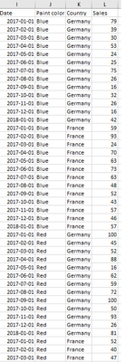
So what I need to do is to transform the data into the following form:
My question is, what would be the easiest way to do this transformation within Power BI for some arbitrary numbers of paint colors and countries? The way I'm doing it right now is by manually duplicating the original table, deleting all but one row, for example "Sales of red paint in Germany" and then adding custom columns "Red" and "Germany" and then appending the tables.
- Mark as New
- Bookmark
- Subscribe
- Mute
- Subscribe to RSS Feed
- Permalink
- Report Inappropriate Content
You can do Edit Queries, Select your Date column, right click and do Unpivot Other Columns.
This will give you Date column, Attribute Column and Value Column. You can rename Attribute and Value as required.
After this, select Attribute column, go to Add Column, use Column from Examples, create 2 columns for Color and Country.
Regards
- Mark as New
- Bookmark
- Subscribe
- Mute
- Subscribe to RSS Feed
- Permalink
- Report Inappropriate Content
This works great! I'm new working with data in general so I wasn't familiar with the concept of pivoting and I didn't know of the "Column from examples" function, it seems extremely useful. The data I'm working with is formatted nicely enough that I can also use "split column - by delimiter" to achieve this even more easily.
Helpful resources

Fabric Data Days
Advance your Data & AI career with 50 days of live learning, contests, hands-on challenges, study groups & certifications and more!

Power BI Monthly Update - October 2025
Check out the October 2025 Power BI update to learn about new features.


