FabCon is coming to Atlanta
Join us at FabCon Atlanta from March 16 - 20, 2026, for the ultimate Fabric, Power BI, AI and SQL community-led event. Save $200 with code FABCOMM.
Register now!- Power BI forums
- Get Help with Power BI
- Desktop
- Service
- Report Server
- Power Query
- Mobile Apps
- Developer
- DAX Commands and Tips
- Custom Visuals Development Discussion
- Health and Life Sciences
- Power BI Spanish forums
- Translated Spanish Desktop
- Training and Consulting
- Instructor Led Training
- Dashboard in a Day for Women, by Women
- Galleries
- Data Stories Gallery
- Themes Gallery
- Contests Gallery
- QuickViz Gallery
- Quick Measures Gallery
- Visual Calculations Gallery
- Notebook Gallery
- Translytical Task Flow Gallery
- TMDL Gallery
- R Script Showcase
- Webinars and Video Gallery
- Ideas
- Custom Visuals Ideas (read-only)
- Issues
- Issues
- Events
- Upcoming Events
The Power BI Data Visualization World Championships is back! Get ahead of the game and start preparing now! Learn more
- Power BI forums
- Forums
- Get Help with Power BI
- Desktop
- Help with Synoptic Panel
- Subscribe to RSS Feed
- Mark Topic as New
- Mark Topic as Read
- Float this Topic for Current User
- Bookmark
- Subscribe
- Printer Friendly Page
- Mark as New
- Bookmark
- Subscribe
- Mute
- Subscribe to RSS Feed
- Permalink
- Report Inappropriate Content
Help with Synoptic Panel
Hi,
Need help for Synoptic Panel. So I have a data of Risk which in Matrix visual is already correct. The raw data is like this :
| Category_________ | Severity_________ | Likelihood_________ | SeverityLikelihood_________ |
| People | 4 | 4 | 44 |
| People | 4 | 4 | 44 |
| People | 2 | 5 | 25 |
| People | 5 | 5 | 55 |
| Assets | 4 | 2 | 42 |
| Assets | 5 | 2 | 52 |
| Assets | 4 | 2 | 42 |
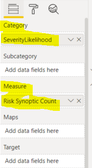
And in Power BI, created a simple measure like this :
And then I've created a Synoptic Design in which I map the combination of SeverityLikelihood in each of the block. Back in Power BI, import the image in Synoptic Panel while put the Category and Measure with its data.
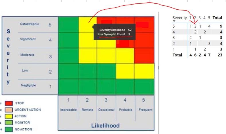
The result is actually correct, but somehow the value is not appear in the box. I have to hover my mouse then in tooltips I can see the value is correct.
If you see the picture, the tooltips is correct, compared to the right whcih is the Matrix Visual of it.
In the properties of this visual, the Data value only manage the background color, whcih is I have to put the same color as the image. But there is no setting for Data Value, or have I missed something ?
Any help will be appreciated.
Thanks,
Solved! Go to Solution.
- Mark as New
- Bookmark
- Subscribe
- Mute
- Subscribe to RSS Feed
- Permalink
- Report Inappropriate Content
Hi @admin_xlsior ,
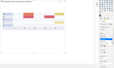
You need to turn on the data labels and chosse the data values in the settings:
Don't mind the colours.
Regards
Miguel Félix
Did I answer your question? Mark my post as a solution!
Proud to be a Super User!
Check out my blog: Power BI em Português- Mark as New
- Bookmark
- Subscribe
- Mute
- Subscribe to RSS Feed
- Permalink
- Report Inappropriate Content
Hi @admin_xlsior ,
You need to turn on the data labels and chosse the data values in the settings:
Don't mind the colours.
Regards
Miguel Félix
Did I answer your question? Mark my post as a solution!
Proud to be a Super User!
Check out my blog: Power BI em PortuguêsHelpful resources

Power BI Dataviz World Championships
The Power BI Data Visualization World Championships is back! Get ahead of the game and start preparing now!

| User | Count |
|---|---|
| 38 | |
| 36 | |
| 33 | |
| 33 | |
| 29 |
| User | Count |
|---|---|
| 132 | |
| 90 | |
| 78 | |
| 66 | |
| 65 |


