Fabric Data Days starts November 4th!
Advance your Data & AI career with 50 days of live learning, dataviz contests, hands-on challenges, study groups & certifications and more!
Get registered- Power BI forums
- Get Help with Power BI
- Desktop
- Service
- Report Server
- Power Query
- Mobile Apps
- Developer
- DAX Commands and Tips
- Custom Visuals Development Discussion
- Health and Life Sciences
- Power BI Spanish forums
- Translated Spanish Desktop
- Training and Consulting
- Instructor Led Training
- Dashboard in a Day for Women, by Women
- Galleries
- Data Stories Gallery
- Themes Gallery
- Contests Gallery
- QuickViz Gallery
- Quick Measures Gallery
- Visual Calculations Gallery
- Notebook Gallery
- Translytical Task Flow Gallery
- TMDL Gallery
- R Script Showcase
- Webinars and Video Gallery
- Ideas
- Custom Visuals Ideas (read-only)
- Issues
- Issues
- Events
- Upcoming Events
Get Fabric Certified for FREE during Fabric Data Days. Don't miss your chance! Request now
- Power BI forums
- Forums
- Get Help with Power BI
- Desktop
- Re: Help using only one data point ( 1 of 24 hours...
- Subscribe to RSS Feed
- Mark Topic as New
- Mark Topic as Read
- Float this Topic for Current User
- Bookmark
- Subscribe
- Printer Friendly Page
- Mark as New
- Bookmark
- Subscribe
- Mute
- Subscribe to RSS Feed
- Permalink
- Report Inappropriate Content
Help using only one data point ( 1 of 24 hours per day) to show daily growth.
I have a dataset that is dropping about 5000 datapoints per hour into a SQL table.
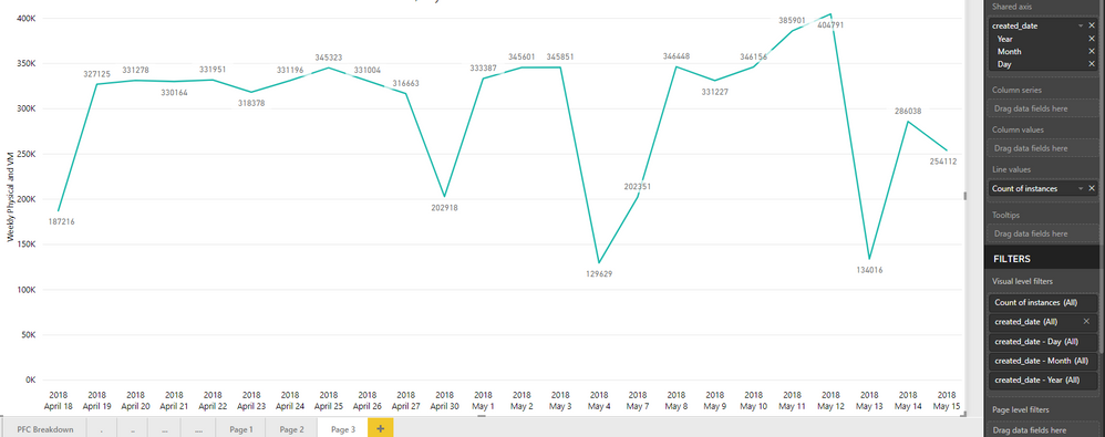
One of the columns is called "instances" and one we'll call "outstances" and this number can range from 1-100 per datapoint which leads to a slowly increasing count nearing 15,000 and 10,000 respectively (shown accurately below)
[The picture below is what I want, but it is being manually manipulated through excel]
Since the data is now being dropped hourly, instead of seeing my target number (~15,000 average) I am getting my average muiltiplied by 24 (hours per day of data refresh):
My goal/need is to be able to represent just one datapoint per day (say... 10:00AM's data point, everyday) so that I get a instance and outstance count of 8,000 and 15,000 respectively, with a historical aspect showing growth (like the first image).
Hope this makes sense, I can elaborate more if needed. Really need help with this I've been stuck for days now..
Thanks!
- Mark as New
- Bookmark
- Subscribe
- Mute
- Subscribe to RSS Feed
- Permalink
- Report Inappropriate Content
Hi @Voyager,
From your description, I understand that you want to create a line chart that show the daily growth by one data point.
If it is convenient, could you share a dummy pbix file which can reproduce the scenario, so that we can help further investigate on it? You can upload it to OneDrive or Dropbox and post the link here. Do mask sensitive data before uploading.)
Best Regards,
Cherry
If this post helps, then please consider Accept it as the solution to help the other members find it more quickly.
- Mark as New
- Bookmark
- Subscribe
- Mute
- Subscribe to RSS Feed
- Permalink
- Report Inappropriate Content
It is not convenient, because of the size and sensitivity of the data, but I'll attempt something and respond to this thread.
Helpful resources

Power BI Monthly Update - November 2025
Check out the November 2025 Power BI update to learn about new features.

Fabric Data Days
Advance your Data & AI career with 50 days of live learning, contests, hands-on challenges, study groups & certifications and more!

| User | Count |
|---|---|
| 98 | |
| 72 | |
| 50 | |
| 50 | |
| 43 |


