FabCon is coming to Atlanta
Join us at FabCon Atlanta from March 16 - 20, 2026, for the ultimate Fabric, Power BI, AI and SQL community-led event. Save $200 with code FABCOMM.
Register now!- Power BI forums
- Get Help with Power BI
- Desktop
- Service
- Report Server
- Power Query
- Mobile Apps
- Developer
- DAX Commands and Tips
- Custom Visuals Development Discussion
- Health and Life Sciences
- Power BI Spanish forums
- Translated Spanish Desktop
- Training and Consulting
- Instructor Led Training
- Dashboard in a Day for Women, by Women
- Galleries
- Data Stories Gallery
- Themes Gallery
- Contests Gallery
- QuickViz Gallery
- Quick Measures Gallery
- Visual Calculations Gallery
- Notebook Gallery
- Translytical Task Flow Gallery
- TMDL Gallery
- R Script Showcase
- Webinars and Video Gallery
- Ideas
- Custom Visuals Ideas (read-only)
- Issues
- Issues
- Events
- Upcoming Events
The Power BI Data Visualization World Championships is back! Get ahead of the game and start preparing now! Learn more
- Power BI forums
- Forums
- Get Help with Power BI
- Desktop
- Re: Average Productivity over time
- Subscribe to RSS Feed
- Mark Topic as New
- Mark Topic as Read
- Float this Topic for Current User
- Bookmark
- Subscribe
- Printer Friendly Page
- Mark as New
- Bookmark
- Subscribe
- Mute
- Subscribe to RSS Feed
- Permalink
- Report Inappropriate Content
Help to create Average Productivity over time
Hello Everyone,
I need your Help generating a chart showing the average & Cumalative trend over time for a dataset.
Production Explaination:
In the production process, we create 1 Module, and this module is made up of 16 Skids. Each skid is considered finished when a specific activity is marked as 100% complete,my goal is to analyze our production data to understand the average & Cumalative trend for the number of skids we produce each month.
Dataset Explaination
To illustrate this, I have provided a link to the dataset we are working with,2 tables are interconnected through column (EquipmentId),1st table(ActivtiyLevelProgress) is having the ActivityDescription & Progress while the other column is having the
CWP_or_Skid ,InstallationEnd & InstallationStart.
1st Table ActivityLevelProgress (highlight is the 2 Most important columns)
2nd Table Equipment ((highlight are the 3 Most important columns)
Link to Dataset
SampleDataset
What do i need to do
I need to create a couple of measures 1 Monthly Average,1 total till date (Aggregation),dynamic time X Axis
1- Dynamic time X-Axis based on InstallationEnd & InstallationStart which changes based on ActivityDescription.
2-Monthly Average Measure should count the Number of CWP_or_Skid that are finished based on ActivityDescription & Progress in every month while referring to a dynamic time X-Axis (InstallationEnd & InstallationStart)
3-1 total till date (Aggregation) while counts the total number of CWP_or_Skid that are finished based on ActivityDescription & Progress in every month in an upward trend while referring to a dynamic time X-Axis (InstallationEnd & InstallationStart)
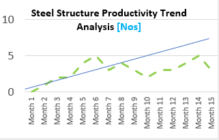
Outcome chart would look like
Dotted is the average & straight line is the
Your insights and expertise will be invaluable in this endeavor.
@amitchandak @lbendlin @Ahmedx @parry2k @Ritaf1983
- Mark as New
- Bookmark
- Subscribe
- Mute
- Subscribe to RSS Feed
- Permalink
- Report Inappropriate Content
Please provide sample data (with sensitive information removed) that covers your issue or question completely, in a usable format (not as a screenshot). Leave out anything not related to the issue.
If you are unsure how to do that please refer to https://community.fabric.microsoft.com/t5/Community-Blog/How-to-provide-sample-data-in-the-Power-BI-...
Please show the expected outcome based on the sample data you provided.
If you want to get answers faster please refer to https://community.fabric.microsoft.com/t5/Desktop/How-to-Get-Your-Question-Answered-Quickly/m-p/1447...
- Mark as New
- Bookmark
- Subscribe
- Mute
- Subscribe to RSS Feed
- Permalink
- Report Inappropriate Content
I have provided a sample dateset in excel format in the orginal post
- Mark as New
- Bookmark
- Subscribe
- Mute
- Subscribe to RSS Feed
- Permalink
- Report Inappropriate Content
access denied - please check
- Mark as New
- Bookmark
- Subscribe
- Mute
- Subscribe to RSS Feed
- Permalink
- Report Inappropriate Content
Thank you for your Response
I have checked the link and it should be working
- Mark as New
- Bookmark
- Subscribe
- Mute
- Subscribe to RSS Feed
- Permalink
- Report Inappropriate Content
Thank you for your clarification..i will do so
Helpful resources

Power BI Dataviz World Championships
The Power BI Data Visualization World Championships is back! Get ahead of the game and start preparing now!

| User | Count |
|---|---|
| 40 | |
| 38 | |
| 36 | |
| 29 | |
| 28 |
| User | Count |
|---|---|
| 127 | |
| 88 | |
| 78 | |
| 66 | |
| 65 |


