FabCon is coming to Atlanta
Join us at FabCon Atlanta from March 16 - 20, 2026, for the ultimate Fabric, Power BI, AI and SQL community-led event. Save $200 with code FABCOMM.
Register now!- Power BI forums
- Get Help with Power BI
- Desktop
- Service
- Report Server
- Power Query
- Mobile Apps
- Developer
- DAX Commands and Tips
- Custom Visuals Development Discussion
- Health and Life Sciences
- Power BI Spanish forums
- Translated Spanish Desktop
- Training and Consulting
- Instructor Led Training
- Dashboard in a Day for Women, by Women
- Galleries
- Data Stories Gallery
- Themes Gallery
- Contests Gallery
- QuickViz Gallery
- Quick Measures Gallery
- Visual Calculations Gallery
- Notebook Gallery
- Translytical Task Flow Gallery
- TMDL Gallery
- R Script Showcase
- Webinars and Video Gallery
- Ideas
- Custom Visuals Ideas (read-only)
- Issues
- Issues
- Events
- Upcoming Events
The Power BI Data Visualization World Championships is back! Get ahead of the game and start preparing now! Learn more
- Power BI forums
- Forums
- Get Help with Power BI
- Desktop
- Re: Help representing data in line chart
- Subscribe to RSS Feed
- Mark Topic as New
- Mark Topic as Read
- Float this Topic for Current User
- Bookmark
- Subscribe
- Printer Friendly Page
- Mark as New
- Bookmark
- Subscribe
- Mute
- Subscribe to RSS Feed
- Permalink
- Report Inappropriate Content
Help representing data in line chart
Hi everyone!
I've got some issues trying to represent some data in a line chart. I want to represent in a line chart, two lines, one describing the number of records/documents requested and another line with the number of records/documents resolved. Both lines will show the number of records (y axis) by months (x axis).
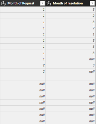
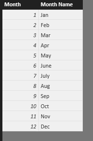
The problem is that I'm provided with two columns: month of request and month of resolution. The months are specified as numbers, so January as number 1 and so on. I created another table relating each number to their corresponding month name, and created a relation between the month number and the number in the column "month of resolution". When I try to create the same relationship with the column "month of request", things don't work so well.
So every row represents a record or document. And the values shown in the columns are the months. So for the first row of the image, the record was requested in January (1) and resolved in March (3).
I'm asking for some guidance to solve this problem. How can I create the desired line chart with this data I own? What columns should I insert in Axis, Legend and Value?
Thanks in advanced
Solved! Go to Solution.
- Mark as New
- Bookmark
- Subscribe
- Mute
- Subscribe to RSS Feed
- Permalink
- Report Inappropriate Content
I would reshape the table as follows(In PowerQuery):
1. Split the table into two separate tables, say "RequestMonth" that holds the "Month of Request" column and "ResolutionMonth" which holds the "Month of resolution" column.
2. Change the name of the "Month of..." column in both tables to "month_num"(For example).
3. Add a "Type" column to each of these tables, with the value "Request" for all rows in the RequestMonth table and the value "Resolution" for all rows in the ResolutionMonth table.
4. Combine both tables into a single one. You'll get a two-column table, one that holds month numbers and one that specify what that month number represents.
Now, since you have a single "month_num" column, creating a relationship between it and the month names table will not cause ambiguity.
I would then proceed to populate the field buckets of the Line Chart as follows:
- Axis: "Month Name".
- Legend: "Type".
- Values: "Count of month_num".
BONUS STEPS:
1. Add another column to the table(My personal preference would be in DAX) called "date" with the following formula-
"date = IF(ISNUMBER([month_num]), DATE(1972, [month_num], 1), BLANK())".
2. Since its value is a date, when you'd put it in the Axis field bucket, Power BI would allow you to select a sub-value of that date from the date hierarchy to be used instead of the value itself(By clicking the little triangle on the right side of the "date" field in the bucket). So if you choose "Month", it will show the give back the corresponding month names, in consideration with Power BI's localization settings, and better yet, it would absolve you from the need to create the "Month Names" table and defining the relationship with it.
Note:
I arbitrarily passed the value 1972 as the "year" parameter for the DATE() function since we only care for the months in the case you presented, so the year value has no meaning.
ALTERNATIVE STEP:
Instead of putting the "Type" field in the "Legend" field bucket and "count of month_num" in the the "Values" field bucket, you can add two DAX measures to the table:
- Records/Documents Requested = CALCULATE(COUNTROWS([month_num]), FILTER(tablename, [Type] = "Request"))
- Records/Documents Resolved = CALCULATE(COUNTROWS([month_num]), FILTER(tablename, [Type] = "Resolution"))
And put them in the "Values" bucket, which will make the Line Chart's legend and Tooltips show the measure names to describe each line, instead of the values we put in the "Type" field.
Final note:
I assumed here you know how to reshape tables in PowerQuery the way I described above. Should you require further guidance performing those steps, feel free to ask.
- Mark as New
- Bookmark
- Subscribe
- Mute
- Subscribe to RSS Feed
- Permalink
- Report Inappropriate Content
First of all, thanks for the help!
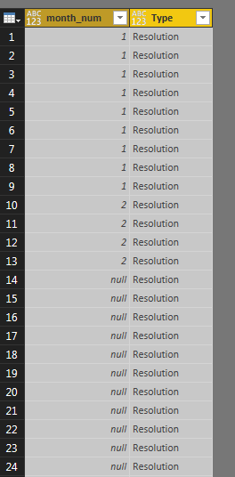
I've got problems with step number 4. How can I merge both tables? Is it possible to do it with Power Bi Desktop? I did all steps, with the Query Editor of Power BI. But I got problems while combining both tables... How should I combine them? If I try to combine them by "month_num" I got a column/table like this:
1st: I went to the merge query option
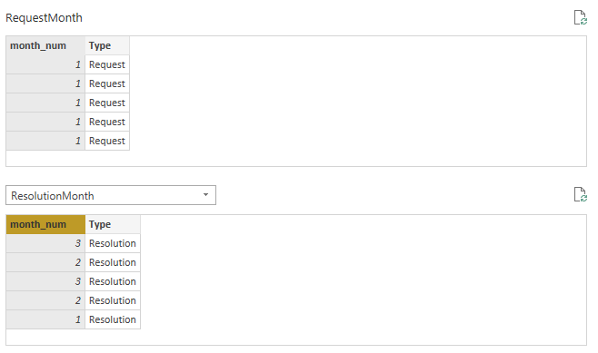
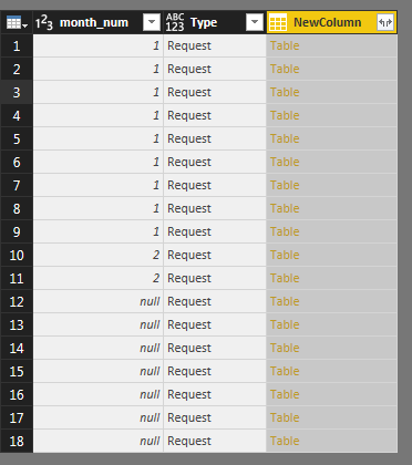
What I'm doing wrong? I hope you understand my explanation.
Appreciated for your help.
- Mark as New
- Bookmark
- Subscribe
- Mute
- Subscribe to RSS Feed
- Permalink
- Report Inappropriate Content
Combine them using the Table.Combine() function in the Advanced Editor.
E.g-
CombinedTable = Table.Combine({RequestMonth, ResolutionMonth})The Table.Combine() function takes a list of tables with an identical structure and merges them into one long table(I.e. each table's rows are appended after the rows of the previous one in the resulting table).
- Mark as New
- Bookmark
- Subscribe
- Mute
- Subscribe to RSS Feed
- Permalink
- Report Inappropriate Content
Solved! Thanks so much!
- Mark as New
- Bookmark
- Subscribe
- Mute
- Subscribe to RSS Feed
- Permalink
- Report Inappropriate Content
You're welcome. Glad I could help.
- Mark as New
- Bookmark
- Subscribe
- Mute
- Subscribe to RSS Feed
- Permalink
- Report Inappropriate Content
HI
Master Month,
Need to create relationship between your table to month master
Then pick X Axis value from Month Master Table , and pick measures from your source table ,
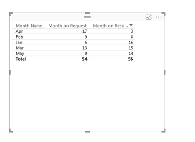
The result look like
let me know ,
- Mark as New
- Bookmark
- Subscribe
- Mute
- Subscribe to RSS Feed
- Permalink
- Report Inappropriate Content
Thank you Baskar for your help.
I already create the master month table, but I dont understand what kind of relationship you're doing. Did you create a new column "month" in the source table filled with "1's"? The result I got is far different from yours... 😞
Anyway, thank you so much for your help
Helpful resources

Power BI Dataviz World Championships
The Power BI Data Visualization World Championships is back! Get ahead of the game and start preparing now!

| User | Count |
|---|---|
| 39 | |
| 37 | |
| 35 | |
| 34 | |
| 27 |
| User | Count |
|---|---|
| 137 | |
| 97 | |
| 74 | |
| 66 | |
| 65 |
