Join us at FabCon Vienna from September 15-18, 2025
The ultimate Fabric, Power BI, SQL, and AI community-led learning event. Save €200 with code FABCOMM.
Get registered- Power BI forums
- Get Help with Power BI
- Desktop
- Service
- Report Server
- Power Query
- Mobile Apps
- Developer
- DAX Commands and Tips
- Custom Visuals Development Discussion
- Health and Life Sciences
- Power BI Spanish forums
- Translated Spanish Desktop
- Training and Consulting
- Instructor Led Training
- Dashboard in a Day for Women, by Women
- Galleries
- Data Stories Gallery
- Themes Gallery
- Contests Gallery
- Quick Measures Gallery
- Notebook Gallery
- Translytical Task Flow Gallery
- TMDL Gallery
- R Script Showcase
- Webinars and Video Gallery
- Ideas
- Custom Visuals Ideas (read-only)
- Issues
- Issues
- Events
- Upcoming Events
Enhance your career with this limited time 50% discount on Fabric and Power BI exams. Ends September 15. Request your voucher.
- Power BI forums
- Forums
- Get Help with Power BI
- Desktop
- Re: Help on slicing by column name
- Subscribe to RSS Feed
- Mark Topic as New
- Mark Topic as Read
- Float this Topic for Current User
- Bookmark
- Subscribe
- Printer Friendly Page
- Mark as New
- Bookmark
- Subscribe
- Mute
- Subscribe to RSS Feed
- Permalink
- Report Inappropriate Content
Help on slicing by column name
Hi guys, I'm pretty new to Power BI (I downloaded it for the first time a few weeks ago and have been on youtube since) and I've built a solution and dashboard for an email campaign. Most of it seems to work great, but recently I had an idea for a graph where we show data progressing over time for an area, but instead of showing all areas at one, I want to add a slicer to view one at a time. As I'm very much a beginner, I will post everything I can, in case I need to change my solution in different stages.
Project Overview
It's a monthly community email called a talent community that includes 2 areas - Culture articles and Job articles. The campaign platform drops a CSV each month of raw data in a network folder. I've setup Excel to check that folder, grab all the CSV's and merge them together into a table called Raw Data. Power BI then connects to that table and pulls the data in - to be displayed in my dashboard.
Problem
With only doing a 'Get Data from File' I can create some great graphs like the following-
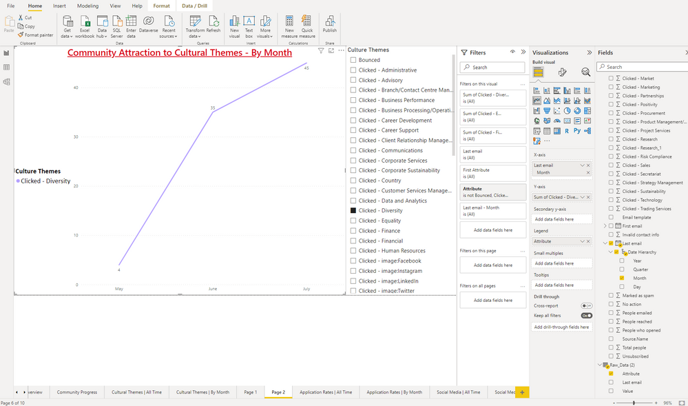
But what I want to do is take all the Culture Themes click data (a culture theme for example is Diversity, Equality or Legal), and represent them in a line graph, but have a slicer so you need to pick one theme at a time. Here's an example of what I want, but I've tricked it so it's just one Theme setup as opposed to all themes being added, and the slicer doing the work. Hope that makes sense!
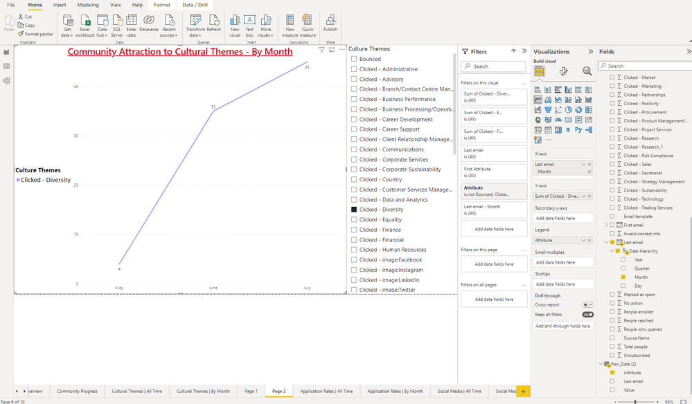
So, when I try to set up the functionaility properly, I have set them up like so - but I can only add in one Theme from the first Raw Data table - when I try to add in more they just replace the first theme instead of adding to.
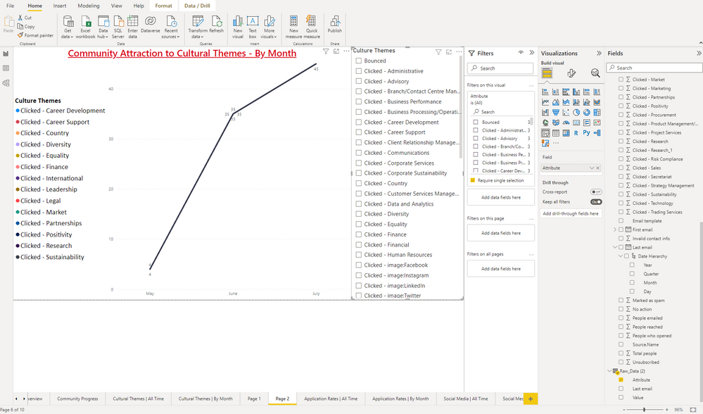
And if I unclick the selection it still seems to give me the same data despite the legend showing all themes (so I would expect 14 lines in the chart - one for each).
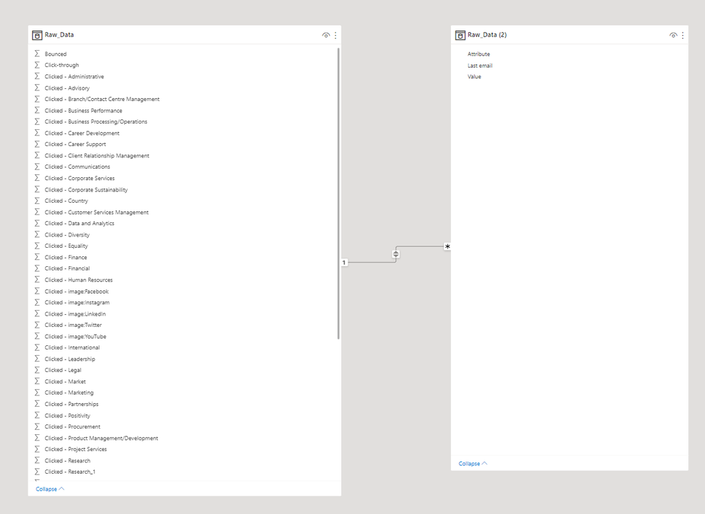
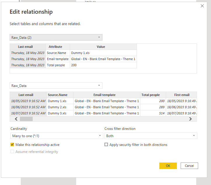
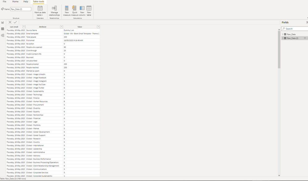
To get here, I imported the same data table twice creating a new table Raw Data 2. I then created an active relationship from my last email sent colum in Raw Data 1 to same in Raw Data 2. I then went into Transform for Raw Data 2, and selected Last Email Sent, then click Unpivot Others, like so-
and
And the data itself-
Raw Data
Raw Data 2
And here's my example data - on the left is column name and on the right is the first row of data.
Column Name----First Row of Data
Source.Name----Dummy 1.xls
Email template----Global - EN - Blank Email Template - Theme 1
Total people----200
First email----18/05/2023 9:16
Last email----18/05/2023 9:16
No action----5
People who opened----90
Click-through----25
Invalid contact info----0
Bounced----0
Unsubscribed----0
People emailed----200
People reached----200
Marked as spam----0
Clicked - image:LinkedIn----3
Clicked - image:Facebook----4
Clicked - image:Instagram----3
Clicked - image:YouTube----5
Clicked - image:Twitter----6
Clicked - Sustainability----2
Clicked - Technology----4
Clicked - Finance----6
Clicked - Human Resources----8
Clicked - Procurement----5
Clicked - Diversity----4
Clicked - Equality----6
Clicked - Partnerships----7
Clicked - Financial----6
Clicked - Legal----7
Clicked - Positivity----5
Clicked - Market----5
Clicked - Career Development----5
Clicked - Career Support----6
Clicked - Research----6
Clicked - Country----5
Clicked - International----5
Clicked - Leadership----4
Clicked - Administrative----7
Clicked - Advisory----4
Clicked - Business Performance----7
Clicked - Business Processing/Operations----5
Clicked - Client Relationship Management----6
Clicked - Communications----5
Clicked - Corporate Services----5
Clicked - Corporate Sustainability----1
Clicked - Customer Services Management----7
Clicked - Data and Analytics----5
Clicked - Secretariat----7
Clicked - Marketing----4
Clicked - Branch/Contact Centre Management----9
Clicked - Product Management/Development----6
Clicked - Project Services----8
Clicked - Research_1----5
Clicked - Risk Compliance----4
Clicked - Sales----5
Clicked - Strategy Management----5
Clicked - Trading Services----4
So with all that said, how do I do what I'm trying to do and be able to show a theme's monthly line data correctly, and slice by theme which is a column name?
Solved! Go to Solution.
- Mark as New
- Bookmark
- Subscribe
- Mute
- Subscribe to RSS Feed
- Permalink
- Report Inappropriate Content
Hi , @Grant82
According to your description, you want to " be able to show a theme's monthly line data correctly, and slice by theme which is a column name".
For your raw data , this data format is useless for analysis in Power BI, you can use RawData2 directly.
Here are the steps you can refer to :
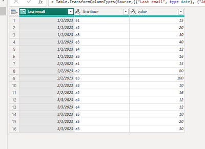
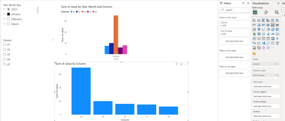
(1)This is my test data , i have only one table like your Raw Data2:
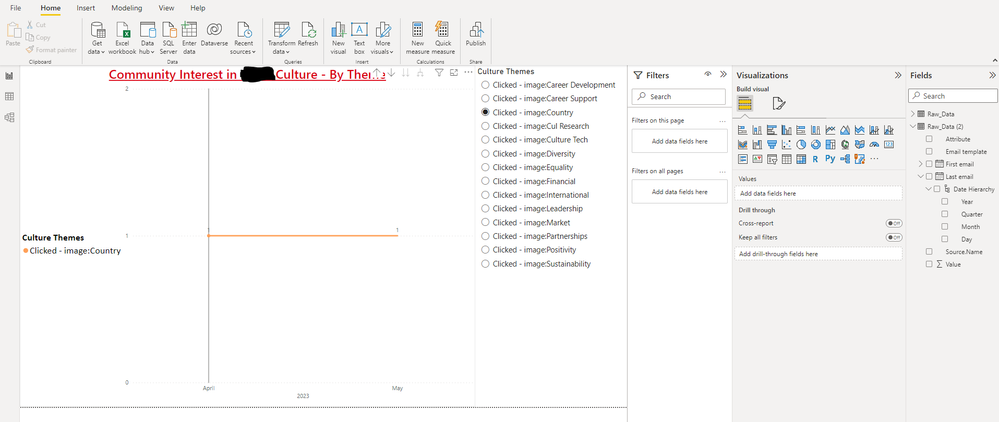
(2)We just need to put this fields on the visual and we can see the "Attribute" we selected in the slicer :
If this method does not meet your needs, you can provide us with your special sample data and the desired output sample data in the form of tables, so that we can better help you solve the problem. (You can also upload you sample .pbix [without sensitive data] to the OneDrive and share with the OneDrive link to me ! )
Thank you for your time and sharing, and thank you for your support and understanding of PowerBI!
Best Regards,
Aniya Zhang
If this post helps, then please consider Accept it as the solution to help the other members find it more quickly
- Mark as New
- Bookmark
- Subscribe
- Mute
- Subscribe to RSS Feed
- Permalink
- Report Inappropriate Content
Thank you I got this to work - I had to redo the table unpivot, taking out all attributes that had alphabetical values - I was just getting the Count option previously. Then I was able to get to where you demonstrated above. Is there a way now to update the attribute vales (by that I mean the column names - or in this pic, the Culture Themes) so that I can take out all the "Clicked - image:" and only show the text after?
- Mark as New
- Bookmark
- Subscribe
- Mute
- Subscribe to RSS Feed
- Permalink
- Report Inappropriate Content
Hi , @Grant82
Thanks for your reply , you can try to click "New Column" create a calcualted column in Power BI Desktop :
Column = MID([Attribute],SEARCH( "-" , [Attribute])+2 , LEN([Attribute])-SEARCH( "-" , [Attribute])) Then you can use this new column as the field.
Thank you for your time and sharing, and thank you for your support and understanding of PowerBI!
Best Regards,
Aniya Zhang
If this post helps, then please consider Accept it as the solution to help the other members find it more quickly
- Mark as New
- Bookmark
- Subscribe
- Mute
- Subscribe to RSS Feed
- Permalink
- Report Inappropriate Content
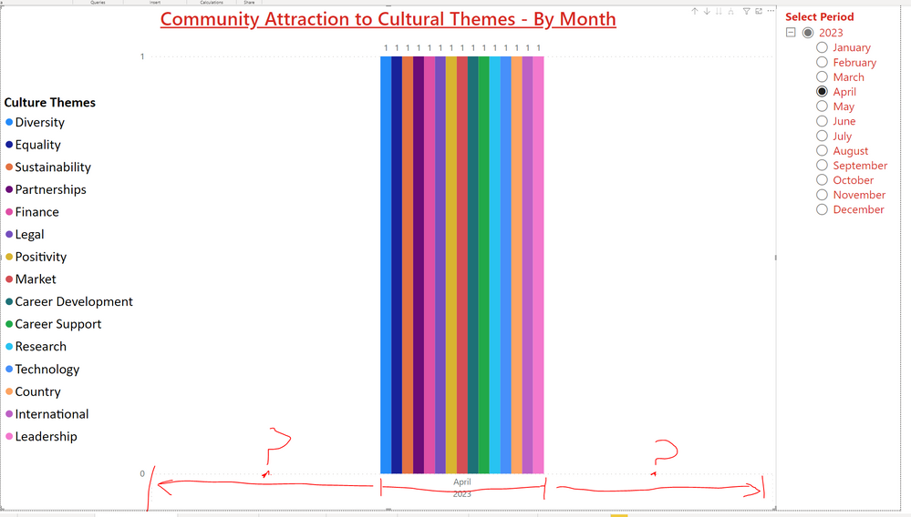
That's awesome thank you! One more - I'm almost there - is there any way to increase the area that the columns use so that they're not just tightly clustered in the middle of the graph?
- Mark as New
- Bookmark
- Subscribe
- Mute
- Subscribe to RSS Feed
- Permalink
- Report Inappropriate Content
Hi , @Grant82
This is the default behavior for placing a Legend, and will display your bar chart in-display, and cannot change the surrounding width.
If you want to display the Attribute value of a certain month and display it in a scattered manner, then you cannot place the Attribute on the Legend, but only on the X axis:
Thank you for your time and sharing, and thank you for your support and understanding of PowerBI!
Best Regards,
Aniya Zhang
If this post helps, then please consider Accept it as the solution to help the other members find it more quickly
Helpful resources
| User | Count |
|---|---|
| 65 | |
| 61 | |
| 60 | |
| 53 | |
| 30 |
| User | Count |
|---|---|
| 180 | |
| 88 | |
| 71 | |
| 48 | |
| 46 |

