A new Data Days event is coming soon!
This time we’re going bigger than ever. Fabric, Power BI, SQL, AI and more. We're covering it all. You won't want to miss it.
Learn more- Power BI forums
- Get Help with Power BI
- Desktop
- Service
- Report Server
- Power Query
- Mobile Apps
- Developer
- DAX Commands and Tips
- Custom Visuals Development Discussion
- Health and Life Sciences
- Power BI Spanish forums
- Translated Spanish Desktop
- Training and Consulting
- Instructor Led Training
- Dashboard in a Day for Women, by Women
- Galleries
- Data Stories Gallery
- Themes Gallery
- Contests Gallery
- QuickViz Gallery
- Quick Measures Gallery
- Visual Calculations Gallery
- Notebook Gallery
- Translytical Task Flow Gallery
- TMDL Gallery
- R Script Showcase
- Webinars and Video Gallery
- Ideas
- Custom Visuals Ideas (read-only)
- Issues
- Issues
- Events
- Upcoming Events
Level up your Power BI skills this month - build one visual each week and tell better stories with data! Get started
- Power BI forums
- Forums
- Get Help with Power BI
- Desktop
- Help / Support - Bar+Line Chart with multiple line...
- Subscribe to RSS Feed
- Mark Topic as New
- Mark Topic as Read
- Float this Topic for Current User
- Bookmark
- Subscribe
- Printer Friendly Page
- Mark as New
- Bookmark
- Subscribe
- Mute
- Subscribe to RSS Feed
- Permalink
- Report Inappropriate Content
Help / Support - Bar+Line Chart with multiple lines
Hi Community,
I have an interesting challenge that has probably happened to most of the developers.
Here's what I want to achieve and the issues that I am encountering, while doing it:
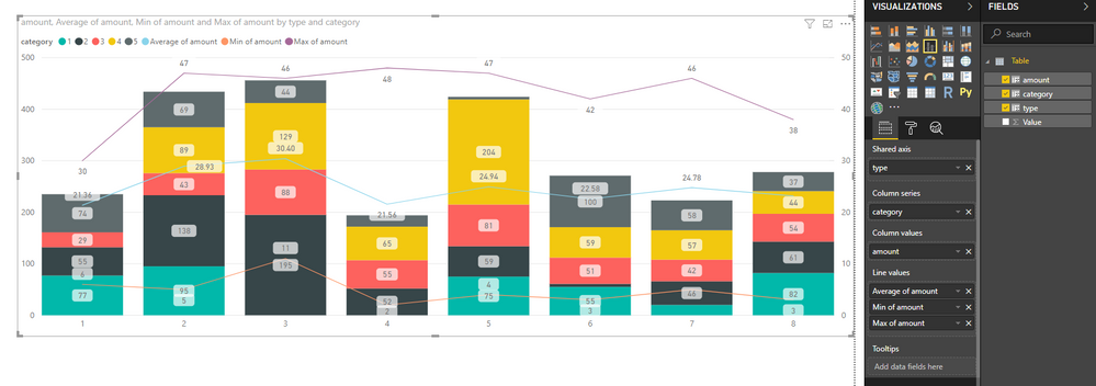
1) I am building a visual where my Bar+Line chart should present as in the attached image (See below). These categories are in the same table, and my customer built this in excel, using 3 of the fields to build the line series.
2) What I have tried so far:
Created a group to isolate these 3 line measures, then filtered the visual (to remove these from the columns and have them only in lines). Issue is that the moment I filter the visual, they are also removed from the line series.
Created 3 different measures to isolate them from the original field ((to remove these from the columns and have them only in lines). Issue is that the moment I filter the visual, they are also removed from the line series.
Can anyone please help me? I spent a day trying so many different options. I have checked other articles here and videos, but none are similar to what I need to achieve.
Thank you so much!
Nelson
- Mark as New
- Bookmark
- Subscribe
- Mute
- Subscribe to RSS Feed
- Permalink
- Report Inappropriate Content
Hi @Anonymous,
I'd like to suggest you use line and stacked column chart to achieve your requirement. It support use legend field and multiple line fields at same time.
Sample:
Regards,
Xiaoxin Sheng
- Mark as New
- Bookmark
- Subscribe
- Mute
- Subscribe to RSS Feed
- Permalink
- Report Inappropriate Content
Hi there,
Thank you for the suggestion. That's the one I am using. Perhaps I have not made myself clear as to what is the main issue.
The problem is that the data that I want to show in those lines, are the same field. So the problem is, when I drag the field to the lines and filter to only show that specific attribute, it also filters the columns.
Here's what I want, show the values in line and filter them out in those bars.
In the following example, the blue line corresponds to the red bar volume, how do I filter it and only show the line, considering what I have mentioned above ?
Thank you!!
Kind Regards,
Nelson
- Mark as New
- Bookmark
- Subscribe
- Mute
- Subscribe to RSS Feed
- Permalink
- Report Inappropriate Content
And this is what happens when I filter out (only from the bars) the values that I have in lines.
On the right, you can see that I have the measures created and added as line values, but because they refer to the same values as in bars, they get filtered out.
Anyone knows a solution for this ?
Much appreciated!
- Mark as New
- Bookmark
- Subscribe
- Mute
- Subscribe to RSS Feed
- Permalink
- Report Inappropriate Content
Hi @Anonymous,
It seems like your graph has been filter and line value are too small to display on current y axis.
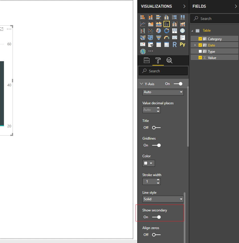
Unfortunately, current this visual not contains any 'break down' axis features, I'd like to suggest you turn on use secondary to display line graph on another y axis unit to solve this scenario.
Regards,
Xiaoxin Sheng
- Mark as New
- Bookmark
- Subscribe
- Mute
- Subscribe to RSS Feed
- Permalink
- Report Inappropriate Content
Hi XiaoXin,
Thanks for your support. In fact, that has helped me to bring my line values to the position where they should. However my main difficulty isn't solved yet.
I bring those line values in, however I cannot filter them out of the bar values 😞 I have tried a million things... I would really like that someone came into this difficulty and could help me.
Here's how it looks right now:
- Mark as New
- Bookmark
- Subscribe
- Mute
- Subscribe to RSS Feed
- Permalink
- Report Inappropriate Content
- Mark as New
- Bookmark
- Subscribe
- Mute
- Subscribe to RSS Feed
- Permalink
- Report Inappropriate Content
HI @Anonymous,
Hmm, did you means display these number labels and data point on graph?
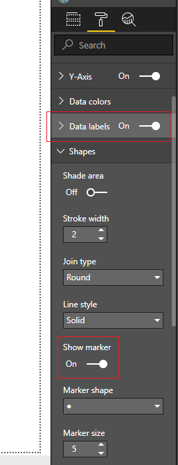
If you this is a case, you can turn on 'data label' option and 'show marker' option to achieve this.
If not help, can you please explain more about which properties you wanted to be filtered?
Regards,
Xiaoxin Sheng
- Mark as New
- Bookmark
- Subscribe
- Mute
- Subscribe to RSS Feed
- Permalink
- Report Inappropriate Content
Hi Xiaoxin,
Thanks for your reply.
That is partially what I need to achieve. I would like to see only the line data labels, how do I do this ? Tried to search online but did not get to a solution.
Also, nobody seems to know the solution for what I need. I think this is worth looking into. Those line calculated fields are also in the bars, I need to filter them out of the bars. Anyone knows !?
Thank yoy very much!
Kind Regards
Nelson
- Mark as New
- Bookmark
- Subscribe
- Mute
- Subscribe to RSS Feed
- Permalink
- Report Inappropriate Content
Hi @Anonymous,
Nope, current you can use options to setting line series data label display or not, bar label cannot be customized.
>>nobody seems to know the solution for what I need. I think this is worth looking into. Those line calculated fields are also in the bars, I need to filter them out of the bars. Anyone knows !?
I think it is impossible to achieve this requirement. For bar and line chart, line fields and column fields summarize values based on same category column. So if you filter on axis fields, it will filter on both line and bar values. (you can try to add 'all' function into measure, but it will also ignore all filter effects)
Regards,
Xiaoxin Sheng
- Mark as New
- Bookmark
- Subscribe
- Mute
- Subscribe to RSS Feed
- Permalink
- Report Inappropriate Content
Thank you very much for your help.
Have a great 2019!!
Cheers
Helpful resources

Power BI Monthly Update - April 2026
Check out the April 2026 Power BI update to learn about new features.

Data Days 2026 coming soon!
Sign up to receive a private message when registration opens and key events begin.

New to Fabric Survey
If you have recently started exploring Fabric, we'd love to hear how it's going. Your feedback can help with product improvements.

| User | Count |
|---|---|
| 35 | |
| 32 | |
| 25 | |
| 22 | |
| 18 |
| User | Count |
|---|---|
| 65 | |
| 35 | |
| 32 | |
| 25 | |
| 23 |


