European Microsoft Fabric Community Conference
The ultimate Microsoft Fabric, Power BI, Azure AI, and SQL learning event: Join us in Stockholm, September 24-27, 2024.
Save €200 with code MSCUST on top of early bird pricing!
- Power BI forums
- Updates
- News & Announcements
- Get Help with Power BI
- Desktop
- Service
- Report Server
- Power Query
- Mobile Apps
- Developer
- DAX Commands and Tips
- Custom Visuals Development Discussion
- Health and Life Sciences
- Power BI Spanish forums
- Translated Spanish Desktop
- Training and Consulting
- Instructor Led Training
- Dashboard in a Day for Women, by Women
- Galleries
- Community Connections & How-To Videos
- COVID-19 Data Stories Gallery
- Themes Gallery
- Data Stories Gallery
- R Script Showcase
- Webinars and Video Gallery
- Quick Measures Gallery
- 2021 MSBizAppsSummit Gallery
- 2020 MSBizAppsSummit Gallery
- 2019 MSBizAppsSummit Gallery
- Events
- Ideas
- Custom Visuals Ideas
- Issues
- Issues
- Events
- Upcoming Events
- Community Blog
- Power BI Community Blog
- Custom Visuals Community Blog
- Community Support
- Community Accounts & Registration
- Using the Community
- Community Feedback
Find everything you need to get certified on Fabric—skills challenges, live sessions, exam prep, role guidance, and more. Get started
- Power BI forums
- Forums
- Get Help with Power BI
- Desktop
- Re: Heatmap based on range
- Subscribe to RSS Feed
- Mark Topic as New
- Mark Topic as Read
- Float this Topic for Current User
- Bookmark
- Subscribe
- Printer Friendly Page
- Mark as New
- Bookmark
- Subscribe
- Mute
- Subscribe to RSS Feed
- Permalink
- Report Inappropriate Content
Heatmap based on range
Hi,
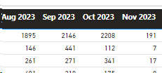
I have a matrix with months and numbers like in the image. I would like to turn it into a heatmap of four colours/options for 0-25% of the range. 25-50% of the range. 50%-75% of the range and finally 75-100% of the range of numbers in the matrix.
Is this possible via a measure?
Thanks
Solved! Go to Solution.
- Mark as New
- Bookmark
- Subscribe
- Mute
- Subscribe to RSS Feed
- Permalink
- Report Inappropriate Content
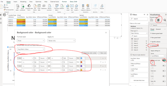
Click on matrix
click on format
click on cell elements
Turn on Background color
click on Fx
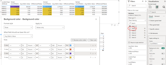
My value is not a percent, but PowerBI calculates the percent based on the row and context filter.
I can demonstrate this by adding another row to my Matrix that has a super high value:
Don't forget to mark as solution and give me a thumbs up if you found this helpful!
- Mark as New
- Bookmark
- Subscribe
- Mute
- Subscribe to RSS Feed
- Permalink
- Report Inappropriate Content
Helpful resources

Europe’s largest Microsoft Fabric Community Conference
Join the community in Stockholm for expert Microsoft Fabric learning including a very exciting keynote from Arun Ulag, Corporate Vice President, Azure Data.

Power BI Monthly Update - July 2024
Check out the July 2024 Power BI update to learn about new features.

| User | Count |
|---|---|
| 112 | |
| 109 | |
| 67 | |
| 46 | |
| 41 |
| User | Count |
|---|---|
| 186 | |
| 85 | |
| 76 | |
| 74 | |
| 56 |


