FabCon is coming to Atlanta
Join us at FabCon Atlanta from March 16 - 20, 2026, for the ultimate Fabric, Power BI, AI and SQL community-led event. Save $200 with code FABCOMM.
Register now!- Power BI forums
- Get Help with Power BI
- Desktop
- Service
- Report Server
- Power Query
- Mobile Apps
- Developer
- DAX Commands and Tips
- Custom Visuals Development Discussion
- Health and Life Sciences
- Power BI Spanish forums
- Translated Spanish Desktop
- Training and Consulting
- Instructor Led Training
- Dashboard in a Day for Women, by Women
- Galleries
- Data Stories Gallery
- Themes Gallery
- Contests Gallery
- QuickViz Gallery
- Quick Measures Gallery
- Visual Calculations Gallery
- Notebook Gallery
- Translytical Task Flow Gallery
- TMDL Gallery
- R Script Showcase
- Webinars and Video Gallery
- Ideas
- Custom Visuals Ideas (read-only)
- Issues
- Issues
- Events
- Upcoming Events
Get Fabric Certified for FREE during Fabric Data Days. Don't miss your chance! Request now
- Power BI forums
- Forums
- Get Help with Power BI
- Desktop
- Having drill down on certain columns and none on o...
- Subscribe to RSS Feed
- Mark Topic as New
- Mark Topic as Read
- Float this Topic for Current User
- Bookmark
- Subscribe
- Printer Friendly Page
- Mark as New
- Bookmark
- Subscribe
- Mute
- Subscribe to RSS Feed
- Permalink
- Report Inappropriate Content
Having drill down on certain columns and none on other
Hi everyone,
I am a Power BI noob and need help on reproducing some simple Tableau visualizations into Power BI,
I am not sure if there is a work around or if custom visualization is required (in which case I am an even bigger noob).
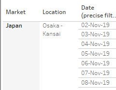
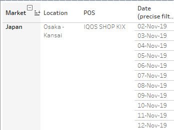
I am trying to reproduce a report as follows:
As you can see from the above, I have a hierarchy with Market > Location > POS and then a date.
Because i have a hierarchy, i can drill down from market to Location all the way to POS, however my date stays visible at all times because it is not part of the hierarchy.
This is very convenient because the aim is to be able to see at a daily level volumes either at market level or location level or even down to POS level.
I tried to reproduce the same effect with the matrix visualization but unfortunately it puts the date within the drill down which means that my users unfortunately lose these different degrees of details. They can only see at POS level daily.
Could you please help?
Thank you!
- Mark as New
- Bookmark
- Subscribe
- Mute
- Subscribe to RSS Feed
- Permalink
- Report Inappropriate Content
Hi @dreyz64 ,
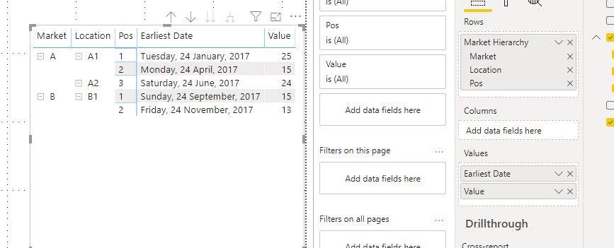
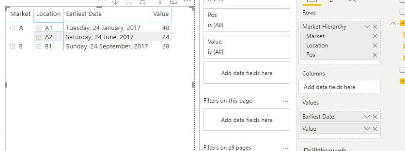
Based on my research, we can only put the date into cloumn field or values filed to keep it always show while drill down, when it is in value field, it will be aggreated.
Best regards,
If this post helps, then please consider Accept it as the solution to help the other members find it more quickly.
- Mark as New
- Bookmark
- Subscribe
- Mute
- Subscribe to RSS Feed
- Permalink
- Report Inappropriate Content
Hi v-lid-msft,
Thanks for your answer.
Indeed I had seen this but unfortunately I do not want to have 'Earliest Date' or anything.
I would like to have the whole data not aggregated and this is where I come short...
Could be an update for PBI...
Best
Helpful resources

Power BI Monthly Update - November 2025
Check out the November 2025 Power BI update to learn about new features.

Fabric Data Days
Advance your Data & AI career with 50 days of live learning, contests, hands-on challenges, study groups & certifications and more!


