Fabric Data Days starts November 4th!
Advance your Data & AI career with 50 days of live learning, dataviz contests, hands-on challenges, study groups & certifications and more!
Get registered- Power BI forums
- Get Help with Power BI
- Desktop
- Service
- Report Server
- Power Query
- Mobile Apps
- Developer
- DAX Commands and Tips
- Custom Visuals Development Discussion
- Health and Life Sciences
- Power BI Spanish forums
- Translated Spanish Desktop
- Training and Consulting
- Instructor Led Training
- Dashboard in a Day for Women, by Women
- Galleries
- Data Stories Gallery
- Themes Gallery
- Contests Gallery
- QuickViz Gallery
- Quick Measures Gallery
- Visual Calculations Gallery
- Notebook Gallery
- Translytical Task Flow Gallery
- TMDL Gallery
- R Script Showcase
- Webinars and Video Gallery
- Ideas
- Custom Visuals Ideas (read-only)
- Issues
- Issues
- Events
- Upcoming Events
Get Fabric Certified for FREE during Fabric Data Days. Don't miss your chance! Request now
- Power BI forums
- Forums
- Get Help with Power BI
- Desktop
- Have values in a radar chart not be split by dimen...
- Subscribe to RSS Feed
- Mark Topic as New
- Mark Topic as Read
- Float this Topic for Current User
- Bookmark
- Subscribe
- Printer Friendly Page
- Mark as New
- Bookmark
- Subscribe
- Mute
- Subscribe to RSS Feed
- Permalink
- Report Inappropriate Content
Have values in a radar chart not be split by dimensions in a legend
Hey everyone! Powerbi newbie here. I'm not sure if this is possible but I'll post my question below:
For context, this was an employee experience survey and I want to display information in a radar chart. There are 2 things I want to display:
1. An overall score (Labelled - Importance).
2. The overall score divided by department (back-end, mid-end, front-end).
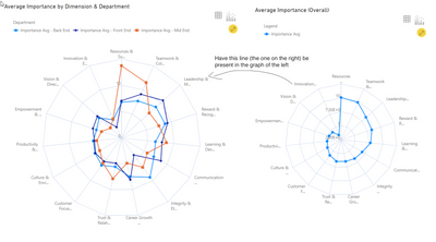
Here is an image of what I want:
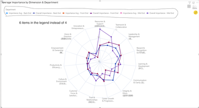
I am able to do this by creating a separate measure of the same value and putting it in the values tab. The issue is that this then results in there being 6 items in the legend (Eg. Importance - front-end/mid-end/back-end, Overall Importance - front-end/mid-end/back-end) where as the result I want is to only have 4 items in the legend (Eg. Value - front-end/mid-end/back-end, Overall Value)
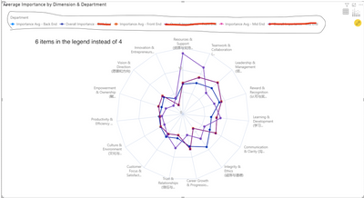
Below is an image of what happens:
Below is an image of what I want:
How might I achieve what I want?
If there is anything that isn't clear/any other info needed let me know. Thanks!
- Mark as New
- Bookmark
- Subscribe
- Mute
- Subscribe to RSS Feed
- Permalink
- Report Inappropriate Content
Hey @Anonymous. Thanks for the help.
My data set does not contain any dates so I don't think the formula with MONTH will work. I've attached images of my data set below.
Fact Table:
Dimension Table:
Does the formula need to be altered to fit this dataset? Thanks for the help.
Best Regards,
Data_Hero
- Mark as New
- Bookmark
- Subscribe
- Mute
- Subscribe to RSS Feed
- Permalink
- Report Inappropriate Content
Hi @Data_Hero ,
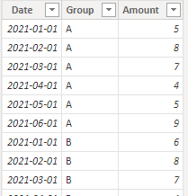
I created some data:
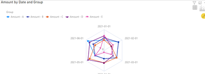
Table:
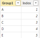
Table2:
Visual:
Here are the steps you can follow:
1. You can use Enter data to create a table.
2. Create measure.
Measure =
SWITCH(
    TRUE(), MAX('Table2'[Group1])="A",CALCULATE(SUM('Table'[Amount]),FILTER(ALL('Table'),'Table'[Group]="A"&&MONTH('Table'[Date])=MONTH(MAX('Table'[Date]))))  ,
MAX('Table2'[Group1])="B", CALCULATE(SUM('Table'[Amount]),FILTER(ALL('Table'),'Table'[Group]="B"&&MONTH('Table'[Date])=MONTH(MAX('Table'[Date]))))  ,
MAX('Table2'[Group1])="C", CALCULATE(SUM('Table'[Amount]),FILTER(ALL('Table'),'Table'[Group]="C"&&MONTH('Table'[Date])=MONTH(MAX('Table'[Date]))))  ,
MAX('Table2'[Group1])="D", CALCULATE(SUM('Table'[Amount]),FILTER(ALL('Table'),'Table'[Group]="D"&&MONTH('Table'[Date])=MONTH(MAX('Table'[Date])))) ,
MAX('Table2'[Group1])="E", CALCULATE(SUM('Table'[Amount]),FILTER(ALL('Table'),'Table'[Group]="E"&&MONTH('Table'[Date])=MONTH(MAX('Table'[Date]))))  )
Flag = IF(
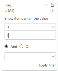
MAX('Table2'[lndex])<=3,1,0)3. Place [Flag]in Filters, set is=1, apply filter.
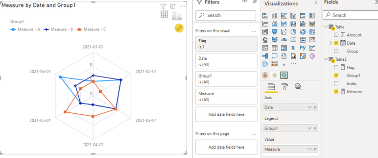
4. Result:
Best Regards,
Liu Yang
If this post helps, then please consider Accept it as the solution to help the other members find it more quickly
Helpful resources

Power BI Monthly Update - November 2025
Check out the November 2025 Power BI update to learn about new features.

Fabric Data Days
Advance your Data & AI career with 50 days of live learning, contests, hands-on challenges, study groups & certifications and more!

| User | Count |
|---|---|
| 96 | |
| 70 | |
| 50 | |
| 42 | |
| 40 |
