A new Data Days event is coming soon!
This time we’re going bigger than ever. Fabric, Power BI, SQL, AI and more. We're covering it all. You won't want to miss it.
Learn more- Power BI forums
- Get Help with Power BI
- Desktop
- Service
- Report Server
- Power Query
- Mobile Apps
- Developer
- DAX Commands and Tips
- Custom Visuals Development Discussion
- Health and Life Sciences
- Power BI Spanish forums
- Translated Spanish Desktop
- Training and Consulting
- Instructor Led Training
- Dashboard in a Day for Women, by Women
- Galleries
- Data Stories Gallery
- Themes Gallery
- Contests Gallery
- QuickViz Gallery
- Quick Measures Gallery
- Visual Calculations Gallery
- Notebook Gallery
- Translytical Task Flow Gallery
- TMDL Gallery
- R Script Showcase
- Webinars and Video Gallery
- Ideas
- Custom Visuals Ideas (read-only)
- Issues
- Issues
- Events
- Upcoming Events
Did you hear? There's a new SQL AI Developer certification (DP-800). Start preparing now and be one of the first to get certified. Register now
- Power BI forums
- Forums
- Get Help with Power BI
- Desktop
- Re: HOW TO: conditional format table with multiple...
- Subscribe to RSS Feed
- Mark Topic as New
- Mark Topic as Read
- Float this Topic for Current User
- Bookmark
- Subscribe
- Printer Friendly Page
- Mark as New
- Bookmark
- Subscribe
- Mute
- Subscribe to RSS Feed
- Permalink
- Report Inappropriate Content
HOW TO: conditional format table with multiple text columns
Hello All,
I was wondering if there is a way to conditional format multiple text columns to yield the following color scheme in a table? The only way I can think of is creating a measure for each of the columns and using the switch to get them into numbers and then using the conditional format function. The problem is I have A LOT of columns. Is there an easier way?
OUT RED
PEND YELLOW
COMP GREEN
BLANK = NO COLOR
| Region | Contact | Order | P1 | P2 | P3 |
EAST | A | 1 | OUT | PEND | PEND |
| WEST | B | 2 | COMP | OUT | COMP |
| NORTH | C | 3 | PEND | OUT | |
| SOUTH | D | 4 | COMP |
Solved! Go to Solution.
- Mark as New
- Bookmark
- Subscribe
- Mute
- Subscribe to RSS Feed
- Permalink
- Report Inappropriate Content
Hi @Anonymous ,
According to your description, here’s my solution.
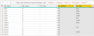
1.Unpivot columns of “P1,P2,P3”.In this case, the layout of the data view will change, however you can also use a duplicated new table to achieve it .
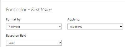
2.you only need to write one measure:
Color = SWITCH(MAX('Table (2)'[Value]),"OUT","RED","COMP","YELLOW","PEND","GREEN")
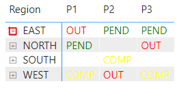
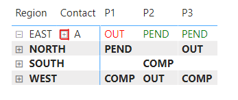
3.Alough the data view differs, the report view still can remain the same by a matrix like this.
Best Regards,
Community Support Team _ kalyj
If this post helps, then please consider Accept it as the solution to help the other members find it more quickly.
- Mark as New
- Bookmark
- Subscribe
- Mute
- Subscribe to RSS Feed
- Permalink
- Report Inappropriate Content
How come when i drag region, contact, and order into rows into a matrix doesn't show up like how you're doing it. It only shows the region. The contact, and order do not show up right next to it as yours do.
- Mark as New
- Bookmark
- Subscribe
- Mute
- Subscribe to RSS Feed
- Permalink
- Report Inappropriate Content
- Mark as New
- Bookmark
- Subscribe
- Mute
- Subscribe to RSS Feed
- Permalink
- Report Inappropriate Content
Hi,
I get the syntax error "Too many arguments were passed to the MAX function. THe maximum argument count for the function is 2" when using your recommended measure
Color = SWITCH(MAX('Table (2)'[Value]),"OUT","RED","COMP","YELLOW","PEND","GREEN"). Am I doing something wrong?
- Mark as New
- Bookmark
- Subscribe
- Mute
- Subscribe to RSS Feed
- Permalink
- Report Inappropriate Content
Hi @Anonymous ,
According to your error message, I suggest you check your formula again, whether you add bracket after MAX function like below.
MAX('Table (2)'[Value])
Best Regards,
Community Support Team _ kalyj
- Mark as New
- Bookmark
- Subscribe
- Mute
- Subscribe to RSS Feed
- Permalink
- Report Inappropriate Content
Hi,
In the Query Editor, you should select the first 3 columns and then use the "Unpivot other columns". You will then have to write only 3 measures - one each for Out, Pend and Comp.
Hope this helps.
Regards,
Ashish Mathur
http://www.ashishmathur.com
https://www.linkedin.com/in/excelenthusiasts/
- Mark as New
- Bookmark
- Subscribe
- Mute
- Subscribe to RSS Feed
- Permalink
- Report Inappropriate Content
Hi Ashish,
Will that affect the layout? It is important that the layout be this specific way
- Mark as New
- Bookmark
- Subscribe
- Mute
- Subscribe to RSS Feed
- Permalink
- Report Inappropriate Content
Hi,
I don;t think transforming the data in a certain way will affect the desired result. Please try.
Regards,
Ashish Mathur
http://www.ashishmathur.com
https://www.linkedin.com/in/excelenthusiasts/
Helpful resources

Power BI Monthly Update - April 2026
Check out the April 2026 Power BI update to learn about new features.

Data Days 2026 coming soon!
Sign up to receive a private message when registration opens and key events begin.

New to Fabric Survey
If you have recently started exploring Fabric, we'd love to hear how it's going. Your feedback can help with product improvements.

| User | Count |
|---|---|
| 34 | |
| 31 | |
| 25 | |
| 20 | |
| 16 |
| User | Count |
|---|---|
| 61 | |
| 49 | |
| 28 | |
| 23 | |
| 23 |


