FabCon is coming to Atlanta
Join us at FabCon Atlanta from March 16 - 20, 2026, for the ultimate Fabric, Power BI, AI and SQL community-led event. Save $200 with code FABCOMM.
Register now!- Power BI forums
- Get Help with Power BI
- Desktop
- Service
- Report Server
- Power Query
- Mobile Apps
- Developer
- DAX Commands and Tips
- Custom Visuals Development Discussion
- Health and Life Sciences
- Power BI Spanish forums
- Translated Spanish Desktop
- Training and Consulting
- Instructor Led Training
- Dashboard in a Day for Women, by Women
- Galleries
- Data Stories Gallery
- Themes Gallery
- Contests Gallery
- QuickViz Gallery
- Quick Measures Gallery
- Visual Calculations Gallery
- Notebook Gallery
- Translytical Task Flow Gallery
- TMDL Gallery
- R Script Showcase
- Webinars and Video Gallery
- Ideas
- Custom Visuals Ideas (read-only)
- Issues
- Issues
- Events
- Upcoming Events
The Power BI Data Visualization World Championships is back! Get ahead of the game and start preparing now! Learn more
- Power BI forums
- Forums
- Get Help with Power BI
- Desktop
- Re: HELP: Line chart VALUES NOT COUNTS!
- Subscribe to RSS Feed
- Mark Topic as New
- Mark Topic as Read
- Float this Topic for Current User
- Bookmark
- Subscribe
- Printer Friendly Page
- Mark as New
- Bookmark
- Subscribe
- Mute
- Subscribe to RSS Feed
- Permalink
- Report Inappropriate Content
HELP: Line chart VALUES NOT COUNTS!
I'm having trouble here. Not sure what I'm missing.
Scenario:
- Two tables; both have exact same column names
- One table is forecasted values, other is actual values
- Relationship screen shows 1-to-1 for both tables
- There is a date column; both tables have the same dates
- There is a temperature column; each table has different temps and I want to show the difference between tables
I can't figure out how plot the differences between the two charts on a line or stacked bar chart! When I pull temperature column of one table to the "Value" field of the visual, I get a "Count of Temperatures". I don't want a COUNT, I want to see all temperatures over the time period.
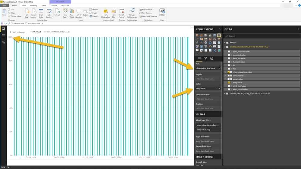
So then I drag the time column to the "Axis" field of the visual. Cool, I get a time scale along the x axis with "100%" showing for each temperature COUNT.
Basically, how do I change the visual to show me the VALUE of the temperature column over time instead of the COUNT of temperature readings?
Thank you!
Solved! Go to Solution.
- Mark as New
- Bookmark
- Subscribe
- Mute
- Subscribe to RSS Feed
- Permalink
- Report Inappropriate Content
Hi @ericOnline,
Why did you use the 100% Stacked Column Chart while you don't like the % columns? Maybe you can use another visual instead. If you can share a sample file, please upload it to the cloud drive like OneDrive, GoogleDrive, then share the download link here.
Best Regards,
Dale
If this post helps, then please consider Accept it as the solution to help the other members find it more quickly.
- Mark as New
- Bookmark
- Subscribe
- Mute
- Subscribe to RSS Feed
- Permalink
- Report Inappropriate Content
For anyone still looking at this problem, I resolved this same issue by changing the summarization to SUM under properties with the y-axis value I wanted. I then added the y-axis value to the line graph as the Sum of "value". If the values are distinct across your x-axis, then you'll see the actual value populate on your graph.
- Mark as New
- Bookmark
- Subscribe
- Mute
- Subscribe to RSS Feed
- Permalink
- Report Inappropriate Content
This is the answer I was looking for...Thank you VERY much.
- Mark as New
- Bookmark
- Subscribe
- Mute
- Subscribe to RSS Feed
- Permalink
- Report Inappropriate Content
- Mark as New
- Bookmark
- Subscribe
- Mute
- Subscribe to RSS Feed
- Permalink
- Report Inappropriate Content
Yes, don't use it. Every once a year I try and create a graph or scrape some data. Invariably, i.e. EVERY TIME, there's an issue. Oh you can only do this if it's a Tuesday with a full moon. Any errors don't provide any useful feedback.
It's like the std msft way of describing things. For example: "to perform or implement function "x", turn on your computer, select the software and implement said function". Wow was that ever helpful!!
So no I can't be bothered with BI right now.
- Mark as New
- Bookmark
- Subscribe
- Mute
- Subscribe to RSS Feed
- Permalink
- Report Inappropriate Content
Generally you get this behavior because your column is of type Text and you probably don't want that. Check your data type. If it really is a number, you can drop down the little arrow for the column in the Values area and change the aggregation.
Follow on LinkedIn
@ me in replies or I'll lose your thread!!!
Instead of a Kudo, please vote for this idea
Become an expert!: Enterprise DNA
External Tools: MSHGQM
YouTube Channel!: Microsoft Hates Greg
Latest book!: DAX For Humans
DAX is easy, CALCULATE makes DAX hard...
- Mark as New
- Bookmark
- Subscribe
- Mute
- Subscribe to RSS Feed
- Permalink
- Report Inappropriate Content
No, you can't do squat.
We can talk about slicing and dicing all we want. Fact is Power BI is making far too many assumptions and playing games. I went far in my schooling in a scientific field. Whenever we make a bar graph, or line graph or a giraff, YOU PRESENT YOUR X-AXIS AND Y-AXIS VALUES. Nobody asked for PowerBI to do this, and its not even intuitive on how to turn that mess off. What it looks like is kids that can program and then show that they set up this tool, not the way real people actually use data but with snazzy filters, from the get go. NO ONE WANTS THAT AT THE BEGINNING. HOW WELSE ARE YOU SUPPOSED TO VERIFY THE DATA??????????????????????????????????????????????????????????????????????????????????
- Mark as New
- Bookmark
- Subscribe
- Mute
- Subscribe to RSS Feed
- Permalink
- Report Inappropriate Content
This is how I feel every time I try to do anything in power bi. It's incredible how poorly designed it is.
Here's another example of how bad power bi is:
I only use it because I am forced to for my job. I will never recomend it to anyone ever.
- Mark as New
- Bookmark
- Subscribe
- Mute
- Subscribe to RSS Feed
- Permalink
- Report Inappropriate Content
I hear you. It's all so bad that this is the second time trying to respond. First time a box popped up asking if I'd like to give feedback. It blew away everything I wrote and took me to another page. WTF?????!!!!
Yes for sure I will up my subscription for the pro version now. NOT
- Mark as New
- Bookmark
- Subscribe
- Mute
- Subscribe to RSS Feed
- Permalink
- Report Inappropriate Content
Hi @Greg_Deckler, thank you for the reply.
I changed the dataType to decimal number and am having similar behavior. Dragging the "temperature" column to "Value" gives me a SUM this time instead of a COUNT (same thing?).
If I click the dropdown next to "temperature" the only options are SUM, AVERAGE, MIN, MAX, COUNT(distinct), COUNT, STANDARD DEV, VARIANCE, MEDIAN.
Where is "VALUE OF THE ACTUAL FIELD"?
- Mark as New
- Bookmark
- Subscribe
- Mute
- Subscribe to RSS Feed
- Permalink
- Report Inappropriate Content
Well, if you have your axis granular enough to display at the individual row level, then SUM, AVERAGE, MIN, MAX, etc. don't matter (except for COUNT, COUNT bad), they are all the value of that specific row. In certain settings, you will get a "Do not summarize" option, but that is not for all visuals.
Follow on LinkedIn
@ me in replies or I'll lose your thread!!!
Instead of a Kudo, please vote for this idea
Become an expert!: Enterprise DNA
External Tools: MSHGQM
YouTube Channel!: Microsoft Hates Greg
Latest book!: DAX For Humans
DAX is easy, CALCULATE makes DAX hard...
- Mark as New
- Bookmark
- Subscribe
- Mute
- Subscribe to RSS Feed
- Permalink
- Report Inappropriate Content
Hm. The Y axis is labeled "%", and each measure is "100%" which makes no sense to me! Each of these should be a temperature value. Each values in this column is a temperature measurement (EX: "48.99", "48.00", etc.).
- Mark as New
- Bookmark
- Subscribe
- Mute
- Subscribe to RSS Feed
- Permalink
- Report Inappropriate Content
YOU SHOULDNT HAVE TO SHARE ANY REDICULOUS. YOU SIMPLY WANT A SIMPLE GRAPH DISPLAYING THE DATA. NO PERCENTAGES, NO SUMS NO PERCENTAGES. THE DATA!!!!!!
The reason people say that is they probably have never used real data in their life and just know how to play around with these programs, which BTW is badly setup therefore.
- Mark as New
- Bookmark
- Subscribe
- Mute
- Subscribe to RSS Feed
- Permalink
- Report Inappropriate Content
Strange, any way that you can share the PBIX file or provide sample/example source data?
Follow on LinkedIn
@ me in replies or I'll lose your thread!!!
Instead of a Kudo, please vote for this idea
Become an expert!: Enterprise DNA
External Tools: MSHGQM
YouTube Channel!: Microsoft Hates Greg
Latest book!: DAX For Humans
DAX is easy, CALCULATE makes DAX hard...
- Mark as New
- Bookmark
- Subscribe
- Mute
- Subscribe to RSS Feed
- Permalink
- Report Inappropriate Content
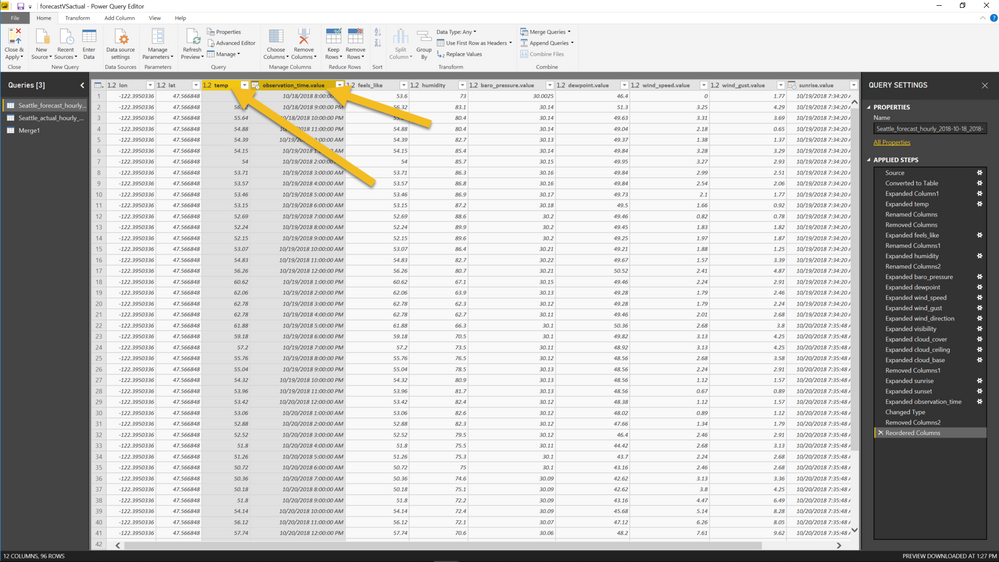
Sure. Attached is the .pbix file. I don't have the "Add Attachments" button when replying. Here are some screenshots that show the issue:
Data:
- Temp: decimal
- ObservedTime: dateTime
Stacked Bar Chart Vis:
- Temp: Value
- ObservedTime: Axis
- YAxis showing as "%"
- Mark as New
- Bookmark
- Subscribe
- Mute
- Subscribe to RSS Feed
- Permalink
- Report Inappropriate Content
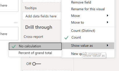
OK, here is what I am guessing, at some point you clicked the little drop down arrow for your value and chose "Show As" | "% of Grand Total". Turn that off.
Follow on LinkedIn
@ me in replies or I'll lose your thread!!!
Instead of a Kudo, please vote for this idea
Become an expert!: Enterprise DNA
External Tools: MSHGQM
YouTube Channel!: Microsoft Hates Greg
Latest book!: DAX For Humans
DAX is easy, CALCULATE makes DAX hard...
- Mark as New
- Bookmark
- Subscribe
- Mute
- Subscribe to RSS Feed
- Permalink
- Report Inappropriate Content
Really appreciate you keeping the discussion alive @Greg_Deckler.
Newp. I have "No Calculation" checked yet the % is still showing.
- Mark as New
- Bookmark
- Subscribe
- Mute
- Subscribe to RSS Feed
- Permalink
- Report Inappropriate Content
Did you get the output? I am having the same issue, help!!
- Mark as New
- Bookmark
- Subscribe
- Mute
- Subscribe to RSS Feed
- Permalink
- Report Inappropriate Content
Hi @Anonymous ,
@Greg_Deckler 's suggestions worked:
"
Generally you get this behavior because your column is of type Text and you probably don't want that. Check your data type. If it really is a number, you can drop down the little arrow for the column in the Values area and change the aggregation.
"
- Mark as New
- Bookmark
- Subscribe
- Mute
- Subscribe to RSS Feed
- Permalink
- Report Inappropriate Content
Ohh, I just missed the second page of the solution!
My problem is slightly different, but got it!!
Thank you anyways!
- Mark as New
- Bookmark
- Subscribe
- Mute
- Subscribe to RSS Feed
- Permalink
- Report Inappropriate Content
Oh yeah, good call @v-jiascu-msft, missed that he was using the 100% stacked column chart. @ericOnline, you want the chart visual 2 to the left of the one you have now.
Follow on LinkedIn
@ me in replies or I'll lose your thread!!!
Instead of a Kudo, please vote for this idea
Become an expert!: Enterprise DNA
External Tools: MSHGQM
YouTube Channel!: Microsoft Hates Greg
Latest book!: DAX For Humans
DAX is easy, CALCULATE makes DAX hard...
Helpful resources

Power BI Dataviz World Championships
The Power BI Data Visualization World Championships is back! Get ahead of the game and start preparing now!

| User | Count |
|---|---|
| 37 | |
| 37 | |
| 33 | |
| 32 | |
| 29 |
| User | Count |
|---|---|
| 130 | |
| 88 | |
| 82 | |
| 68 | |
| 64 |


