FabCon is coming to Atlanta
Join us at FabCon Atlanta from March 16 - 20, 2026, for the ultimate Fabric, Power BI, AI and SQL community-led event. Save $200 with code FABCOMM.
Register now!- Power BI forums
- Get Help with Power BI
- Desktop
- Service
- Report Server
- Power Query
- Mobile Apps
- Developer
- DAX Commands and Tips
- Custom Visuals Development Discussion
- Health and Life Sciences
- Power BI Spanish forums
- Translated Spanish Desktop
- Training and Consulting
- Instructor Led Training
- Dashboard in a Day for Women, by Women
- Galleries
- Data Stories Gallery
- Themes Gallery
- Contests Gallery
- Quick Measures Gallery
- Notebook Gallery
- Translytical Task Flow Gallery
- TMDL Gallery
- R Script Showcase
- Webinars and Video Gallery
- Ideas
- Custom Visuals Ideas (read-only)
- Issues
- Issues
- Events
- Upcoming Events
Calling all Data Engineers! Fabric Data Engineer (Exam DP-700) live sessions are back! Starting October 16th. Sign up.
- Power BI forums
- Forums
- Get Help with Power BI
- Desktop
- Grouping dates in a bar chart by month
- Subscribe to RSS Feed
- Mark Topic as New
- Mark Topic as Read
- Float this Topic for Current User
- Bookmark
- Subscribe
- Printer Friendly Page
- Mark as New
- Bookmark
- Subscribe
- Mute
- Subscribe to RSS Feed
- Permalink
- Report Inappropriate Content
Grouping dates in a bar chart by month
Hi All,
I am trying to create a bar chart to show the number of responses by month. The two colums i have is response ID's (y-Axis) and response date (X axis, format dd-mmm-yyyy).
I am wanting to group the dates together so the bar chart is showing responses in a month, not an indiidual day. The response date data type is set to date/time.
Any help would be appreciated.
Solved! Go to Solution.
- Mark as New
- Bookmark
- Subscribe
- Mute
- Subscribe to RSS Feed
- Permalink
- Report Inappropriate Content
Hi,
Seperate time from the Date/Time column. Create a Calendar Table and then a relationship from the Date column of the Data Table to the Date column of the Calendar Table. In the Calendar Table, create calculated column formulas for Year, Month name and Month number. Sort the Month name column by the Month number. To your visual, drag Year and Month name from the Calendar Table. Write this measure
Measure = countrows(Data)
Hope this helps.
Regards,
Ashish Mathur
http://www.ashishmathur.com
https://www.linkedin.com/in/excelenthusiasts/
- Mark as New
- Bookmark
- Subscribe
- Mute
- Subscribe to RSS Feed
- Permalink
- Report Inappropriate Content
Hi @TBSST
If you working with 1 table of fact :
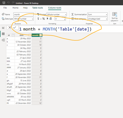
You can add a column with the month:
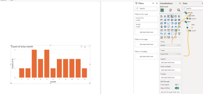
and put it to X axis
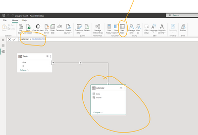
The best Practise to work with dates is to create a date table and "use" it :
Link to a sample file with both options
For more informations about dates table:
https://www.datacamp.com/tutorial/how-to-create-date-tables-in-power-bi-tutorial
If this post helps, then please consider Accepting it as the solution to help the other members find it more quickly
Rita Fainshtein | Microsoft MVP
https://www.linkedin.com/in/rita-fainshtein/
Blog : https://www.madeiradata.com/profile/ritaf/profile
- Mark as New
- Bookmark
- Subscribe
- Mute
- Subscribe to RSS Feed
- Permalink
- Report Inappropriate Content
Hi,
Seperate time from the Date/Time column. Create a Calendar Table and then a relationship from the Date column of the Data Table to the Date column of the Calendar Table. In the Calendar Table, create calculated column formulas for Year, Month name and Month number. Sort the Month name column by the Month number. To your visual, drag Year and Month name from the Calendar Table. Write this measure
Measure = countrows(Data)
Hope this helps.
Regards,
Ashish Mathur
http://www.ashishmathur.com
https://www.linkedin.com/in/excelenthusiasts/
Helpful resources

FabCon Global Hackathon
Join the Fabric FabCon Global Hackathon—running virtually through Nov 3. Open to all skill levels. $10,000 in prizes!

Power BI Monthly Update - September 2025
Check out the September 2025 Power BI update to learn about new features.


