FabCon is coming to Atlanta
Join us at FabCon Atlanta from March 16 - 20, 2026, for the ultimate Fabric, Power BI, AI and SQL community-led event. Save $200 with code FABCOMM.
Register now!- Power BI forums
- Get Help with Power BI
- Desktop
- Service
- Report Server
- Power Query
- Mobile Apps
- Developer
- DAX Commands and Tips
- Custom Visuals Development Discussion
- Health and Life Sciences
- Power BI Spanish forums
- Translated Spanish Desktop
- Training and Consulting
- Instructor Led Training
- Dashboard in a Day for Women, by Women
- Galleries
- Data Stories Gallery
- Themes Gallery
- Contests Gallery
- Quick Measures Gallery
- Notebook Gallery
- Translytical Task Flow Gallery
- TMDL Gallery
- R Script Showcase
- Webinars and Video Gallery
- Ideas
- Custom Visuals Ideas (read-only)
- Issues
- Issues
- Events
- Upcoming Events
To celebrate FabCon Vienna, we are offering 50% off select exams. Ends October 3rd. Request your discount now.
- Power BI forums
- Forums
- Get Help with Power BI
- Desktop
- Re: Grouping count by value per category
- Subscribe to RSS Feed
- Mark Topic as New
- Mark Topic as Read
- Float this Topic for Current User
- Bookmark
- Subscribe
- Printer Friendly Page
- Mark as New
- Bookmark
- Subscribe
- Mute
- Subscribe to RSS Feed
- Permalink
- Report Inappropriate Content
Grouping count by value per category
Hello all,
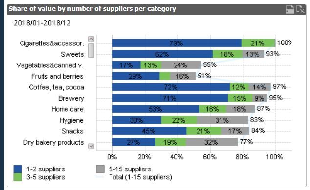
How may I get such results?
Will stacked % bars give such? how to group these count range?
Thanks alot.
Invoice (table) - Value (column)
CDTs (table) - Category (column)
Vendor (table) - Supplier name (column)
- Mark as New
- Bookmark
- Subscribe
- Mute
- Subscribe to RSS Feed
- Permalink
- Report Inappropriate Content
@abadi_89 , for the count you need bucketing
https://www.youtube.com/watch?v=CuczXPj0N-k
or
segmentation
https://www.daxpatterns.com/dynamic-segmentation/
https://radacad.com/grouping-and-binning-step-towards-better-data-visualization
Then you can calculate % of sub total - https://www.youtube.com/watch?v=6jTildcV2ho
- Mark as New
- Bookmark
- Subscribe
- Mute
- Subscribe to RSS Feed
- Permalink
- Report Inappropriate Content
Thank you @amitchandak ,
I managed to make the bucketing but couldn't manage to after? it won't go to the visual!
Any ideas?
- Mark as New
- Bookmark
- Subscribe
- Mute
- Subscribe to RSS Feed
- Permalink
- Report Inappropriate Content
Hi @abadi_89
It seems your Segmentation is a measure. In order to use segmentation as category in a bar chart, you need to create a calculated column for segmentation instead of a measure because measures cannot be put in Legend or Axis fields of a chart. For example,
Regards,
Jing
- Mark as New
- Bookmark
- Subscribe
- Mute
- Subscribe to RSS Feed
- Permalink
- Report Inappropriate Content
Thank you!
Now it make sense, any idea how to create that column if the region is in another table?
What I have is:
Invoice (table) - Value (column)
CDTs (table) - Category (column)
Vendor (table) - Supplier name (column)
- Mark as New
- Bookmark
- Subscribe
- Mute
- Subscribe to RSS Feed
- Permalink
- Report Inappropriate Content
What is the relationship between these tables? If you create proper relationships on columns in these tables, this should also work.


