Fabric Data Days starts November 4th!
Advance your Data & AI career with 50 days of live learning, dataviz contests, hands-on challenges, study groups & certifications and more!
Get registered- Power BI forums
- Get Help with Power BI
- Desktop
- Service
- Report Server
- Power Query
- Mobile Apps
- Developer
- DAX Commands and Tips
- Custom Visuals Development Discussion
- Health and Life Sciences
- Power BI Spanish forums
- Translated Spanish Desktop
- Training and Consulting
- Instructor Led Training
- Dashboard in a Day for Women, by Women
- Galleries
- Data Stories Gallery
- Themes Gallery
- Contests Gallery
- QuickViz Gallery
- Quick Measures Gallery
- Visual Calculations Gallery
- Notebook Gallery
- Translytical Task Flow Gallery
- TMDL Gallery
- R Script Showcase
- Webinars and Video Gallery
- Ideas
- Custom Visuals Ideas (read-only)
- Issues
- Issues
- Events
- Upcoming Events
Get Fabric Certified for FREE during Fabric Data Days. Don't miss your chance! Request now
- Power BI forums
- Forums
- Get Help with Power BI
- Desktop
- Re: Grouped view in Visual
- Subscribe to RSS Feed
- Mark Topic as New
- Mark Topic as Read
- Float this Topic for Current User
- Bookmark
- Subscribe
- Printer Friendly Page
- Mark as New
- Bookmark
- Subscribe
- Mute
- Subscribe to RSS Feed
- Permalink
- Report Inappropriate Content
Grouped view in Visual
Hi,
I'm new at this. Hopefully someone can help me.
Problem: i want to see 1 number and behind it, per status, OK or NOT OK. Can anyone tell me how to do that?
Example made in Excel:
The check if something is OK or NOT OK is working with de DAX formula.
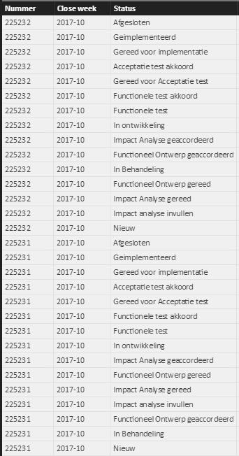
This is how the data looks that i am using.
Data:
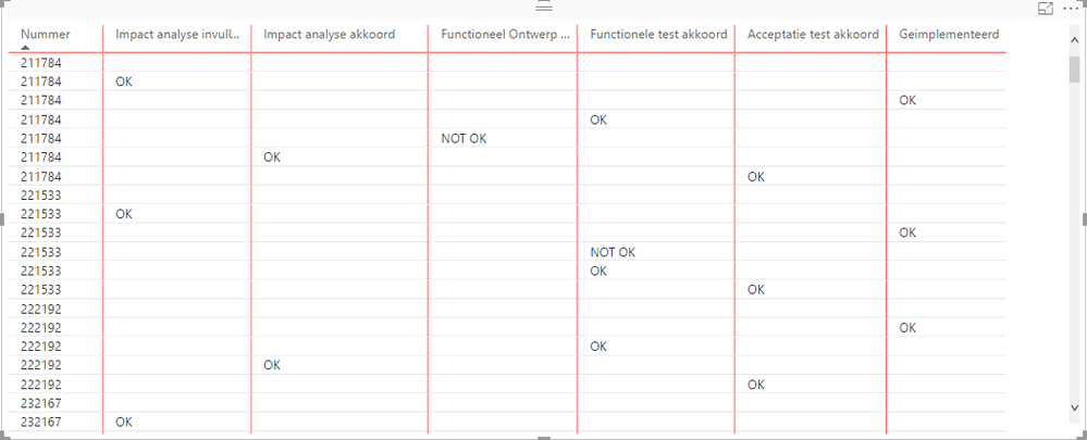
This is how the visual looks like now:
I'm hoping someone can help me :).
Grtz,
Shakti Janki
Solved! Go to Solution.
- Mark as New
- Bookmark
- Subscribe
- Mute
- Subscribe to RSS Feed
- Permalink
- Report Inappropriate Content
Hi @Shakti_Janki,
I am unable to reproduce your issue. In my test, I created a calculated column which returned OK/Not OK based on source table. Then, I used a matrix visual to display data, add [Nummer] into Rows section, add [Status] into Columns section and add the new column into Values section.
In your scenario, it seems that the data was not grouped based on [Nummer] in visual, how did you make the DAX formula?
Regards,
Yuliana Gu
If this post helps, then please consider Accept it as the solution to help the other members find it more quickly.
- Mark as New
- Bookmark
- Subscribe
- Mute
- Subscribe to RSS Feed
- Permalink
- Report Inappropriate Content
Hi @v-yulgu-msft,
Thanks! I think i got it right now. The first thing was that i was not using the Matrix visual, but the Table visual.
When i changed that, i followed you advice to add [Nummer] into Rows section and added the new columns into the Values section. These changes resulted in this:
The DAX formula i used was: Impact analyse akkoord = IF(Query1[Status]="Impact Analyse geaccordeerd";IF(Query1[Functie]="FB";"OK";IF(Query1[Functie]="ICT Beheerder";"Akkoord";IF(Query1[Functie]="Changemanager";"Akkoord";"Niet akkoord"))))
Thanks for all your help!
Also @vanessafvg
- Mark as New
- Bookmark
- Subscribe
- Mute
- Subscribe to RSS Feed
- Permalink
- Report Inappropriate Content
it makes sent to pivot in power query in my mind. but there might be a better way to do this
https://powerbi.microsoft.com/en-us/documentation/powerbi-desktop-common-query-tasks/ (look under the pivot section)
this is what i would do
1. in power query add a custom column with a value "ok"
2. pivot on the status column using the custom column as your value
what you will end up with is all your columns like your first graph except there will be 1 and 0, 1 = ok, 0 = not ok.
If I took the time to answer your question and I came up with a solution, please mark my post as a solution and /or give kudos freely for the effort 🙂 Thank you!
Proud to be a Super User!
Helpful resources

Fabric Data Days
Advance your Data & AI career with 50 days of live learning, contests, hands-on challenges, study groups & certifications and more!

Power BI Monthly Update - October 2025
Check out the October 2025 Power BI update to learn about new features.


