FabCon is coming to Atlanta
Join us at FabCon Atlanta from March 16 - 20, 2026, for the ultimate Fabric, Power BI, AI and SQL community-led event. Save $200 with code FABCOMM.
Register now!- Power BI forums
- Get Help with Power BI
- Desktop
- Service
- Report Server
- Power Query
- Mobile Apps
- Developer
- DAX Commands and Tips
- Custom Visuals Development Discussion
- Health and Life Sciences
- Power BI Spanish forums
- Translated Spanish Desktop
- Training and Consulting
- Instructor Led Training
- Dashboard in a Day for Women, by Women
- Galleries
- Data Stories Gallery
- Themes Gallery
- Contests Gallery
- Quick Measures Gallery
- Notebook Gallery
- Translytical Task Flow Gallery
- TMDL Gallery
- R Script Showcase
- Webinars and Video Gallery
- Ideas
- Custom Visuals Ideas (read-only)
- Issues
- Issues
- Events
- Upcoming Events
To celebrate FabCon Vienna, we are offering 50% off select exams. Ends October 3rd. Request your discount now.
- Power BI forums
- Forums
- Get Help with Power BI
- Desktop
- Grouped Bar Chart with Multiple Values
- Subscribe to RSS Feed
- Mark Topic as New
- Mark Topic as Read
- Float this Topic for Current User
- Bookmark
- Subscribe
- Printer Friendly Page
- Mark as New
- Bookmark
- Subscribe
- Mute
- Subscribe to RSS Feed
- Permalink
- Report Inappropriate Content
Grouped Bar Chart with Multiple Values
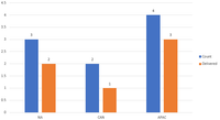
I'm trying to create a grouped bar chart with two differnt Values but I only want to filter one value.
My data set is structure like this:
| Region | Status |
| NA | Delivered |
| NA | In Process |
| NA | Delivered |
| CAN | Delivered |
| APAC | In Process |
| CAN | In Process |
| APAC | Delivered |
| APAC | Delivered |
| APAC | Delivered |
Which I'm wanting a bar chart that shows the total per region grouped with the total status of Delivered. I can do this in Excel just not sure how to do this in PowerBI.
Solved! Go to Solution.
- Mark as New
- Bookmark
- Subscribe
- Mute
- Subscribe to RSS Feed
- Permalink
- Report Inappropriate Content
@Anonymous , create two measures like this and put them bar/clustered visual
count = count(Table[Status])
Delivered = calculate(count(Table[Status]),Table[Status]="Delivered")
- Mark as New
- Bookmark
- Subscribe
- Mute
- Subscribe to RSS Feed
- Permalink
- Report Inappropriate Content
@Anonymous , create two measures like this and put them bar/clustered visual
count = count(Table[Status])
Delivered = calculate(count(Table[Status]),Table[Status]="Delivered")


