FabCon is coming to Atlanta
Join us at FabCon Atlanta from March 16 - 20, 2026, for the ultimate Fabric, Power BI, AI and SQL community-led event. Save $200 with code FABCOMM.
Register now!- Power BI forums
- Get Help with Power BI
- Desktop
- Service
- Report Server
- Power Query
- Mobile Apps
- Developer
- DAX Commands and Tips
- Custom Visuals Development Discussion
- Health and Life Sciences
- Power BI Spanish forums
- Translated Spanish Desktop
- Training and Consulting
- Instructor Led Training
- Dashboard in a Day for Women, by Women
- Galleries
- Data Stories Gallery
- Themes Gallery
- Contests Gallery
- QuickViz Gallery
- Quick Measures Gallery
- Visual Calculations Gallery
- Notebook Gallery
- Translytical Task Flow Gallery
- TMDL Gallery
- R Script Showcase
- Webinars and Video Gallery
- Ideas
- Custom Visuals Ideas (read-only)
- Issues
- Issues
- Events
- Upcoming Events
The Power BI Data Visualization World Championships is back! Get ahead of the game and start preparing now! Learn more
- Power BI forums
- Forums
- Get Help with Power BI
- Desktop
- Group column values, get a total/count of each one...
- Subscribe to RSS Feed
- Mark Topic as New
- Mark Topic as Read
- Float this Topic for Current User
- Bookmark
- Subscribe
- Printer Friendly Page
- Mark as New
- Bookmark
- Subscribe
- Mute
- Subscribe to RSS Feed
- Permalink
- Report Inappropriate Content
Group column values, get a total/count of each one, then visualize in a pie chart
Hello. I'm new to Power BI, so this may be a basic question (although I have googled around and checked the forum before making this post)...
I have a column of data with four values - let's call them V1, V2, V3, and V4. So, the column may look like:
V1
V4
V2
V1
V2
V3
V1
V1
I just want to get the percentage of the appearance of each of those put into a pie chart. So, in the example above, there would be a pie chart with V1 taking up 50% (4/8 entries), V2 taking up 25% (2/8 entries), and V3/V4 taking up 12.5% each (1/8 entries each).
I've only used the WYSIWYG interface of Power BI and haven't messed with scripting yet, but I do have a programming background, so if that is what this solution involves, that should be fine. Thanks!
Solved! Go to Solution.
- Mark as New
- Bookmark
- Subscribe
- Mute
- Subscribe to RSS Feed
- Permalink
- Report Inappropriate Content
Hi my friend.
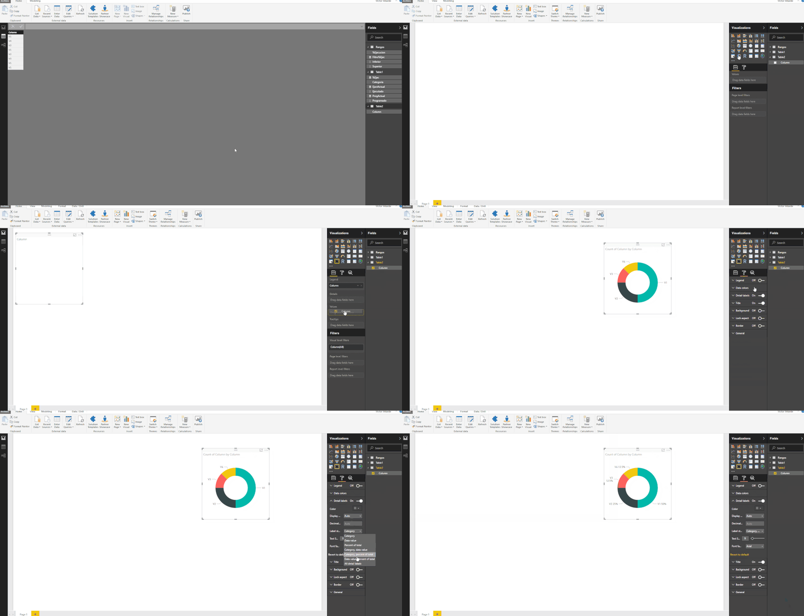
Please follow the steps showed in the below image.
Victor Velarde
Lima-Peru
Lima - Peru
- Mark as New
- Bookmark
- Subscribe
- Mute
- Subscribe to RSS Feed
- Permalink
- Report Inappropriate Content
If you want this in a PieChart just add the column with the V1, V2 and so on to the values of the pie chart and choose option count and also add that column to the legend and that will give the expect result and then.in the options you can choose if.you show values percents in the labels.
Regards,MFelix
Regards
Miguel Félix
Did I answer your question? Mark my post as a solution!
Proud to be a Super User!
Check out my blog: Power BI em Português- Mark as New
- Bookmark
- Subscribe
- Mute
- Subscribe to RSS Feed
- Permalink
- Report Inappropriate Content
Hi my friend.
Please follow the steps showed in the below image.
Victor Velarde
Lima-Peru
Lima - Peru
- Mark as New
- Bookmark
- Subscribe
- Mute
- Subscribe to RSS Feed
- Permalink
- Report Inappropriate Content
Thank you for probably the quickest and most comprehensive/visual/easy-to-understand accurate response I've ever received on a support forum...very much appreciated! ![]()
Helpful resources

Power BI Monthly Update - November 2025
Check out the November 2025 Power BI update to learn about new features.

Fabric Data Days
Advance your Data & AI career with 50 days of live learning, contests, hands-on challenges, study groups & certifications and more!


