FabCon is coming to Atlanta
Join us at FabCon Atlanta from March 16 - 20, 2026, for the ultimate Fabric, Power BI, AI and SQL community-led event. Save $200 with code FABCOMM.
Register now!- Power BI forums
- Get Help with Power BI
- Desktop
- Service
- Report Server
- Power Query
- Mobile Apps
- Developer
- DAX Commands and Tips
- Custom Visuals Development Discussion
- Health and Life Sciences
- Power BI Spanish forums
- Translated Spanish Desktop
- Training and Consulting
- Instructor Led Training
- Dashboard in a Day for Women, by Women
- Galleries
- Data Stories Gallery
- Themes Gallery
- Contests Gallery
- QuickViz Gallery
- Quick Measures Gallery
- Visual Calculations Gallery
- Notebook Gallery
- Translytical Task Flow Gallery
- TMDL Gallery
- R Script Showcase
- Webinars and Video Gallery
- Ideas
- Custom Visuals Ideas (read-only)
- Issues
- Issues
- Events
- Upcoming Events
The Power BI Data Visualization World Championships is back! Get ahead of the game and start preparing now! Learn more
- Power BI forums
- Forums
- Get Help with Power BI
- Desktop
- Re: Group Measures as field parameters
- Subscribe to RSS Feed
- Mark Topic as New
- Mark Topic as Read
- Float this Topic for Current User
- Bookmark
- Subscribe
- Printer Friendly Page
- Mark as New
- Bookmark
- Subscribe
- Mute
- Subscribe to RSS Feed
- Permalink
- Report Inappropriate Content
Group Measures as field parameters
New to using Field parameters - Is it possible to group field parameters?
Let say I have 3 products x 3 measures each I want to plot.
Product1
Measure1: Product 1 sales, Product 1 sales PY, Product 2, sales YTD
Product2:
Measure 1: Product 2 sales, Product 2 sales PY, Product 2 sales YTD
Product 3
Measure 1: Product 3 sales, Product 3 sales PY, Product 3 sales YTD.
I want to select only between "groups" Product 1 / Product 2 / Product 3 in a slicer tile which then shall dynamically change a combo bar/line chart on 3 different fields;
Y-axis (bar); sales
Y-axis (line1); sales PY
Y-axis (line2); sales YTD
X-axis (month)
Is the scenario above possible with field parameters feature?
- Mark as New
- Bookmark
- Subscribe
- Mute
- Subscribe to RSS Feed
- Permalink
- Report Inappropriate Content
There is 4 parameter in the field parameter that you can group measures inside the formula
- Mark as New
- Bookmark
- Subscribe
- Mute
- Subscribe to RSS Feed
- Permalink
- Report Inappropriate Content
Yes, Once you create your field parameter. Go to Table tools and select data groups and create your groups/
- Mark as New
- Bookmark
- Subscribe
- Mute
- Subscribe to RSS Feed
- Permalink
- Report Inappropriate Content
@AGScottThompson Thanks for the reply.
I was able to set it up (in Columns Tools > Data Groups) and got it working as either a line or bar chart (with the Field group as value and month on x-axis).
But is it also possible to use it for a combo chart, I want to visualize the different measures as either line or bar as shown below? Or do I need to set up the groups differently e.g. two different field tables (one for the line measures and one for the bar measures in the combo chart)?
Lets say I have 3 products x 3 measures each I want to plot.
Product1
Group1: Product 1 sales, Product 1 sales PY, Product 2, sales YTD
Product2:
Group 2: Product 2 sales, Product 2 sales PY, Product 2 sales YTD
Product 3
Group 3: Product 3 sales, Product 3 sales PY, Product 3 sales YTD.
I want to select only between "groups" Product 1 / Product 2 / Product 3 in a slicer tile which then shall dynamically change a combo bar/line chart on 3 different fields;
COMBO CHART
Y-axis (bar); sales (group 1-3 depending on selection)
Y-axis (line1); sales PY (group 1-3 depending on selection)
Y-axis (line2); sales YTD (group 1-3 depending on selection)
X-axis (month)
- Mark as New
- Bookmark
- Subscribe
- Mute
- Subscribe to RSS Feed
- Permalink
- Report Inappropriate Content
How did you group in the field parameters?
As I am not getting option to group it.
Could you please provide some snapshots? Thanks!
- Mark as New
- Bookmark
- Subscribe
- Mute
- Subscribe to RSS Feed
- Permalink
- Report Inappropriate Content
@SumitPandey
This was the way I used it for line chart, I have not gotten it to work in a combochart as I´d like to.
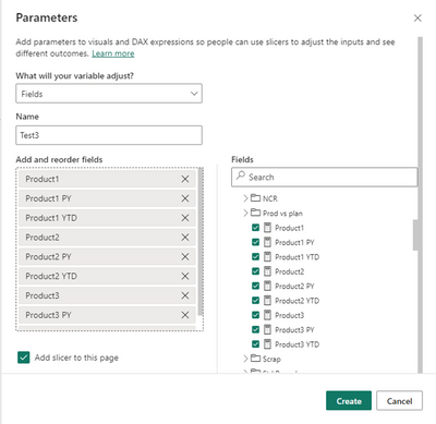
1) First create your field parameter with your measures
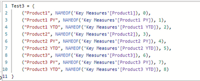
>>> It creates a table with the following content
2) Select the column in the Table created
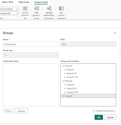
3) Under menu "Column tools" select "Data groups" and set up the groups and name as you prefer
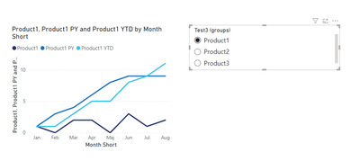
4) Add the group in a slicer and the table column (field parameters) in the line chart.
Hope it helps!
Helpful resources

Power BI Dataviz World Championships
The Power BI Data Visualization World Championships is back! Get ahead of the game and start preparing now!

Power BI Monthly Update - November 2025
Check out the November 2025 Power BI update to learn about new features.

| User | Count |
|---|---|
| 59 | |
| 46 | |
| 42 | |
| 23 | |
| 18 |
| User | Count |
|---|---|
| 193 | |
| 123 | |
| 99 | |
| 67 | |
| 49 |


