Forum Discussion

Graph with monthly data in individual comments
Hello,
I want to create a bart chart with months in the X-axe, however, my months in the dataset are separated in individual columns. Can someone show me how I could make a graph out of this?
Example
Column A Column B Column C
Item Jan-2019 Feb-2019 Mar-2019
A 0 50 100
B 80 60 90
C 100 50 50
best regards
Frederik
Unpivot all Columns and then you will get the data in single column. Then you can hv the way you want in the Graph
Follow the steps as mentioned below and hope your question is answered.

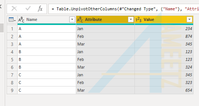
1 Reply
- VijayPCommunity Champion
Unpivot all Columns and then you will get the data in single column. Then you can hv the way you want in the Graph
Follow the steps as mentioned below and hope your question is answered.