FabCon is coming to Atlanta
Join us at FabCon Atlanta from March 16 - 20, 2026, for the ultimate Fabric, Power BI, AI and SQL community-led event. Save $200 with code FABCOMM.
Register now!- Power BI forums
- Get Help with Power BI
- Desktop
- Service
- Report Server
- Power Query
- Mobile Apps
- Developer
- DAX Commands and Tips
- Custom Visuals Development Discussion
- Health and Life Sciences
- Power BI Spanish forums
- Translated Spanish Desktop
- Training and Consulting
- Instructor Led Training
- Dashboard in a Day for Women, by Women
- Galleries
- Data Stories Gallery
- Themes Gallery
- Contests Gallery
- QuickViz Gallery
- Quick Measures Gallery
- Visual Calculations Gallery
- Notebook Gallery
- Translytical Task Flow Gallery
- TMDL Gallery
- R Script Showcase
- Webinars and Video Gallery
- Ideas
- Custom Visuals Ideas (read-only)
- Issues
- Issues
- Events
- Upcoming Events
The Power BI Data Visualization World Championships is back! Get ahead of the game and start preparing now! Learn more
- Power BI forums
- Forums
- Get Help with Power BI
- Desktop
- Graph with SharePoint list
- Subscribe to RSS Feed
- Mark Topic as New
- Mark Topic as Read
- Float this Topic for Current User
- Bookmark
- Subscribe
- Printer Friendly Page
- Mark as New
- Bookmark
- Subscribe
- Mute
- Subscribe to RSS Feed
- Permalink
- Report Inappropriate Content
Graph with SharePoint list
Hello;
I have a PowerApps application and I would like to make a Power Bi graph in this application.
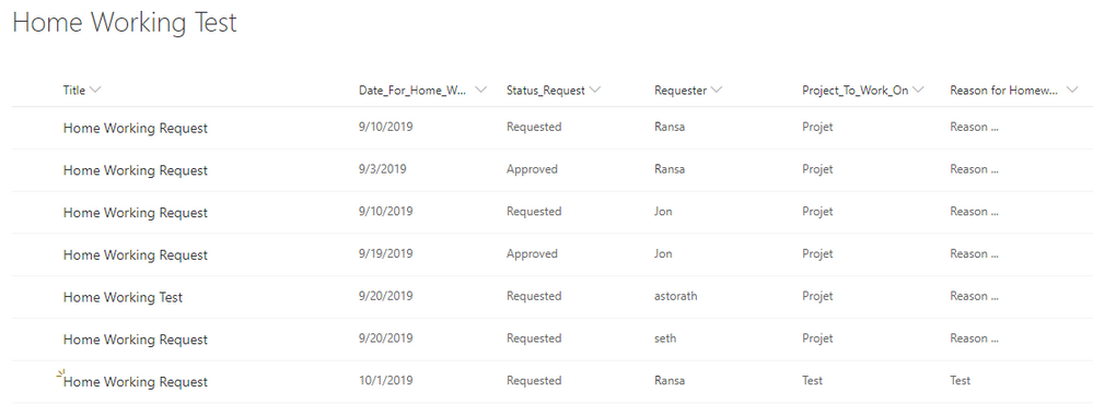
In my application I have a SharePoint list containing homeworking requests by user.
In my application, the user can only see his requests because I have a condition that test on the name of the user and the account with which he is connected. ==> Property Visible => [IF Requester.Email = User().Email;]
I would like to have graph by user that when he clicks a button he obtains this graph :
A graph wih on one axis the number of "homeworking days"/month and on the other axis (the months of the year) ?
The Status for the request must be approved to add day on graph (chart bars)
For exemple : Result for Person "XYZ" => 4 days on April, 3 days on September,...
1) How is it possible to make this graph ? Send list information with Power Flows to Power Bi ?
2) How with the information is it possible to realize this graph ?
The List SharePoint :
Thanks for your help ! 🙂
Solved! Go to Solution.
- Mark as New
- Bookmark
- Subscribe
- Mute
- Subscribe to RSS Feed
- Permalink
- Report Inappropriate Content
Hi @Anonymous ,
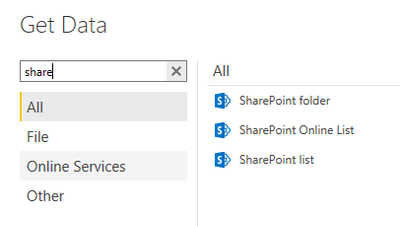
You could get data with SharePoint list from "Get Data".
Then create a new column.
Month =
MONTH ( 'Table'[Your date column] )
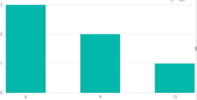
Then you can use stacked column/bar chart to get the visual. Use Month column as an x-axis and use count of Month as an y-axis.
For example:
You could add a slicer to select different peaple.
If this post helps, then please consider Accept it as the solution to help the other members find it.
Helpful resources

Power BI Dataviz World Championships
The Power BI Data Visualization World Championships is back! Get ahead of the game and start preparing now!

| User | Count |
|---|---|
| 40 | |
| 36 | |
| 34 | |
| 31 | |
| 27 |
| User | Count |
|---|---|
| 135 | |
| 102 | |
| 67 | |
| 65 | |
| 56 |


