Join the Fabric User Panel to shape the future of Fabric.
Share feedback directly with Fabric product managers, participate in targeted research studies and influence the Fabric roadmap.
Sign up now- Power BI forums
- Get Help with Power BI
- Desktop
- Service
- Report Server
- Power Query
- Mobile Apps
- Developer
- DAX Commands and Tips
- Custom Visuals Development Discussion
- Health and Life Sciences
- Power BI Spanish forums
- Translated Spanish Desktop
- Training and Consulting
- Instructor Led Training
- Dashboard in a Day for Women, by Women
- Galleries
- Data Stories Gallery
- Themes Gallery
- Contests Gallery
- QuickViz Gallery
- Quick Measures Gallery
- Visual Calculations Gallery
- Notebook Gallery
- Translytical Task Flow Gallery
- TMDL Gallery
- R Script Showcase
- Webinars and Video Gallery
- Ideas
- Custom Visuals Ideas (read-only)
- Issues
- Issues
- Events
- Upcoming Events
Get Fabric certified for FREE! Don't miss your chance! Learn more
- Power BI forums
- Forums
- Get Help with Power BI
- Desktop
- Graph type - Categorial
- Subscribe to RSS Feed
- Mark Topic as New
- Mark Topic as Read
- Float this Topic for Current User
- Bookmark
- Subscribe
- Printer Friendly Page
- Mark as New
- Bookmark
- Subscribe
- Mute
- Subscribe to RSS Feed
- Permalink
- Report Inappropriate Content
Graph type - Categorial
Hi All,
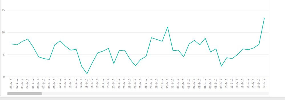
When I chose categorial type under line graph, scroll button appears in the bottom.
How can I get rid of it as I want to see all range all at once.
For example, I want to squeeze 1 Jan 2017 till 1 Dec 2017 (in Width 900 , Height 600) without scrooling .
Appreciate your help!
All the best,
cocomy
- Mark as New
- Bookmark
- Subscribe
- Mute
- Subscribe to RSS Feed
- Permalink
- Report Inappropriate Content
one way is to change the font size of X axis and other way could be formatting Date as mm/dd/yy. Just an idea.
- Mark as New
- Bookmark
- Subscribe
- Mute
- Subscribe to RSS Feed
- Permalink
- Report Inappropriate Content
rocky 09,
Thank you very much for your advice. I tried your recommendation.
I still have to scroll to see all at once. Appreciate if you can come up with another idea!
All the best,
cocomy
- Mark as New
- Bookmark
- Subscribe
- Mute
- Subscribe to RSS Feed
- Permalink
- Report Inappropriate Content
Can you post a screenshot?
- Mark as New
- Bookmark
- Subscribe
- Mute
- Subscribe to RSS Feed
- Permalink
- Report Inappropriate Content
Hi Rocky 09
Here is an exapmple. I would like to show Jan 2017 - Dec 2018 without scrolling.
Is it possible to squeeze ?
I like to use line with marker, I need to select categorial in this case.
All the best,
cocomy
- Mark as New
- Bookmark
- Subscribe
- Mute
- Subscribe to RSS Feed
- Permalink
- Report Inappropriate Content
You are trying to see all (365 days) in that graph. I don't think, you can see day by day data without a scroller.
Work around 1: Just Put Date on X-axis (Without Date Hirarchy) and then go to format then Change the X-axis Type to Continuous.
Work around 2: You can use Drill Option with Date Hirarchy, So, you can drill down the data without a scroller.
Helpful resources

Join our Community Sticker Challenge 2026
If you love stickers, then you will definitely want to check out our Community Sticker Challenge!

Power BI Monthly Update - January 2026
Check out the January 2026 Power BI update to learn about new features.

| User | Count |
|---|---|
| 65 | |
| 64 | |
| 45 | |
| 21 | |
| 18 |
| User | Count |
|---|---|
| 119 | |
| 114 | |
| 38 | |
| 36 | |
| 27 |

