Join us at FabCon Vienna from September 15-18, 2025
The ultimate Fabric, Power BI, SQL, and AI community-led learning event. Save €200 with code FABCOMM.
Get registered- Power BI forums
- Get Help with Power BI
- Desktop
- Service
- Report Server
- Power Query
- Mobile Apps
- Developer
- DAX Commands and Tips
- Custom Visuals Development Discussion
- Health and Life Sciences
- Power BI Spanish forums
- Translated Spanish Desktop
- Training and Consulting
- Instructor Led Training
- Dashboard in a Day for Women, by Women
- Galleries
- Data Stories Gallery
- Themes Gallery
- Contests Gallery
- Quick Measures Gallery
- Notebook Gallery
- Translytical Task Flow Gallery
- TMDL Gallery
- R Script Showcase
- Webinars and Video Gallery
- Ideas
- Custom Visuals Ideas (read-only)
- Issues
- Issues
- Events
- Upcoming Events
Enhance your career with this limited time 50% discount on Fabric and Power BI exams. Ends August 31st. Request your voucher.
- Power BI forums
- Forums
- Get Help with Power BI
- Desktop
- Re: Graph showing x-weeks rolling data over multip...
- Subscribe to RSS Feed
- Mark Topic as New
- Mark Topic as Read
- Float this Topic for Current User
- Bookmark
- Subscribe
- Printer Friendly Page
- Mark as New
- Bookmark
- Subscribe
- Mute
- Subscribe to RSS Feed
- Permalink
- Report Inappropriate Content
Graph showing x-weeks rolling data over multiple years
Dear all,
I have been working on some data that is being reported on a weekly basis (i.e. each week is one data entry). All seemed to work fine until I wanted to refresh my data for the first time in 2022. I then got some strange results because of weeknumbers partly falling into both years, etc.
Currently my view is as follows
I would like to have my x-axis showing the week numbers, but it should obviously 'reset' the count once the new year starts (as in below example by @Anonymous ). I tried some things (e.g. adding the year number to the week number to make it work in chronological order) but I haven't figured out the correct solution for now.
Additionally, once my x-axis is fixed, I would like to show the data of the last x-number (26 or 52) of weeks, preferably updated automatically.
Could anyone help me out with this? Thanks a lot!
Solved! Go to Solution.
- Mark as New
- Bookmark
- Subscribe
- Mute
- Subscribe to RSS Feed
- Permalink
- Report Inappropriate Content
Hi @NiekHacquebord ,
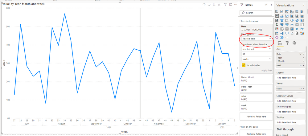
Add a week column to the table.
week = WEEKNUM('Table'[Date],2)Then use date heirarchy and [week] as x-axis and turn off concatenate labels under format -> x-axis.
To only show the latest number of weeks, you could add the [date] column to visual filter then use Relative date filter feature.
Best Regards,
Jay
- Mark as New
- Bookmark
- Subscribe
- Mute
- Subscribe to RSS Feed
- Permalink
- Report Inappropriate Content
@NiekHacquebord , use datesYTD
YTD Sales = CALCULATE(SUM(Sales[Sales Amount]),DATESYTD('Date'[Date],"12/31"))
or a measure like
YTD= CALCULATE(sum('Table'[Qty]), FILTER(ALL('Date'),'Date'[Year]=max('Date'[Year]) && 'Date'[Week] <= Max('Date'[Week]) ))
Use a separate date or year week table
- Mark as New
- Bookmark
- Subscribe
- Mute
- Subscribe to RSS Feed
- Permalink
- Report Inappropriate Content
Hi Amit,
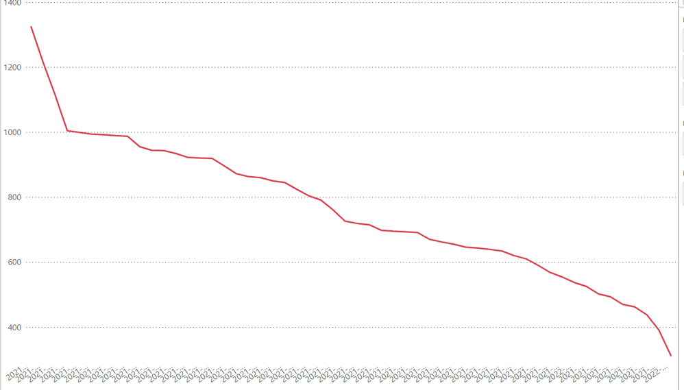
Thanks for your reply! Still haven't managed to make it work, but I am not sure whether I phrased my question correctly. What I tried previously is to use some kind of "YearWeek" column to fix my data (see below). However, the x-axis then has type "categorical", whereas I want to show it chronological order. Is there any way to fix this? Or should I maybe just number all the weeks over all the years and then use "continuous" on the x-axis? Then I probably won't be able to show correct values on the x-axis..
Hope this clarifies my question a bit more.


