FabCon is coming to Atlanta
Join us at FabCon Atlanta from March 16 - 20, 2026, for the ultimate Fabric, Power BI, AI and SQL community-led event. Save $200 with code FABCOMM.
Register now!- Power BI forums
- Get Help with Power BI
- Desktop
- Service
- Report Server
- Power Query
- Mobile Apps
- Developer
- DAX Commands and Tips
- Custom Visuals Development Discussion
- Health and Life Sciences
- Power BI Spanish forums
- Translated Spanish Desktop
- Training and Consulting
- Instructor Led Training
- Dashboard in a Day for Women, by Women
- Galleries
- Data Stories Gallery
- Themes Gallery
- Contests Gallery
- QuickViz Gallery
- Quick Measures Gallery
- Visual Calculations Gallery
- Notebook Gallery
- Translytical Task Flow Gallery
- TMDL Gallery
- R Script Showcase
- Webinars and Video Gallery
- Ideas
- Custom Visuals Ideas (read-only)
- Issues
- Issues
- Events
- Upcoming Events
The Power BI Data Visualization World Championships is back! It's time to submit your entry. Live now!
- Power BI forums
- Forums
- Get Help with Power BI
- Desktop
- Graph scale problem
- Subscribe to RSS Feed
- Mark Topic as New
- Mark Topic as Read
- Float this Topic for Current User
- Bookmark
- Subscribe
- Printer Friendly Page
- Mark as New
- Bookmark
- Subscribe
- Mute
- Subscribe to RSS Feed
- Permalink
- Report Inappropriate Content
Graph scale problem
Hi,
I'm trying to show the percentage of discounts for my customers in a graph. I've calculated the discounts in the following way:
Discount percentage = DIVIDE([Sum of Discounts];[Sum of Revenue])
On the other axis I have the Revenue which and this is then sorted by customer.
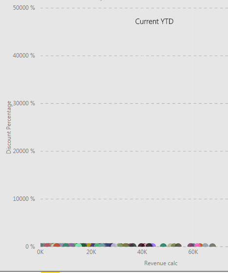
When I put all this in a graph I get the following:
Now I'm wondering why it's scaled like this and how I can get it to scale normally so the graph actually says something?
Cheers,
Mikael
Solved! Go to Solution.
- Mark as New
- Bookmark
- Subscribe
- Mute
- Subscribe to RSS Feed
- Permalink
- Report Inappropriate Content
Hi @mekaelj
Maybe try and set the start/end of the y-axis to values that make sense. Perhaps set the end value to 100?
- Mark as New
- Bookmark
- Subscribe
- Mute
- Subscribe to RSS Feed
- Permalink
- Report Inappropriate Content
HI @mekaelj,
Did these measures contains any specific filters?
If you can please share us more detail contents, it will be help for troubleshooting.(e.g. measure formula, table relationship, screeshots, other filter settings...)
In addition, you can also try to modify Y axis unit size at format tab.
Regards,
Xiaoxin Sheng
- Mark as New
- Bookmark
- Subscribe
- Mute
- Subscribe to RSS Feed
- Permalink
- Report Inappropriate Content
Hi @mekaelj
Maybe try and set the start/end of the y-axis to values that make sense. Perhaps set the end value to 100?
Helpful resources

Power BI Dataviz World Championships
The Power BI Data Visualization World Championships is back! It's time to submit your entry.

| User | Count |
|---|---|
| 49 | |
| 43 | |
| 36 | |
| 33 | |
| 30 |
| User | Count |
|---|---|
| 138 | |
| 120 | |
| 60 | |
| 59 | |
| 56 |


