FabCon is coming to Atlanta
Join us at FabCon Atlanta from March 16 - 20, 2026, for the ultimate Fabric, Power BI, AI and SQL community-led event. Save $200 with code FABCOMM.
Register now!- Power BI forums
- Get Help with Power BI
- Desktop
- Service
- Report Server
- Power Query
- Mobile Apps
- Developer
- DAX Commands and Tips
- Custom Visuals Development Discussion
- Health and Life Sciences
- Power BI Spanish forums
- Translated Spanish Desktop
- Training and Consulting
- Instructor Led Training
- Dashboard in a Day for Women, by Women
- Galleries
- Data Stories Gallery
- Themes Gallery
- Contests Gallery
- Quick Measures Gallery
- Notebook Gallery
- Translytical Task Flow Gallery
- TMDL Gallery
- R Script Showcase
- Webinars and Video Gallery
- Ideas
- Custom Visuals Ideas (read-only)
- Issues
- Issues
- Events
- Upcoming Events
To celebrate FabCon Vienna, we are offering 50% off select exams. Ends October 3rd. Request your discount now.
- Power BI forums
- Forums
- Get Help with Power BI
- Desktop
- Graph per Person list sharepoint
- Subscribe to RSS Feed
- Mark Topic as New
- Mark Topic as Read
- Float this Topic for Current User
- Bookmark
- Subscribe
- Printer Friendly Page
- Mark as New
- Bookmark
- Subscribe
- Mute
- Subscribe to RSS Feed
- Permalink
- Report Inappropriate Content
Graph per Person list sharepoint
Hello;
How is possible to create a graph by person with a SharePoint list ?
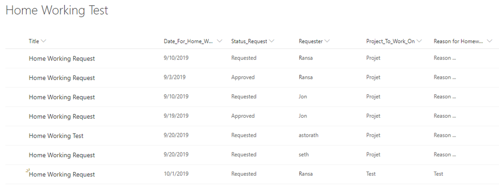
I have this Sharepoint list and I would like a day number (approved) / per month
How is it possible to have a different graph per person ?
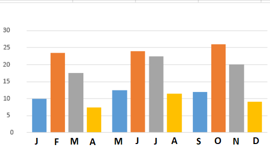
The result I would like to have (one person) : number of day / month => per Person
Thank for your help 🙂 !
Solved! Go to Solution.
- Mark as New
- Bookmark
- Subscribe
- Mute
- Subscribe to RSS Feed
- Permalink
- Report Inappropriate Content
Hey,
to achieve what you want I would do this:
- Make suere that the "Date_For_..." column is of data type Date
- Create an additional calculated column that extracts the year from the date column using a DAX statement like this
Year = YEAR('<tablename>'[Date_From_...]) - Create an additional calculated column that exctract the month (numeric) from the date column using a DAX statement like this
Month = Month('<tablename>'[Date_From_...]) - Create an additional calculated column that exctract the month name from the date column using a DAX statement like this
Month Name = FORMAT('<tablename>'[Date_From_...] , "MMM") - Make sure that the column "Month Name" is sorted by the column "Month"
https://docs.microsoft.com/en-us/power-bi/desktop-sort-by-column#sort-using-the-sort-by-column-butto...
Now you can create a column chart, using the newly created column "Month Name" on the x-axis, drag the "Date_From_..." column to the value band and switch the aggregation function to count.
Use the column "Requester" as a slicer to make sure that only the values from one person are used.
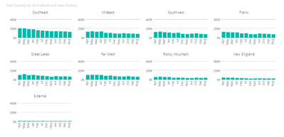
If you want to create a chart that contains all the data for all persons at the same time, but in an extra chart, you have to use a custom visual that supports "small multiples" like the Infographic Designer (available from the marketplace without any costs). Here is a screenshot of a small multiple created by using the Infograhic Designer custom visual:
Hopefully this provides you with some ideas.
Regards,
Tom
Did I answer your question? Mark my post as a solution, this will help others!
Proud to be a Super User!
I accept Kudos 😉
Hamburg, Germany


