Get Fabric certified for FREE!
Don't miss your chance to take the Fabric Data Engineer (DP-600) exam for FREE! Find out how by attending the DP-600 session on April 23rd (pacific time), live or on-demand.
Learn more- Power BI forums
- Get Help with Power BI
- Desktop
- Service
- Report Server
- Power Query
- Mobile Apps
- Developer
- DAX Commands and Tips
- Custom Visuals Development Discussion
- Health and Life Sciences
- Power BI Spanish forums
- Translated Spanish Desktop
- Training and Consulting
- Instructor Led Training
- Dashboard in a Day for Women, by Women
- Galleries
- Data Stories Gallery
- Themes Gallery
- Contests Gallery
- QuickViz Gallery
- Quick Measures Gallery
- Visual Calculations Gallery
- Notebook Gallery
- Translytical Task Flow Gallery
- TMDL Gallery
- R Script Showcase
- Webinars and Video Gallery
- Ideas
- Custom Visuals Ideas (read-only)
- Issues
- Issues
- Events
- Upcoming Events
Next up in the FabCon + SQLCon recap series: The roadmap for Microsoft SQL and Maximizing Developer experiences in Fabric. All sessions are available on-demand after the live show. Register now
- Power BI forums
- Forums
- Get Help with Power BI
- Desktop
- Re: Graph for ranges
- Subscribe to RSS Feed
- Mark Topic as New
- Mark Topic as Read
- Float this Topic for Current User
- Bookmark
- Subscribe
- Printer Friendly Page
- Mark as New
- Bookmark
- Subscribe
- Mute
- Subscribe to RSS Feed
- Permalink
- Report Inappropriate Content
Graph for ranges
Hi,
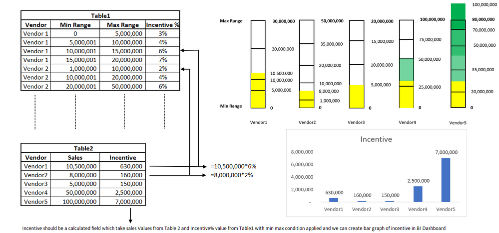
i want to add a bar graph which is based on ranges. i am also attaching a sketch showing how i want the bar graph and procedures to work. my question is, is it possible in Power BI to draw such type of graph 
- Mark as New
- Bookmark
- Subscribe
- Mute
- Subscribe to RSS Feed
- Permalink
- Report Inappropriate Content
Hi @Muhammad_Wasif , You need only one graph the incentive graph or the colorful graph ?
Regards,
Nikhil Chenna
- Mark as New
- Bookmark
- Subscribe
- Mute
- Subscribe to RSS Feed
- Permalink
- Report Inappropriate Content
Hi Nikhil,
I want both Graph Colourful graph is based on sales number and there is a max range and min range each vendor sales number is shown in graph falling between min to max range, vendor5 sales exceed the max range which is shown in graph as well. Based on sales number in table2 incentive percentage is a caculated colum which takes value of sales multiply by incentive% ( this percentage depend on the min range and max range where the sales value fall) and incentive graph is based on this calculated column. i also want to know how can i add this calculated column as well.
- Mark as New
- Bookmark
- Subscribe
- Mute
- Subscribe to RSS Feed
- Permalink
- Report Inappropriate Content
Hi @Muhammad_Wasif ,
You can achieve both in one bar graph only.
1. Plot the second graph which is Vendor wise Incentives.
2. Go to the Conditional formatting and apply condition and you'll get the color on the bars.
You can take try the solution from the below references too,
https://community.powerbi.com/t5/Desktop/Color-min-and-max-value-in-a-bar-chart/td-p/1537187
https://learn.microsoft.com/en-us/power-bi/create-reports/desktop-conditional-table-formatting
Regards,
Nikhil Chenna
Appreciate with a Kudos!! (Click the Thumbs Up Button)
Did I answer your question? Mark my post as a solution!
- Mark as New
- Bookmark
- Subscribe
- Mute
- Subscribe to RSS Feed
- Permalink
- Report Inappropriate Content
Thank you Nikhil. i wil try to learn from the reference link provided and if need help will definelty let you know thank you again
Helpful resources

New to Fabric Survey
If you have recently started exploring Fabric, we'd love to hear how it's going. Your feedback can help with product improvements.

Power BI DataViz World Championships - June 2026
A new Power BI DataViz World Championship is coming this June! Don't miss out on submitting your entry.

FabCon &SQLCon Highlights
Experience the highlights from FabCon & SQLCon, available live and on-demand starting April 14th.

| User | Count |
|---|---|
| 48 | |
| 40 | |
| 37 | |
| 20 | |
| 15 |
| User | Count |
|---|---|
| 70 | |
| 67 | |
| 32 | |
| 27 | |
| 25 |
