FabCon is coming to Atlanta
Join us at FabCon Atlanta from March 16 - 20, 2026, for the ultimate Fabric, Power BI, AI and SQL community-led event. Save $200 with code FABCOMM.
Register now!- Power BI forums
- Get Help with Power BI
- Desktop
- Service
- Report Server
- Power Query
- Mobile Apps
- Developer
- DAX Commands and Tips
- Custom Visuals Development Discussion
- Health and Life Sciences
- Power BI Spanish forums
- Translated Spanish Desktop
- Training and Consulting
- Instructor Led Training
- Dashboard in a Day for Women, by Women
- Galleries
- Data Stories Gallery
- Themes Gallery
- Contests Gallery
- QuickViz Gallery
- Quick Measures Gallery
- Visual Calculations Gallery
- Notebook Gallery
- Translytical Task Flow Gallery
- TMDL Gallery
- R Script Showcase
- Webinars and Video Gallery
- Ideas
- Custom Visuals Ideas (read-only)
- Issues
- Issues
- Events
- Upcoming Events
The Power BI Data Visualization World Championships is back! Get ahead of the game and start preparing now! Learn more
- Power BI forums
- Forums
- Get Help with Power BI
- Desktop
- Re: Graph based on values in different columns
- Subscribe to RSS Feed
- Mark Topic as New
- Mark Topic as Read
- Float this Topic for Current User
- Bookmark
- Subscribe
- Printer Friendly Page
- Mark as New
- Bookmark
- Subscribe
- Mute
- Subscribe to RSS Feed
- Permalink
- Report Inappropriate Content
Graph based on values in different columns
I have a data table with columns of data for each different month.
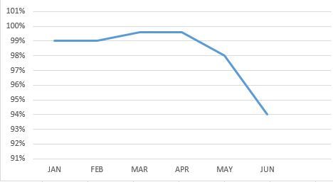
And I need to get a graph showing the evolution of the Values in time, showng the average value of the corresponding column for each month. Something like this:
I just can't find a way to build the graph. Even tried to buid additional tables. Can someone help me with some information on how to get it?
Thanks in advance,
Solved! Go to Solution.
- Mark as New
- Bookmark
- Subscribe
- Mute
- Subscribe to RSS Feed
- Permalink
- Report Inappropriate Content
Hi @dbalaciano,
In your scenario, you can use the Unpivot Columns options under Query Editor > Transform tab to get a Month column and a Value column. ![]()
In the Query Editor
1) select the all the month(JAN, FEB, etc) Columns.
2) Transform tab - Unpivot Columns
3) Rename the Attribute and Values columns - Month and Percentage.
Regards
- Mark as New
- Bookmark
- Subscribe
- Mute
- Subscribe to RSS Feed
- Permalink
- Report Inappropriate Content
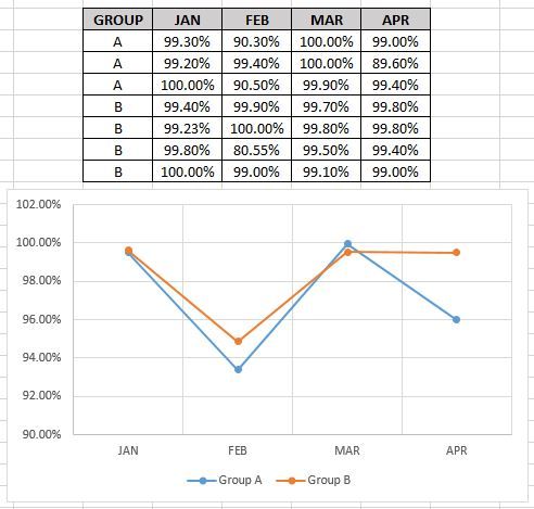
Thanks for your help with the other solutions, but I can't make it work with that because I have all 12 months but my list of projects tends to infinity. The values for each month are in different columns. Below is a simplification of my data structure and the graph I need to obtain showing the sum per group each month. Please ignore the blue line.
When I use the solution proposed above of selecting all months and clicking on unpivot (mi data is being extracted from a live shepoint list), it says "error" on every cell of the columns.
Is there any other solution?
Regards,
- Mark as New
- Bookmark
- Subscribe
- Mute
- Subscribe to RSS Feed
- Permalink
- Report Inappropriate Content
Hi @dbalaciano,
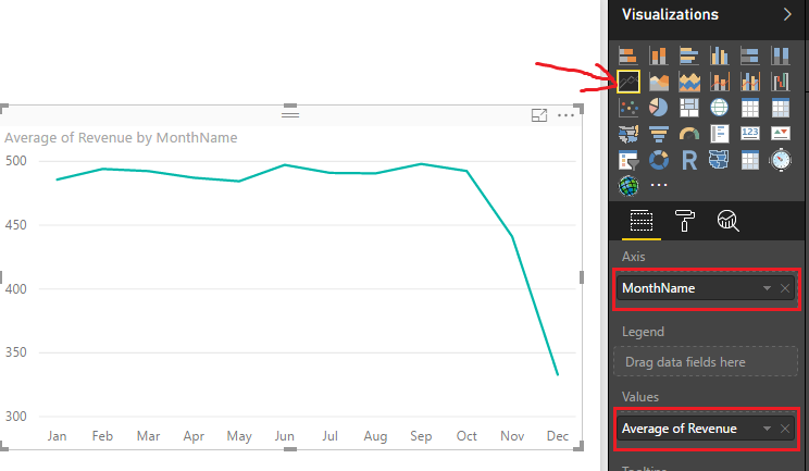
According to your description above, you should be able to use the Line Chart visual with your Month column as Axis, and the corresponding column as Value with aggregation of Average.
If it doesn't work in your scenario, could you post your real table structures with some sample data, so that we can better assistant on it? It's better to share a sample pbix file. You can upload it to OneDrive or Dropbox and post the link here. Do mask sensitive data before uploading. ![]()
Regards
- Mark as New
- Bookmark
- Subscribe
- Mute
- Subscribe to RSS Feed
- Permalink
- Report Inappropriate Content
Thanks for your help, but I can't make it work like that because I don't have a month column. I have the values for each month in different columns. Below is a simplification of my data structure and the graph I need to obtain showing the average per group each month. It seems simple, but I just can't find a way to use different columns as X axis in the graph.
Regards,
Diego
- Mark as New
- Bookmark
- Subscribe
- Mute
- Subscribe to RSS Feed
- Permalink
- Report Inappropriate Content
Hi @dbalaciano,
In your scenario, you can use the Unpivot Columns options under Query Editor > Transform tab to get a Month column and a Value column. ![]()
In the Query Editor
1) select the all the month(JAN, FEB, etc) Columns.
2) Transform tab - Unpivot Columns
3) Rename the Attribute and Values columns - Month and Percentage.
Regards
- Mark as New
- Bookmark
- Subscribe
- Mute
- Subscribe to RSS Feed
- Permalink
- Report Inappropriate Content
That worked perfectly!
Thank you for your help.
Helpful resources

Power BI Dataviz World Championships
The Power BI Data Visualization World Championships is back! Get ahead of the game and start preparing now!

| User | Count |
|---|---|
| 40 | |
| 35 | |
| 34 | |
| 31 | |
| 28 |
| User | Count |
|---|---|
| 136 | |
| 102 | |
| 68 | |
| 66 | |
| 58 |


