FabCon is coming to Atlanta
Join us at FabCon Atlanta from March 16 - 20, 2026, for the ultimate Fabric, Power BI, AI and SQL community-led event. Save $200 with code FABCOMM.
Register now!- Power BI forums
- Get Help with Power BI
- Desktop
- Service
- Report Server
- Power Query
- Mobile Apps
- Developer
- DAX Commands and Tips
- Custom Visuals Development Discussion
- Health and Life Sciences
- Power BI Spanish forums
- Translated Spanish Desktop
- Training and Consulting
- Instructor Led Training
- Dashboard in a Day for Women, by Women
- Galleries
- Data Stories Gallery
- Themes Gallery
- Contests Gallery
- Quick Measures Gallery
- Notebook Gallery
- Translytical Task Flow Gallery
- TMDL Gallery
- R Script Showcase
- Webinars and Video Gallery
- Ideas
- Custom Visuals Ideas (read-only)
- Issues
- Issues
- Events
- Upcoming Events
Calling all Data Engineers! Fabric Data Engineer (Exam DP-700) live sessions are back! Starting October 16th. Sign up.
- Power BI forums
- Forums
- Get Help with Power BI
- Desktop
- Re: Generating table with icons in place of number...
- Subscribe to RSS Feed
- Mark Topic as New
- Mark Topic as Read
- Float this Topic for Current User
- Bookmark
- Subscribe
- Printer Friendly Page
- Mark as New
- Bookmark
- Subscribe
- Mute
- Subscribe to RSS Feed
- Permalink
- Report Inappropriate Content
Generating table with icons in place of numbers
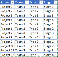
This is my first post so apologies if I have posted in the wrong area or made mistakes regarding best practice when posting questions. I have data which looks something like this:
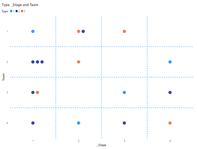
And I am hoping to get a chart or matrix table which has the specific number of coloured icons in place of the number. Preferably something like the picture below, which gives a great "big picture" view of the projects being completed across three different dimensions without looking unneccesarily messy. I have found timeline visuals which look good but can't seem to replace the time axis with a stage axis.

Any help in getting the above visual or even potential workarounds is appreciated.
Regards,
Steven
Solved! Go to Solution.
- Mark as New
- Bookmark
- Subscribe
- Mute
- Subscribe to RSS Feed
- Permalink
- Report Inappropriate Content
- Mark as New
- Bookmark
- Subscribe
- Mute
- Subscribe to RSS Feed
- Permalink
- Report Inappropriate Content
Thanks for the response @lbendlin.
Here is a table of what the data might look like:
| Project | Team | Type | Stage |
| Project 1 | Team 1 | Type 1 | Stage 1 |
| Project 2 | Team 1 | Type 2 | Stage 2 |
| Project 3 | Team 1 | Type 3 | Stage 3 |
| Project 4 | Team 2 | Type 1 | Stage 4 |
| Project 5 | Team 2 | Type 2 | Stage 1 |
| Project 6 | Team 2 | Type 3 | Stage 2 |
| Project 7 | Team 3 | Type 1 | Stage 3 |
| Project 8 | Team 3 | Type 2 | Stage 4 |
| Project 9 | Team 3 | Type 3 | Stage 1 |
| Project 10 | Team 4 | Type 1 | Stage 2 |
| Project 11 | Team 4 | Type 2 | Stage 3 |
| Project 12 | Team 4 | Type 3 | Stage 4 |
| Project 13 | Team 1 | Type 3 | Stage 2 |
| Project 14 | Team 2 | Type 2 | Stage 1 |
| Project 15 | Team 2 | Type 2 | Stage 1 |
| Project 16 | Team 3 | Type 2 | Stage 1 |
| Project 17 | Team 4 | Type 2 | Stage 1 |
And here is an updated picture of what the desired outcome would look like based on this sample data above:
A table with coloured icons in place of numbers, where each icon represents a project, and colour to represent the type. I'm also open to any alternative suggestions for conveying this executive summary of the projects in such a simple concise way.
Hope this is more helpful.
- Mark as New
- Bookmark
- Subscribe
- Mute
- Subscribe to RSS Feed
- Permalink
- Report Inappropriate Content
- Mark as New
- Bookmark
- Subscribe
- Mute
- Subscribe to RSS Feed
- Permalink
- Report Inappropriate Content
That's perfect, thank you very much!
- Mark as New
- Bookmark
- Subscribe
- Mute
- Subscribe to RSS Feed
- Permalink
- Report Inappropriate Content
Welcome to the forums. Please provide sanitized sample data that fully covers your issue. I can only help you with meaningful sample data.
Please paste the data into a table in your post or use one of the file services like OneDrive or Google Drive. Screenshots of your source data are not useful.
Please show the expected outcome based on the sample data you provided. Screenshots of the expected outcome are ok.
https://community.powerbi.com/t5/Community-Blog/How-to-provide-sample-data-in-the-Power-BI-Forum/ba-...
https://community.powerbi.com/t5/Desktop/How-to-Get-Your-Question-Answered-Quickly/m-p/1447523
Helpful resources

FabCon Global Hackathon
Join the Fabric FabCon Global Hackathon—running virtually through Nov 3. Open to all skill levels. $10,000 in prizes!

Power BI Monthly Update - September 2025
Check out the September 2025 Power BI update to learn about new features.


