FabCon is coming to Atlanta
Join us at FabCon Atlanta from March 16 - 20, 2026, for the ultimate Fabric, Power BI, AI and SQL community-led event. Save $200 with code FABCOMM.
Register now!- Power BI forums
- Get Help with Power BI
- Desktop
- Service
- Report Server
- Power Query
- Mobile Apps
- Developer
- DAX Commands and Tips
- Custom Visuals Development Discussion
- Health and Life Sciences
- Power BI Spanish forums
- Translated Spanish Desktop
- Training and Consulting
- Instructor Led Training
- Dashboard in a Day for Women, by Women
- Galleries
- Data Stories Gallery
- Themes Gallery
- Contests Gallery
- QuickViz Gallery
- Quick Measures Gallery
- Visual Calculations Gallery
- Notebook Gallery
- Translytical Task Flow Gallery
- TMDL Gallery
- R Script Showcase
- Webinars and Video Gallery
- Ideas
- Custom Visuals Ideas (read-only)
- Issues
- Issues
- Events
- Upcoming Events
View all the Fabric Data Days sessions on demand. View schedule
- Power BI forums
- Forums
- Get Help with Power BI
- Desktop
- Gauge visual with multiple targets
- Subscribe to RSS Feed
- Mark Topic as New
- Mark Topic as Read
- Float this Topic for Current User
- Bookmark
- Subscribe
- Printer Friendly Page
- Mark as New
- Bookmark
- Subscribe
- Mute
- Subscribe to RSS Feed
- Permalink
- Report Inappropriate Content
Gauge visual with multiple targets
Hi All,
Is it possible to have a gauge visual with two different sets of targets? E.g. "Plan", "Revised Plan"?
Solved! Go to Solution.
- Mark as New
- Bookmark
- Subscribe
- Mute
- Subscribe to RSS Feed
- Permalink
- Report Inappropriate Content
Hi @Anonymous ,
I can't find any custom visual that meets your requirement. Maybe you need to create two visuals:one for plan and the other one for Revised Plan.
If this post helps, then please consider Accept it as the solution to help the other members find it more quickly.
Best Regards,
Dedmon Dai
- Mark as New
- Bookmark
- Subscribe
- Mute
- Subscribe to RSS Feed
- Permalink
- Report Inappropriate Content
Hi @Anonymous , U can use technometer visual for this, refer the screenshot below
- Mark as New
- Bookmark
- Subscribe
- Mute
- Subscribe to RSS Feed
- Permalink
- Report Inappropriate Content
Hello everyone,
I have the same problem, and I tried to stack two gauges like suggested by @egsiegel in his message, but the client need to modify the threshold time to times, so I thought that instead of a gauge there is another visual (like a bar char ecc.) in which I/he can put easily and manually thresholds/target values, visually "similar" to the gauge.
Any suggestions?
- Mark as New
- Bookmark
- Subscribe
- Mute
- Subscribe to RSS Feed
- Permalink
- Report Inappropriate Content
Hi all,
Did anyone find any solution to get 2 different targets as 2 different lines? Your help is highly appreciated.
- Mark as New
- Bookmark
- Subscribe
- Mute
- Subscribe to RSS Feed
- Permalink
- Report Inappropriate Content
I didn't find anything useful - there's an idea posted but it has virtually no votes (link below):
https://ideas.fabric.microsoft.com/ideas/idea/?ideaid=e266e4d0-f245-4795-84a3-2c0c397e3520
With enough votes it might get developed
- Mark as New
- Bookmark
- Subscribe
- Mute
- Subscribe to RSS Feed
- Permalink
- Report Inappropriate Content
We still don't have this in 2023..
Srsly Microsoft
Wasted 4 -5 hours tried every gauge chart ever available .... and even charticulator doesn't help..
Chat gpt was not able to answer this .. conversation went in circles..
Lol the fun part is it got trianed by me..
Lets just pivot data and use stack bar chart
Would be happy to recieve a satisfying solution.
- Mark as New
- Bookmark
- Subscribe
- Mute
- Subscribe to RSS Feed
- Permalink
- Report Inappropriate Content
@Anonymous @Kevin_SC @egsiegel @v-deddai1-msft
In the same spot as all of you - there's an idea posted but it has virtually no votes (link below):
https://ideas.fabric.microsoft.com/ideas/idea/?ideaid=e266e4d0-f245-4795-84a3-2c0c397e3520
- Mark as New
- Bookmark
- Subscribe
- Mute
- Subscribe to RSS Feed
- Permalink
- Report Inappropriate Content
I've just looked through 3 similar topics and found no solutions.
Why didn't you add several ticks to the gauge? It's obvious that there might be more than 1 target. Honestly I believe that whoever designs those visuals have never worked in a non-software company.
Instead you either propose very 'creative' solutions or suggest to add an idea which by the looks of things will not be realized in the near 5 years anyway.
- Mark as New
- Bookmark
- Subscribe
- Mute
- Subscribe to RSS Feed
- Permalink
- Report Inappropriate Content
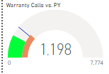
I know I am late to this one, but wanted to post this solution:
I created 2 Gauge visuals with the same min and max values.
1st one has the Values and Target. Do not display the target value (alignment issues) and shut the background off.
2nd should have only the second target set as the value and be 80% the size of the 1st.
set the colors as desired.
put the 1st visual on top of the 2nd and align centers.
group the 2 visuals
it should end up looking like this:
- Mark as New
- Bookmark
- Subscribe
- Mute
- Subscribe to RSS Feed
- Permalink
- Report Inappropriate Content
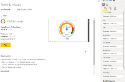
The Dial Gauge custom visual might be what you're looking for. it allows you to set Target and actual.
- Mark as New
- Bookmark
- Subscribe
- Mute
- Subscribe to RSS Feed
- Permalink
- Report Inappropriate Content
@Anonymous thank you for the suggestion but I believe that is more useful if you have a target range as opposed to two single point-value targets as I have?
- Mark as New
- Bookmark
- Subscribe
- Mute
- Subscribe to RSS Feed
- Permalink
- Report Inappropriate Content
Hi @Anonymous ,
I can't find any custom visual that meets your requirement. Maybe you need to create two visuals:one for plan and the other one for Revised Plan.
If this post helps, then please consider Accept it as the solution to help the other members find it more quickly.
Best Regards,
Dedmon Dai
- Mark as New
- Bookmark
- Subscribe
- Mute
- Subscribe to RSS Feed
- Permalink
- Report Inappropriate Content
Hi @v-deddai1-msft, thank you for checking. Yes that is currently what I am doing but it leads to redundancy as the "actual" value is repeated amongst different visuals. Thank you however.
- Mark as New
- Bookmark
- Subscribe
- Mute
- Subscribe to RSS Feed
- Permalink
- Report Inappropriate Content
Hi @Anonymous ,
But It seems to be the only way for now.I also recommend you create an idea for it in https://ideas.powerbi.com/forums/265200-power-bi-ideas to improve the power bi.
Best Regards,
Dedmon Dai
Helpful resources

Power BI Monthly Update - November 2025
Check out the November 2025 Power BI update to learn about new features.

Fabric Data Days
Advance your Data & AI career with 50 days of live learning, contests, hands-on challenges, study groups & certifications and more!


