FabCon is coming to Atlanta
Join us at FabCon Atlanta from March 16 - 20, 2026, for the ultimate Fabric, Power BI, AI and SQL community-led event. Save $200 with code FABCOMM.
Register now!- Power BI forums
- Get Help with Power BI
- Desktop
- Service
- Report Server
- Power Query
- Mobile Apps
- Developer
- DAX Commands and Tips
- Custom Visuals Development Discussion
- Health and Life Sciences
- Power BI Spanish forums
- Translated Spanish Desktop
- Training and Consulting
- Instructor Led Training
- Dashboard in a Day for Women, by Women
- Galleries
- Data Stories Gallery
- Themes Gallery
- Contests Gallery
- QuickViz Gallery
- Quick Measures Gallery
- Visual Calculations Gallery
- Notebook Gallery
- Translytical Task Flow Gallery
- TMDL Gallery
- R Script Showcase
- Webinars and Video Gallery
- Ideas
- Custom Visuals Ideas (read-only)
- Issues
- Issues
- Events
- Upcoming Events
View all the Fabric Data Days sessions on demand. View schedule
- Power BI forums
- Forums
- Get Help with Power BI
- Desktop
- Gauge chart showing blank when using Measure as MA...
- Subscribe to RSS Feed
- Mark Topic as New
- Mark Topic as Read
- Float this Topic for Current User
- Bookmark
- Subscribe
- Printer Friendly Page
- Mark as New
- Bookmark
- Subscribe
- Mute
- Subscribe to RSS Feed
- Permalink
- Report Inappropriate Content
Gauge chart showing blank when using Measure as MAX Value
Hello, I have the following data. We have customer requirements and supplier requirements. The goal for suppliers is to meet customer requirements. I am trying to create a Gauge Chart that has Max as the Customer requirement and actuals is whatever supplier production. I created the measure for customer MAX = CALCULATE(sum(Master[Value]), Master[Station]="Customer")
When I input this value as MAX, the graph turns into something like this - showing blank for max and actual only shows as number.
| Prod Date | Station | Type | Value |
| 7/1/2021 | Customer | PROD | 700 |
| 7/1/2021 | Supplier | PROD | 680 |
| 7/1/2021 | Supplier | Target | 720 |
| 7/2/2021 | Customer | PROD | 660 |
| 7/2/2021 | Supplier | PROD | 640 |
| 7/2/2021 | Supplier | Target | 720 |
- Mark as New
- Bookmark
- Subscribe
- Mute
- Subscribe to RSS Feed
- Permalink
- Report Inappropriate Content
hi @lotus22
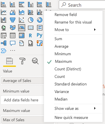
How is this 642 calculated? Secondly in order to show the maximum value, you do not necessarily have to create a measure. Add the column as shown below and select maximum.
Thanks!
alekh
- Mark as New
- Bookmark
- Subscribe
- Mute
- Subscribe to RSS Feed
- Permalink
- Report Inappropriate Content
Hi @Anonymous , 642 is just an example that is not in the table.
I do have to filter Max by Customer as supplier has to meet customer requirements. The gauge should tell us whether we are or not meeting customer requirements.
- Mark as New
- Bookmark
- Subscribe
- Mute
- Subscribe to RSS Feed
- Permalink
- Report Inappropriate Content
hi @lotus22
If you want just the Customer, can you add filter on the visual (Master[Station])? Am I missing something? If this does not help, can you clarify
1. How would the gauge value be calculated? Is it Average/Sum and Is it just for Customer or both Customer + Supplier?
2. If I understand it correctly, the Maximum value would be just for the Customer. Is that right?
Thanks!
Helpful resources

Power BI Monthly Update - November 2025
Check out the November 2025 Power BI update to learn about new features.

Fabric Data Days
Advance your Data & AI career with 50 days of live learning, contests, hands-on challenges, study groups & certifications and more!


