Join us at the 2025 Microsoft Fabric Community Conference
March 31 - April 2, 2025, in Las Vegas, Nevada. Use code MSCUST for a $150 discount! Early bird discount ends December 31.
Register Now- Power BI forums
- Get Help with Power BI
- Desktop
- Service
- Report Server
- Power Query
- Mobile Apps
- Developer
- DAX Commands and Tips
- Custom Visuals Development Discussion
- Health and Life Sciences
- Power BI Spanish forums
- Translated Spanish Desktop
- Training and Consulting
- Instructor Led Training
- Dashboard in a Day for Women, by Women
- Galleries
- Community Connections & How-To Videos
- COVID-19 Data Stories Gallery
- Themes Gallery
- Data Stories Gallery
- R Script Showcase
- Webinars and Video Gallery
- Quick Measures Gallery
- 2021 MSBizAppsSummit Gallery
- 2020 MSBizAppsSummit Gallery
- 2019 MSBizAppsSummit Gallery
- Events
- Ideas
- Custom Visuals Ideas
- Issues
- Issues
- Events
- Upcoming Events
Be one of the first to start using Fabric Databases. View on-demand sessions with database experts and the Microsoft product team to learn just how easy it is to get started. Watch now
- Power BI forums
- Forums
- Get Help with Power BI
- Desktop
- Re: Gaps in the line on composite chart
- Subscribe to RSS Feed
- Mark Topic as New
- Mark Topic as Read
- Float this Topic for Current User
- Bookmark
- Subscribe
- Printer Friendly Page
- Mark as New
- Bookmark
- Subscribe
- Mute
- Subscribe to RSS Feed
- Permalink
- Report Inappropriate Content
Gaps in the line on composite chart
Hi,
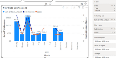
I have a composite column and line chart which has patchy data somethimes, and when it does the lines don't join up, they just have gaps. When the values are zero I want the lines to go to zero and not just vanish. How do I fix this?
Thank you
Solved! Go to Solution.
- Mark as New
- Bookmark
- Subscribe
- Mute
- Subscribe to RSS Feed
- Permalink
- Report Inappropriate Content
@IntaBruce , That is because the values are blank, In case 0 it will show them on the axis.
You can add +0 to the measure. But it can show all month year, so control like
0 between range
Measure = var _1= SUM(Opportunity[Opportunity count]) +0
var _min = minx(ALLSELECTED('Calendar'), 'Calendar'[Date])
var _max = maxx(ALLSELECTED('Calendar'), 'Calendar'[Date])
return
CALCULATE(if(max('Calendar'[Date]) <_min || max('Calendar'[Date]) >_max , BLANK(), _1))
At the Microsoft Analytics Community Conference, global leaders and influential voices are stepping up to share their knowledge and help you master the latest in Microsoft Fabric, Copilot, and Purview. ✨
️ November 12th-14th, 2024
Online Event
Register Here
- Mark as New
- Bookmark
- Subscribe
- Mute
- Subscribe to RSS Feed
- Permalink
- Report Inappropriate Content
Thank you @amitchandak and @Ashish_Mathur , both your suggestions achieved the result I needed. Thank you so much for the speedy response and also helping to enhance my own Power BI skills 😍😍
- Mark as New
- Bookmark
- Subscribe
- Mute
- Subscribe to RSS Feed
- Permalink
- Report Inappropriate Content
You are welcome.
Regards,
Ashish Mathur
http://www.ashishmathur.com
https://www.linkedin.com/in/excelenthusiasts/
- Mark as New
- Bookmark
- Subscribe
- Mute
- Subscribe to RSS Feed
- Permalink
- Report Inappropriate Content
Hi,
The Submissions measure should be revised to
Submissions1 = coalesce([Submissions],0)
Do the same for the other measure which you are showing as a line.
Regards,
Ashish Mathur
http://www.ashishmathur.com
https://www.linkedin.com/in/excelenthusiasts/
- Mark as New
- Bookmark
- Subscribe
- Mute
- Subscribe to RSS Feed
- Permalink
- Report Inappropriate Content
@IntaBruce , That is because the values are blank, In case 0 it will show them on the axis.
You can add +0 to the measure. But it can show all month year, so control like
0 between range
Measure = var _1= SUM(Opportunity[Opportunity count]) +0
var _min = minx(ALLSELECTED('Calendar'), 'Calendar'[Date])
var _max = maxx(ALLSELECTED('Calendar'), 'Calendar'[Date])
return
CALCULATE(if(max('Calendar'[Date]) <_min || max('Calendar'[Date]) >_max , BLANK(), _1))
At the Microsoft Analytics Community Conference, global leaders and influential voices are stepping up to share their knowledge and help you master the latest in Microsoft Fabric, Copilot, and Purview. ✨
️ November 12th-14th, 2024
Online Event
Register Here
Helpful resources

Join us at the Microsoft Fabric Community Conference
March 31 - April 2, 2025, in Las Vegas, Nevada. Use code MSCUST for a $150 discount!

Microsoft Fabric Community Conference 2025
Arun Ulag shares exciting details about the Microsoft Fabric Conference 2025, which will be held in Las Vegas, NV.

| User | Count |
|---|---|
| 114 | |
| 76 | |
| 57 | |
| 52 | |
| 44 |
| User | Count |
|---|---|
| 168 | |
| 116 | |
| 63 | |
| 57 | |
| 50 |

