Get Fabric certified for FREE!
Don't miss your chance to take the Fabric Data Engineer (DP-600) exam for FREE! Find out how by watching the DP-600 session on-demand now through April 28th.
Learn more- Power BI forums
- Get Help with Power BI
- Desktop
- Service
- Report Server
- Power Query
- Mobile Apps
- Developer
- DAX Commands and Tips
- Custom Visuals Development Discussion
- Health and Life Sciences
- Power BI Spanish forums
- Translated Spanish Desktop
- Training and Consulting
- Instructor Led Training
- Dashboard in a Day for Women, by Women
- Galleries
- Data Stories Gallery
- Themes Gallery
- Contests Gallery
- QuickViz Gallery
- Quick Measures Gallery
- Visual Calculations Gallery
- Notebook Gallery
- Translytical Task Flow Gallery
- TMDL Gallery
- R Script Showcase
- Webinars and Video Gallery
- Ideas
- Custom Visuals Ideas (read-only)
- Issues
- Issues
- Events
- Upcoming Events
Join the FabCon + SQLCon recap series. Up next: Power BI, Real-Time Intelligence, IQ and AI, and Data Factory take center stage. All sessions are available on-demand after the live show. Register now
- Power BI forums
- Forums
- Get Help with Power BI
- Desktop
- Re: Gantt Custom Visual - Bar Color Coding
- Subscribe to RSS Feed
- Mark Topic as New
- Mark Topic as Read
- Float this Topic for Current User
- Bookmark
- Subscribe
- Printer Friendly Page
- Mark as New
- Bookmark
- Subscribe
- Mute
- Subscribe to RSS Feed
- Permalink
- Report Inappropriate Content
Gantt Custom Visual - Bar Color Coding
Hello All
I am working on analysis of all the Projects done in our business.
I came across the Gantt Chart - Custom Visual and it fits perfectly in the case I wanted to.
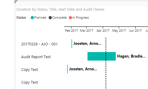
But I am facing a small difficulty to color the bars in Gantt custom visuals.
As you can see that on the top there are 3 status:
1. Completed
2. In Progress
3. Planned
All three have different color coding. What I want is that if the Status="Completed"the I want to color them by "Green"color else all other status will be "a Different color(can be any random color".
Please help me in this formatting.
Regards
Shubham Sharma
- Mark as New
- Bookmark
- Subscribe
- Mute
- Subscribe to RSS Feed
- Permalink
- Report Inappropriate Content
Hi @Anonymous,
I made a sample of a file and have one column with the status when I add it to the the Gant in the legend, however what I think you want is to be able to choose the colours right?
In this visual this is not possible problaby you can contact the author at pbicvsupport@microsoft.com and aks for that option.
Regards,
Mfelix
Regards
Miguel Félix
Did I answer your question? Mark my post as a solution!
Proud to be a Super User!
Check out my blog: Power BI em Português- Mark as New
- Bookmark
- Subscribe
- Mute
- Subscribe to RSS Feed
- Permalink
- Report Inappropriate Content
Hi
I am trying to do this also and struggling to find a way to select different colours based on the status of the project.
Any help appreciated.
Graham
- Mark as New
- Bookmark
- Subscribe
- Mute
- Subscribe to RSS Feed
- Permalink
- Report Inappropriate Content
If you get stuck with a visual don't forget you can get lots of flexibility from R visuals.
https://www.r-bloggers.com/gantt-charts-in-r-using-plotly/
https://davetang.org/muse/2017/02/03/gantt-chart-using-r/
https://rstudio-pubs-static.s3.amazonaws.com/106401_8efca65e9be14404b27e4779d393fb4f.html
Helpful resources

Power BI Monthly Update - April 2026
Check out the April 2026 Power BI update to learn about new features.

New to Fabric Survey
If you have recently started exploring Fabric, we'd love to hear how it's going. Your feedback can help with product improvements.

Power BI DataViz World Championships - June 2026
A new Power BI DataViz World Championship is coming this June! Don't miss out on submitting your entry.

| User | Count |
|---|---|
| 42 | |
| 37 | |
| 35 | |
| 22 | |
| 15 |
| User | Count |
|---|---|
| 67 | |
| 58 | |
| 29 | |
| 27 | |
| 25 |

