FabCon is coming to Atlanta
Join us at FabCon Atlanta from March 16 - 20, 2026, for the ultimate Fabric, Power BI, AI and SQL community-led event. Save $200 with code FABCOMM.
Register now!- Power BI forums
- Get Help with Power BI
- Desktop
- Service
- Report Server
- Power Query
- Mobile Apps
- Developer
- DAX Commands and Tips
- Custom Visuals Development Discussion
- Health and Life Sciences
- Power BI Spanish forums
- Translated Spanish Desktop
- Training and Consulting
- Instructor Led Training
- Dashboard in a Day for Women, by Women
- Galleries
- Data Stories Gallery
- Themes Gallery
- Contests Gallery
- QuickViz Gallery
- Quick Measures Gallery
- Visual Calculations Gallery
- Notebook Gallery
- Translytical Task Flow Gallery
- TMDL Gallery
- R Script Showcase
- Webinars and Video Gallery
- Ideas
- Custom Visuals Ideas (read-only)
- Issues
- Issues
- Events
- Upcoming Events
The Power BI Data Visualization World Championships is back! Get ahead of the game and start preparing now! Learn more
- Power BI forums
- Forums
- Get Help with Power BI
- Desktop
- Re: Funnel Chart Can't Display Percent When There ...
- Subscribe to RSS Feed
- Mark Topic as New
- Mark Topic as Read
- Float this Topic for Current User
- Bookmark
- Subscribe
- Printer Friendly Page
- Mark as New
- Bookmark
- Subscribe
- Mute
- Subscribe to RSS Feed
- Permalink
- Report Inappropriate Content
Funnel Chart Can't Display Percent When There is a Calculation Group in the Data Set
Hi All,
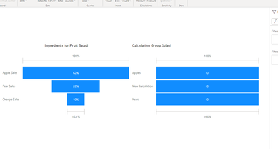
I have a report with a funnel chart visual, but when I create a caculation group in the data set the funnel cannot display values as percent.
The data is structured in a table with three different measures that will be displayed in a standard funnel chart. Each values is a calculated decimal values representing a percentage.
Apples | Pears | Oranges |
0,62 | 0,28 | 0,10 |
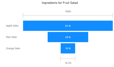
The funnel looks something like this:
This works perfectly fine as long as there are no calculation groups in the data set – the values are displayed properly as a percentage value. Even with Discourage Implicit Measures enabled. However when I add a calculation group into the mix, the values are displayed as regular decimal values. The calculated values are formatted as percentage.
I can create a calculation group to achieve this, but creating a separate group (and thus a table) for each funnel visual isn’t really an option.
Does anyone know of a solution to this issue? It looks like a bug, but I'm hoping there is some kind of work around for it.
Examples:
Sample dataset without a calculation group
Sample data with a caculation group
Cross post to the issues channel as it seems like a bug in the visual: Cross post to issues
Kind regards,
/Sune
- Mark as New
- Bookmark
- Subscribe
- Mute
- Subscribe to RSS Feed
- Permalink
- Report Inappropriate Content
Hi @fibaek ,
It's amazing,how to get the table"Fruit salad"?
I create this table in Sample dataset without a calculation group ,Just enter data
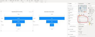
Then I get the below:
And base on Sample data with a caculation group , I create a new table:
Measure = IF(MAX('type'[type])="Apple",SUM(Sales[Apple]),IF(MAX('type'[type])="Pear",SUM(Sales[Pear]),SUM(Sales[Orange])))
Final get:
You could download pbix if you need.Wish it is helpful for you!
Best Regards
Lucien
- Mark as New
- Bookmark
- Subscribe
- Mute
- Subscribe to RSS Feed
- Permalink
- Report Inappropriate Content
Hello @v-luwang-msft
The 'fruit salad' table is the calculation group in the data set.
If I understand your example correctly you create a new table for the funnel visual. Consequently I would have to make five individually maintained tables in the data set if I need five funnelcharts in my report.
I don't understand how adding a cacluation group to the data set - even one that is not related to the data in question - can break the formatting of another visual. The visual works fine, except for the format.
/Sune
Helpful resources

Power BI Dataviz World Championships
The Power BI Data Visualization World Championships is back! Get ahead of the game and start preparing now!

| User | Count |
|---|---|
| 40 | |
| 38 | |
| 36 | |
| 29 | |
| 28 |
| User | Count |
|---|---|
| 127 | |
| 88 | |
| 78 | |
| 66 | |
| 65 |


