cancel
Showing results for 
Search instead for 
Did you mean: 

Get Fabric Certified for FREE during Fabric Data Days. Don't miss your chance! Request now

Reply
davidburch
Regular Visitor

Formatting data for Radar Charts

Hi there,


I’m trying to build a radar chart, and recreate what I’ve created in Excel within a Power BI dashboard – showing two quarters worth of scores for various different skills, with having the option to drill down to individual locations


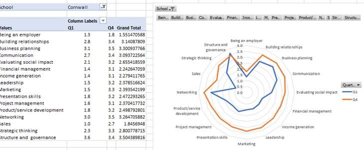
I summarised the data in a table:

But when I created a radar chart, the radar ‘columns’ were Q1 and Q4, whereas I wanted these as radar ‘points’, with the ‘column headings’ being the skills


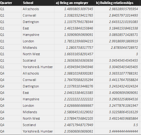
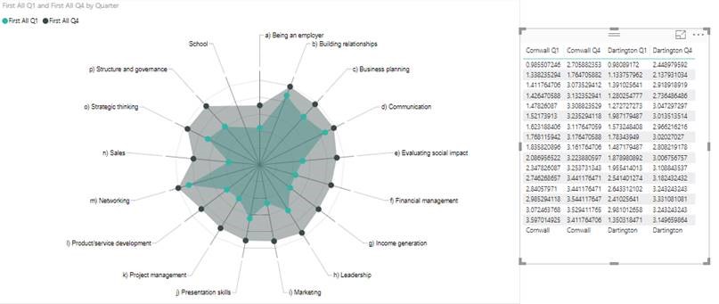
So I re-formatted the data with the skills as rows and then the date (Q1/Q4 together with the location) as columns.

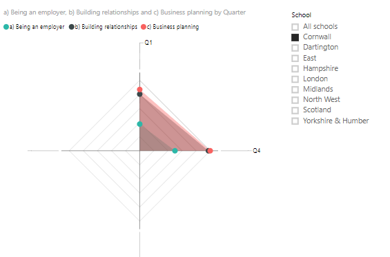
This produces the right graph, however I want to be able to easily flick between locations (so you can just see the Q1 and Q4 figure for one location at a time).

I’ve attempted to add a ‘slicer’ box (as I did for the data with the original formatting) but I can’t see a way to filter between locations, as the locations are now part of the column headers? it now just produces a table of figures:

Any help in producing this slicer box together (to flick between different locations data) with the graph showing two quarters data as above would be much appreciated!


Thanks

1 ACCEPTED SOLUTION
v-yulgu-msft
Microsoft Employee
Microsoft Employee

Hi @davidburch,


Open Query Editor mode, select all 'skills' fileds, then click "unpivote columns" button. Remember to rename new columns.

1.PNG


Then, choose [Quarter] field, click 'Pivot Column' button.

2.PNG


With above changes, you will get a new table structure as shown in below image.

3.PNG


Create radar chart like below.

4.PNG


Best regards,

Yuliana Gu

Community Support Team _ Yuliana Gu
If this post helps, then please consider Accept it as the solution to help the other members find it more quickly.

View solution in original post

2 REPLIES 2
v-yulgu-msft
Microsoft Employee
Microsoft Employee

Hi @davidburch,


Open Query Editor mode, select all 'skills' fileds, then click "unpivote columns" button. Remember to rename new columns.

1.PNG


Then, choose [Quarter] field, click 'Pivot Column' button.

2.PNG


With above changes, you will get a new table structure as shown in below image.

3.PNG


Create radar chart like below.

4.PNG


Best regards,

Yuliana Gu

Community Support Team _ Yuliana Gu
If this post helps, then please consider Accept it as the solution to help the other members find it more quickly.

Thanks so much!!!! 😃

Helpful resources

Announcements
November Power BI Update Carousel

Power BI Monthly Update - November 2025

Check out the November 2025 Power BI update to learn about new features.

Fabric Data Days Carousel

Fabric Data Days

Advance your Data & AI career with 50 days of live learning, contests, hands-on challenges, study groups & certifications and more!

FabCon Atlanta 2026 carousel

FabCon Atlanta 2026

Join us at FabCon Atlanta, March 16-20, for the ultimate Fabric, Power BI, AI and SQL community-led event. Save $200 with code FABCOMM.

Top Solution Authors
Top Kudoed Authors