- Power BI forums
- Get Help with Power BI
- Desktop
- Service
- Report Server
- Power Query
- Mobile Apps
- Developer
- DAX Commands and Tips
- Custom Visuals Development Discussion
- Health and Life Sciences
- Power BI Spanish forums
- Translated Spanish Desktop
- Training and Consulting
- Instructor Led Training
- Dashboard in a Day for Women, by Women
- Galleries
- Data Stories Gallery
- Themes Gallery
- Contests Gallery
- QuickViz Gallery
- Quick Measures Gallery
- Visual Calculations Gallery
- Notebook Gallery
- Translytical Task Flow Gallery
- TMDL Gallery
- R Script Showcase
- Webinars and Video Gallery
- Ideas
- Custom Visuals Ideas (read-only)
- Issues
- Issues
- Events
- Upcoming Events
We've captured the moments from FabCon & SQLCon that everyone is talking about, and we are bringing them to the community, live and on-demand. Starts on April 14th. Register now
- Power BI forums
- Forums
- Get Help with Power BI
- Desktop
- Re: Formatiting matrix
- Subscribe to RSS Feed
- Mark Topic as New
- Mark Topic as Read
- Float this Topic for Current User
- Bookmark
- Subscribe
- Printer Friendly Page
- Mark as New
- Bookmark
- Subscribe
- Mute
- Subscribe to RSS Feed
- Permalink
- Report Inappropriate Content
Formatiting matrix
Hello,
I have table of data as below :
| Center | Machine | install | checked | Filter | AccountLock | AccountUnlock | passwordcontrol | passwordReuse | authorized | Service | Log | timeout |
| apttsv1 | sxmus1 | OK | OK | OK | OK | OK | KO | OK | OK | OK | OK | OK |
| apttsv1 | sxmus2 | OK | OK | OK | OK | OK | KO | OK | OK | OK | KO | OK |
| apttsv1 | sxmus3 | OK | OK | OK | OK | OK | KO | OK | OK | OK | KO | OK |
| apttsv1 | sxmus4 | OK | OK | OK | OK | OK | KO | OK | OK | OK | KO | OK |
| apttsv1 | sxmus5 | OK | OK | OK | OK | OK | KO | OK | OK | OK | KO | OK |
| apttsv1 | sxmus6 | OK | OK | OK | OK | OK | KO | OK | OK | OK | KO | OK |
| apttsv1 | sxmus7 | OK | OK | OK | OK | OK | KO | OK | OK | OK | KO | OK |
| apttsv1 | sxmus8 | OK | OK | OK | OK | OK | KO | OK | OK | OK | KO | OK |
| apttsv2 | sxmus9 | OK | OK | OK | OK | OK | KO | OK | OK | OK | KO | OK |
| apttsv2 | sxmus10 | OK | OK | OK | OK | OK | KO | OK | OK | OK | KO | OK |
| apttsv2 | sxmus11 | OK | OK | OK | OK | OK | KO | OK | OK | OK | KO | OK |
I would like to formatting the matrix below :
I am trying to format the cell:
- OK : Green
- KO : Red
- Machine : Green if all OK
- Machine : Red if there is a KO
-Center : Green if all Machine Green (All OK)
- Center: Red if any Machine Red (If any KO)
Could you please advise ?
Thank you in advance.
Tg
Solved! Go to Solution.
- Mark as New
- Bookmark
- Subscribe
- Mute
- Subscribe to RSS Feed
- Permalink
- Report Inappropriate Content
Further to this @Anonymous
I do have a potential work-around.
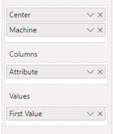
First, structure the data by unpivoting it in Power Pivot and adding a column that is "1" for KO and "0" for OK:
This will then make it much easier to create a Matrix using those values!
Then, create a measure that summarises "hasKO" by making a sum of the values. We now know that if the sum = 0 there are no KO's and anything else means that there is at least one.
anyKO = sum(Sheet1[hasKO])

This will also colour the value totals. Using the value totals as a comparison will give you an indication of the machine and server situations:


HTH
Pi
- Mark as New
- Bookmark
- Subscribe
- Mute
- Subscribe to RSS Feed
- Permalink
- Report Inappropriate Content
Further to this @Anonymous
I do have a potential work-around.
First, structure the data by unpivoting it in Power Pivot and adding a column that is "1" for KO and "0" for OK:
This will then make it much easier to create a Matrix using those values!
Then, create a measure that summarises "hasKO" by making a sum of the values. We now know that if the sum = 0 there are no KO's and anything else means that there is at least one.
anyKO = sum(Sheet1[hasKO])

This will also colour the value totals. Using the value totals as a comparison will give you an indication of the machine and server situations:


HTH
Pi
- Mark as New
- Bookmark
- Subscribe
- Mute
- Subscribe to RSS Feed
- Permalink
- Report Inappropriate Content
Thank you for your suggestion.
- Mark as New
- Bookmark
- Subscribe
- Mute
- Subscribe to RSS Feed
- Permalink
- Report Inappropriate Content
Hi Tg!
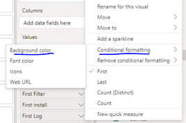
Formatting Cell values is simple, you can format them conditionally using a column value. Here I have created a column that corresponds to "Log" and returns a colour:


When applied, this will now color your "Log" field appropriately

To apply this to the whole visual you will need to create one for each column in the Matrix
For the Centre and Machine values, I haven't been able to find a way to colour these conditionally, yet. There is currently an idea being upvoted if you would like to partake:
https://ideas.powerbi.com/ideas/idea/?ideaid=28bbb6fd-11d5-4713-aa23-030ad77d5d4f
Regards,
Pi
Helpful resources

New to Fabric Survey
If you have recently started exploring Fabric, we'd love to hear how it's going. Your feedback can help with product improvements.

Power BI DataViz World Championships - June 2026
A new Power BI DataViz World Championship is coming this June! Don't miss out on submitting your entry.

| User | Count |
|---|---|
| 57 | |
| 40 | |
| 36 | |
| 18 | |
| 18 |
| User | Count |
|---|---|
| 70 | |
| 67 | |
| 38 | |
| 34 | |
| 23 |


