Join us at the 2025 Microsoft Fabric Community Conference
Microsoft Fabric Community Conference 2025, March 31 - April 2, Las Vegas, Nevada. Use code FABINSIDER for a $400 discount.
Register now- Power BI forums
- Get Help with Power BI
- Desktop
- Service
- Report Server
- Power Query
- Mobile Apps
- Developer
- DAX Commands and Tips
- Custom Visuals Development Discussion
- Health and Life Sciences
- Power BI Spanish forums
- Translated Spanish Desktop
- Training and Consulting
- Instructor Led Training
- Dashboard in a Day for Women, by Women
- Galleries
- Webinars and Video Gallery
- Data Stories Gallery
- Themes Gallery
- Power BI DataViz World Championships Gallery
- Quick Measures Gallery
- R Script Showcase
- COVID-19 Data Stories Gallery
- Community Connections & How-To Videos
- 2021 MSBizAppsSummit Gallery
- 2020 MSBizAppsSummit Gallery
- 2019 MSBizAppsSummit Gallery
- Events
- Ideas
- Custom Visuals Ideas
- Issues
- Issues
- Events
- Upcoming Events
The Power BI DataViz World Championships are on! With four chances to enter, you could win a spot in the LIVE Grand Finale in Las Vegas. Show off your skills.
- Power BI forums
- Forums
- Get Help with Power BI
- Desktop
- Format bar chart colours
- Subscribe to RSS Feed
- Mark Topic as New
- Mark Topic as Read
- Float this Topic for Current User
- Bookmark
- Subscribe
- Printer Friendly Page
- Mark as New
- Bookmark
- Subscribe
- Mute
- Subscribe to RSS Feed
- Permalink
- Report Inappropriate Content
Format bar chart colours
Hi
I have a bar chart that needs to show colour changes depending on whether the values have increased or decreased from the previous Month.
For example -
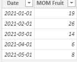
I have a calculated field called MOM Fruit
Jan = 19
Feb = 26
Mar = 14
Apr = 6
May = 8
So, I need Feb to be Red, Mar Green, Apr Green and May Red
Any help would be great
Solved! Go to Solution.
- Mark as New
- Bookmark
- Subscribe
- Mute
- Subscribe to RSS Feed
- Permalink
- Report Inappropriate Content
Hi @kevbrown1980 ,
I created some data:
Here are the steps you can follow:
1. Create measure.
Color =
var _current=CALCULATE(SUM('Table'[MOM Fruit]),FILTER(ALL('Table'),MONTH('Table'[Date])=MONTH(MAX('Table'[Date]))))
var _last=CALCULATE(SUM('Table'[MOM Fruit]),FILTER(ALL('Table'),MONTH('Table'[Date])=MONTH(MAX('Table'[Date])-1)))
var _if=
IF(
    _last=BLANK(),_current,_last)
var _su=
_current - _if
return
SWITCH(
    TRUE(),
    _su=0,"blue",
    _su>0,"red",
    _su<0,"green")
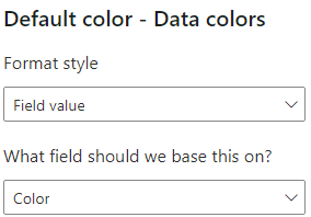
2. Click Visual - Format - Data colors -- fx
3. Enter the Default color interface.
Format style – Field value
What field should we base this on – [color]
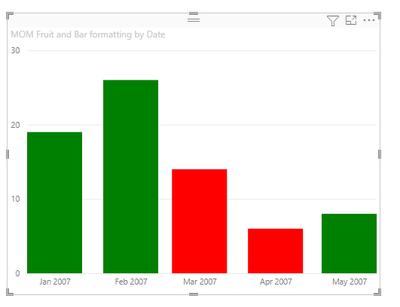
4. Result:
Best Regards,
Liu Yang
If this post helps, then please consider Accept it as the solution to help the other members find it more quickly
- Mark as New
- Bookmark
- Subscribe
- Mute
- Subscribe to RSS Feed
- Permalink
- Report Inappropriate Content
Hello @kevbrown1980.
Assuming you have a date table, you could create a measure using this pattern:
Bar formatting =
VAR PriorMonthMOMFruit =
    CALCULATE ( SUM ( 'Table'[MOM Fruit] ), DATEADD ( 'Date'[Date], -1, MONTH ) )
VAR CurrentMonthMOMFruit =
    CALCULATE ( SUM ( 'Table'[MOM Fruit] ) )
VAR Result =
    IF ( ( CurrentMonthMOMFruit - PriorMonthMOMFruit ) > 0, "Green", "Red" )
RETURN
    Result
Note that you can replace "Green" and "Red" with hex values if you want to fine-tune the shade of the colour.
Then, select your bar chart, and in the visualization pane, under Data colors, click the "fx" button:
On the next screen, under the "Format style" drop-down at the top, choose "Field value".
Then, under "What field should we base this on", choose the measure you created above.
Your results should look something like this:
I created a .pbix file here that you can download if it is helpful.
-Steve
- Mark as New
- Bookmark
- Subscribe
- Mute
- Subscribe to RSS Feed
- Permalink
- Report Inappropriate Content
@kevbrown1980 , create a measure like this example and use it conditional formatting using field value option
Colour =
SWITCH(TRUE(),
max('Table'[Month]) = "Feb", "red",
max('Table'[Month]) = "Mar", "Green",
max('Table'[Month]) = "Apr", "Green",
max('Table'[Month]) = "May", "Red",
//keep on adding
"green")
How to do conditional formatting by measure and apply it on pie?: https://youtu.be/RqBb5eBf_I4
Helpful resources

Join us at the Microsoft Fabric Community Conference
March 31 - April 2, 2025, in Las Vegas, Nevada. Use code MSCUST for a $150 discount!

Power BI Monthly Update - February 2025
Check out the February 2025 Power BI update to learn about new features.

Join our Community Sticker Challenge 2025
If you love stickers, then you will definitely want to check out our Community Sticker Challenge!

| User | Count |
|---|---|
| 84 | |
| 69 | |
| 68 | |
| 39 | |
| 37 |


