- Power BI forums
- Updates
- News & Announcements
- Get Help with Power BI
- Desktop
- Service
- Report Server
- Power Query
- Mobile Apps
- Developer
- DAX Commands and Tips
- Custom Visuals Development Discussion
- Health and Life Sciences
- Power BI Spanish forums
- Translated Spanish Desktop
- Power Platform Integration - Better Together!
- Power Platform Integrations (Read-only)
- Power Platform and Dynamics 365 Integrations (Read-only)
- Training and Consulting
- Instructor Led Training
- Dashboard in a Day for Women, by Women
- Galleries
- Community Connections & How-To Videos
- COVID-19 Data Stories Gallery
- Themes Gallery
- Data Stories Gallery
- R Script Showcase
- Webinars and Video Gallery
- Quick Measures Gallery
- 2021 MSBizAppsSummit Gallery
- 2020 MSBizAppsSummit Gallery
- 2019 MSBizAppsSummit Gallery
- Events
- Ideas
- Custom Visuals Ideas
- Issues
- Issues
- Events
- Upcoming Events
- Community Blog
- Power BI Community Blog
- Custom Visuals Community Blog
- Community Support
- Community Accounts & Registration
- Using the Community
- Community Feedback
Earn a 50% discount on the DP-600 certification exam by completing the Fabric 30 Days to Learn It challenge.
- Power BI forums
- Forums
- Get Help with Power BI
- Desktop
- Fit to width Line chart
- Subscribe to RSS Feed
- Mark Topic as New
- Mark Topic as Read
- Float this Topic for Current User
- Bookmark
- Subscribe
- Printer Friendly Page
- Mark as New
- Bookmark
- Subscribe
- Mute
- Subscribe to RSS Feed
- Permalink
- Report Inappropriate Content
Fit to width Line chart
Hi there, I have a 3 room temperature datas and 1 outdoor temperature data, each recorded for every minute for 7 days. Totally 10080 rows of data. I have created a line chart to compare the room temperatures with outdoor temperature. As this has huge data, i need to scroll to see the rest of the graph. Is there a way to fit all these data into a single page to compare the temperatures without scrolling?
Thanks in advance.
Solved! Go to Solution.
- Mark as New
- Bookmark
- Subscribe
- Mute
- Subscribe to RSS Feed
- Permalink
- Report Inappropriate Content
Hi, @Anonymous
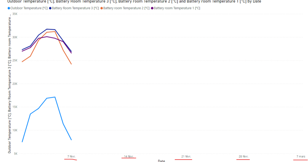
According to your sample picture, it seems like the time period between the Start and End you set is over 7 days.
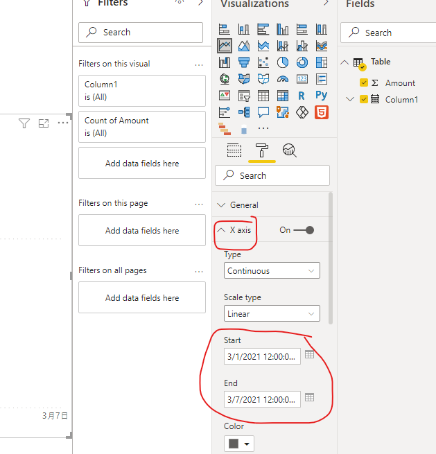
You can try to go to the X-axis setting to set the Start as “2021-01-02” and the End as “2021-01-08”.
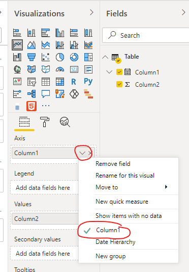
To avoid the aggregation value in your line chart, you can try to set the Date column in your line chart like this:
If you still have a problem, you can post your sample pbix file (without sensitive data) so that we can help you in advance.
How to Get Your Question Answered Quickly
Best Regards,
Community Support Team _Robert Qin
If this post helps, then please consider Accept it as the solution to help the other members find it more quickly.
- Mark as New
- Bookmark
- Subscribe
- Mute
- Subscribe to RSS Feed
- Permalink
- Report Inappropriate Content
Hi, @Anonymous
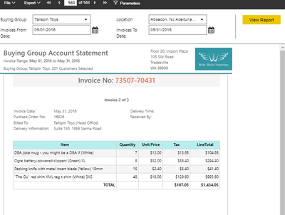
According to your description, you said you have 10080 rows of data and you want to make them displayed on one single page, I think paginated reports in Power BI can perfectly meet your requirement, you can follow these documents:
https://docs.microsoft.com/en-us/power-bi/paginated-reports/paginated-reports-faq
If you still have a problem, you can reply to me.
How to Get Your Question Answered Quickly
Thank you very much!
Best Regards,
Community Support Team _Robert Qin
If this post helps, then please consider Accept it as the solution to help the other members find it more quickly.
- Mark as New
- Bookmark
- Subscribe
- Mute
- Subscribe to RSS Feed
- Permalink
- Report Inappropriate Content
Hi @v-robertq-msft ,
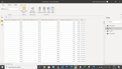
Thanks for your reply. I don't want paginated reports as tables. I need a line chart with date and time in X axis and temperature readings in Y axis. Here is the data. The temperature is recorded for every minute for 7 days.
I have created time tables and date tables to create a link. I need a chart like this.
When I try to make line chart, I'm getting data for every minute of all 7 days. Instead, I need it for 24 hours of each day.
Is it possible to create a line chart showing all 7 day values with date and time?
How can I solve this?
Thanks in advance.
- Mark as New
- Bookmark
- Subscribe
- Mute
- Subscribe to RSS Feed
- Permalink
- Report Inappropriate Content
Hi, @Anonymous
According to your description and sample picture, I can understand your requirement clearly. I think you can go to the “Format” setting of this line chart->X-Axis->set the Start and End date of this chart to go across all the 7 days, like this:
And you can get what you want.
More info about line chart in Power BI
Best Regards,
Community Support Team _Robert Qin
If this post helps, then please consider Accept it as the solution to help the other members find it more quickly.
- Mark as New
- Bookmark
- Subscribe
- Mute
- Subscribe to RSS Feed
- Permalink
- Report Inappropriate Content
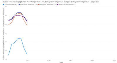
Thanks. I've tried this. I ended up with the below graph which is giving me the aggregated values.
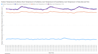
But, all I need is the exact temperature values. If I drill down to next level in the hierachy, I am getting the graph with date, time and exact values without aggregation which is what I need.
But, since I have data recorded for every 1 minute for 7 days, I am getting only 1 hour of data in the report view of the chart and I need to scroll to see the rest. Is there a way to see all the datas in a single page without scrolling to check for maximum and minimum values for all 7 days?
Thanks in advance.
- Mark as New
- Bookmark
- Subscribe
- Mute
- Subscribe to RSS Feed
- Permalink
- Report Inappropriate Content
Hi, @Anonymous
According to your sample picture, it seems like the time period between the Start and End you set is over 7 days.
You can try to go to the X-axis setting to set the Start as “2021-01-02” and the End as “2021-01-08”.
To avoid the aggregation value in your line chart, you can try to set the Date column in your line chart like this:
If you still have a problem, you can post your sample pbix file (without sensitive data) so that we can help you in advance.
How to Get Your Question Answered Quickly
Best Regards,
Community Support Team _Robert Qin
If this post helps, then please consider Accept it as the solution to help the other members find it more quickly.
Helpful resources
| User | Count |
|---|---|
| 96 | |
| 85 | |
| 77 | |
| 66 | |
| 63 |
| User | Count |
|---|---|
| 110 | |
| 96 | |
| 96 | |
| 67 | |
| 59 |
