Get Fabric certified for FREE!
Don't miss your chance to take the Fabric Data Engineer (DP-600) exam for FREE! Find out how by attending the DP-600 session on April 23rd (pacific time), live or on-demand.
Learn more- Power BI forums
- Get Help with Power BI
- Desktop
- Service
- Report Server
- Power Query
- Mobile Apps
- Developer
- DAX Commands and Tips
- Custom Visuals Development Discussion
- Health and Life Sciences
- Power BI Spanish forums
- Translated Spanish Desktop
- Training and Consulting
- Instructor Led Training
- Dashboard in a Day for Women, by Women
- Galleries
- Data Stories Gallery
- Themes Gallery
- Contests Gallery
- QuickViz Gallery
- Quick Measures Gallery
- Visual Calculations Gallery
- Notebook Gallery
- Translytical Task Flow Gallery
- TMDL Gallery
- R Script Showcase
- Webinars and Video Gallery
- Ideas
- Custom Visuals Ideas (read-only)
- Issues
- Issues
- Events
- Upcoming Events
Next up in the FabCon + SQLCon recap series: The roadmap for Microsoft SQL and Maximizing Developer experiences in Fabric. All sessions are available on-demand after the live show. Register now
- Power BI forums
- Forums
- Get Help with Power BI
- Desktop
- Re: Filters with visualization
- Subscribe to RSS Feed
- Mark Topic as New
- Mark Topic as Read
- Float this Topic for Current User
- Bookmark
- Subscribe
- Printer Friendly Page
- Mark as New
- Bookmark
- Subscribe
- Mute
- Subscribe to RSS Feed
- Permalink
- Report Inappropriate Content
Filters with visualization
Hi guys,
I'm working on a dashborad and while using it I realized something I'm not sure how to fix.
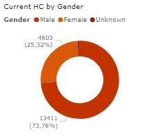
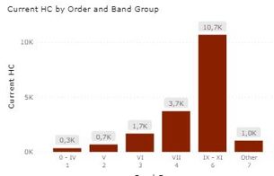
So, I have 2 graphics: The firstone is a donut chart which divides the population by gender and shows me the amount on each one and the porcentage, and the second one, which is a column chart, shows the amount by group.
This two charts are connected to basically the same data base and are on the same dashboard.
The problem, or what I want to try to change is, for example, when I select female option directly on the first chart the second one changes accordingly and shows me the amount of females on each one of the groups, which its ok, but when I try it the other way around (to select any group on the second chart), the fisrt one shows me the % on each gender from the total original value, not the amount on the group selected.
If I select the group 0-IV which has 0,3k population I want to see in the donunt chart the porcentage of each gender out of those 0,3k, not the total amount.
Any idea on how could I do this? Is it even possible?
Thanks in advance for any help you can give me.
Solved! Go to Solution.
- Mark as New
- Bookmark
- Subscribe
- Mute
- Subscribe to RSS Feed
- Permalink
- Report Inappropriate Content
Hi @yfquirogah,
this is certainly possible. I think you should have a look at the visual interactions of your visuals and set them to the right properties.
There are 3 options between visuals, if the selected visualization should:
- cross-filter one of the other visualizations on the page, select the filter icon in the upper right corner of that visualization
- cross-highlight one of the other visualizations on the page, select the highlight icon
- have no impact on one of the other visualizations on the page, select the no impact icon
Helpful resources

New to Fabric Survey
If you have recently started exploring Fabric, we'd love to hear how it's going. Your feedback can help with product improvements.

Power BI DataViz World Championships - June 2026
A new Power BI DataViz World Championship is coming this June! Don't miss out on submitting your entry.

Join our Fabric User Panel
Share feedback directly with Fabric product managers, participate in targeted research studies and influence the Fabric roadmap.

| User | Count |
|---|---|
| 48 | |
| 43 | |
| 39 | |
| 19 | |
| 17 |
| User | Count |
|---|---|
| 67 | |
| 63 | |
| 30 | |
| 30 | |
| 23 |


