- Power BI forums
- Get Help with Power BI
- Desktop
- Service
- Report Server
- Power Query
- Mobile Apps
- Developer
- DAX Commands and Tips
- Custom Visuals Development Discussion
- Health and Life Sciences
- Power BI Spanish forums
- Translated Spanish Desktop
- Training and Consulting
- Instructor Led Training
- Dashboard in a Day for Women, by Women
- Galleries
- Data Stories Gallery
- Themes Gallery
- Contests Gallery
- QuickViz Gallery
- Quick Measures Gallery
- Visual Calculations Gallery
- Notebook Gallery
- Translytical Task Flow Gallery
- TMDL Gallery
- R Script Showcase
- Webinars and Video Gallery
- Ideas
- Custom Visuals Ideas (read-only)
- Issues
- Issues
- Events
- Upcoming Events
Join the FabCon + SQLCon recap series. Up next: Power BI, Real-Time Intelligence, IQ and AI, and Data Factory take center stage. All sessions are available on-demand after the live show. Register now
- Power BI forums
- Forums
- Get Help with Power BI
- Desktop
- Filter with slicer the data for a Python HeatMap S...
- Subscribe to RSS Feed
- Mark Topic as New
- Mark Topic as Read
- Float this Topic for Current User
- Bookmark
- Subscribe
- Printer Friendly Page
- Mark as New
- Bookmark
- Subscribe
- Mute
- Subscribe to RSS Feed
- Permalink
- Report Inappropriate Content
Filter with slicer the data for a Python HeatMap Script Visual in power BI using Python
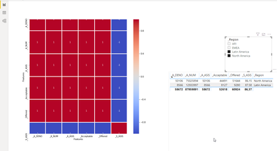
This is a basic python headmap script visual in Power BI.
I am looking to apply a filter to this python script code bellow.
How can be this be filter by slicer(dimension) in this correlation Heatmap code? Below is the code I have written.
------
# The following code to create a dataframe and remove duplicated rows is always executed and acts as a preamble for your script:

# dataset = pandas.DataFrame(A_DENO, A_NUM, _Acceptable,_S_ASIS,_A_ASIS, _Offered,_Region)
# dataset = dataset.drop_duplicates()

# Paste or type your script code here:
import pandas as pd # for data analysis
import matplotlib.pyplot as plt
import seaborn as sns
# Compute the correlation matrix

#filter by Region
# HERE NEED TO MAKE DATASET3.['REGION']
###dataset2= dataset.loc[dataset.Region =='North America' ]
corr = dataset2.corr()
##plt.figure(figsize=(17,17))
sns.heatmap(corr,cmap='coolwarm', annot = True, fmt='.5g',linewidth =1.9)
#plt.title("Correlation HeatMap", fontsize = 16)
plt.xlabel("Features", fontsize = 10)
plt.ylabel("Features", fontsize = 10)
plt.show()
------
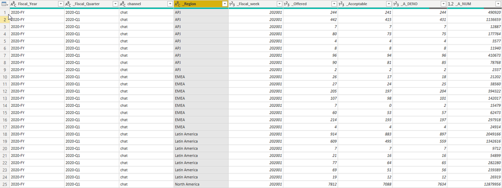
The dataset contains several columns.
But I took the picture for those I am interest to work in this python script.
_S_ASIS=
DIVIDE(    SUM('Cad_KPI'[_Acceptable]),    SUM('Cad_KPI'[_Offered]))*100
_A_ASIS
=DIVIDE(DIVIDE(    SUM('Cad_KPI'[_A_NUM]),    SUM('Cad_KPI'[_A_DENO])), 60)
Sample data in this image.
Solved! Go to Solution.
- Mark as New
- Bookmark
- Subscribe
- Mute
- Subscribe to RSS Feed
- Permalink
- Report Inappropriate Content
Hi @perezco,
I think your heat map needs at least two lines of data.
Please mark my post as solution, this will also help others.
Please give Kudos for support.
Marcus Wegener works as Full Stack Power BI Engineer at BI or DIE.
His mission is clear: "Get the most out of data, with Power BI."
twitter - LinkedIn - YouTube - website - podcast - Power BI Tutorials
- Mark as New
- Bookmark
- Subscribe
- Mute
- Subscribe to RSS Feed
- Permalink
- Report Inappropriate Content
Hi @perezco ,
Power BI replots the Python visual, whenever a data change occurs. (filtering)
The Python visual always only receives the filtered data.
https://docs.microsoft.com/en-us/power-bi/desktop-python-visuals
Regards,
Marcus
Dortmund - Germany
If I answered your question, please mark my post as solution, this will also help others.
Please give Kudos for support.
Please mark my post as solution, this will also help others.
Please give Kudos for support.
Marcus Wegener works as Full Stack Power BI Engineer at BI or DIE.
His mission is clear: "Get the most out of data, with Power BI."
twitter - LinkedIn - YouTube - website - podcast - Power BI Tutorials
- Mark as New
- Bookmark
- Subscribe
- Mute
- Subscribe to RSS Feed
- Permalink
- Report Inappropriate Content
right, @mwegener .... yes I can used the filters section for the Vizulation from the left but I need is to use slicer filter.
example for Bar chart code:

- Mark as New
- Bookmark
- Subscribe
- Mute
- Subscribe to RSS Feed
- Permalink
- Report Inappropriate Content
Hi @perezco ,
could you share your sample pbix?
Please mark my post as solution, this will also help others.
Please give Kudos for support.
Marcus Wegener works as Full Stack Power BI Engineer at BI or DIE.
His mission is clear: "Get the most out of data, with Power BI."
twitter - LinkedIn - YouTube - website - podcast - Power BI Tutorials
- Mark as New
- Bookmark
- Subscribe
- Mute
- Subscribe to RSS Feed
- Permalink
- Report Inappropriate Content
- Mark as New
- Bookmark
- Subscribe
- Mute
- Subscribe to RSS Feed
- Permalink
- Report Inappropriate Content
Hi @perezco,
I think your heat map needs at least two lines of data.
Please mark my post as solution, this will also help others.
Please give Kudos for support.
Marcus Wegener works as Full Stack Power BI Engineer at BI or DIE.
His mission is clear: "Get the most out of data, with Power BI."
twitter - LinkedIn - YouTube - website - podcast - Power BI Tutorials
- Mark as New
- Bookmark
- Subscribe
- Mute
- Subscribe to RSS Feed
- Permalink
- Report Inappropriate Content
yes, I am aware this demo file brings few records.. But I see that work fine with the filters slicers.
thanks
- Mark as New
- Bookmark
- Subscribe
- Mute
- Subscribe to RSS Feed
- Permalink
- Report Inappropriate Content
Hi @perezco ,
If I answered your question, please mark my post as solution, this will also help others.
Please give Kudos for support.
Please mark my post as solution, this will also help others.
Please give Kudos for support.
Marcus Wegener works as Full Stack Power BI Engineer at BI or DIE.
His mission is clear: "Get the most out of data, with Power BI."
twitter - LinkedIn - YouTube - website - podcast - Power BI Tutorials
Helpful resources

Power BI Monthly Update - April 2026
Check out the April 2026 Power BI update to learn about new features.

New to Fabric Survey
If you have recently started exploring Fabric, we'd love to hear how it's going. Your feedback can help with product improvements.

Power BI DataViz World Championships - June 2026
A new Power BI DataViz World Championship is coming this June! Don't miss out on submitting your entry.

| User | Count |
|---|---|
| 39 | |
| 37 | |
| 31 | |
| 22 | |
| 14 |
| User | Count |
|---|---|
| 67 | |
| 58 | |
| 30 | |
| 27 | |
| 25 |


