Fabric Data Days starts November 4th!
Advance your Data & AI career with 50 days of live learning, dataviz contests, hands-on challenges, study groups & certifications and more!
Get registered- Power BI forums
- Get Help with Power BI
- Desktop
- Service
- Report Server
- Power Query
- Mobile Apps
- Developer
- DAX Commands and Tips
- Custom Visuals Development Discussion
- Health and Life Sciences
- Power BI Spanish forums
- Translated Spanish Desktop
- Training and Consulting
- Instructor Led Training
- Dashboard in a Day for Women, by Women
- Galleries
- Data Stories Gallery
- Themes Gallery
- Contests Gallery
- QuickViz Gallery
- Quick Measures Gallery
- Visual Calculations Gallery
- Notebook Gallery
- Translytical Task Flow Gallery
- TMDL Gallery
- R Script Showcase
- Webinars and Video Gallery
- Ideas
- Custom Visuals Ideas (read-only)
- Issues
- Issues
- Events
- Upcoming Events
Get Fabric Certified for FREE during Fabric Data Days. Don't miss your chance! Request now
- Power BI forums
- Forums
- Get Help with Power BI
- Desktop
- Re: Filter visual without filtering data
- Subscribe to RSS Feed
- Mark Topic as New
- Mark Topic as Read
- Float this Topic for Current User
- Bookmark
- Subscribe
- Printer Friendly Page
- Mark as New
- Bookmark
- Subscribe
- Mute
- Subscribe to RSS Feed
- Permalink
- Report Inappropriate Content
Filter visual without filtering data
Hi,
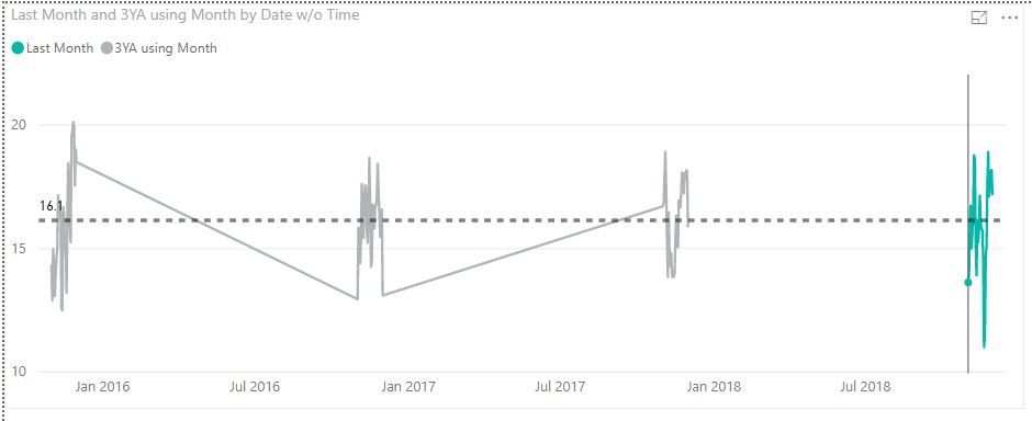
Im current graphing temperatures by region, and I want to show a month of daily averages and have a constant line of the 3 year average for that month. I have calculated my 3 year averages, but when I try to plot current with the 3 year average, and set an average line based on the 3 year average I get the following visual;
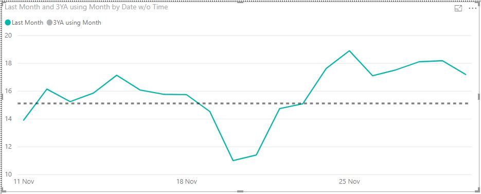
I tried using the visual filter and setting it to the last month but when I do it stops calculating the average line and the black line just sits in the visual, not changing when I change month or region;
Any ideas on how to tackle this?
- Mark as New
- Bookmark
- Subscribe
- Mute
- Subscribe to RSS Feed
- Permalink
- Report Inappropriate Content
Hi @Anonymous
It seems you may have a look at this blog. Sample data and expected output will be helpful to provide an accurate solution.
How to Get Your Question Answered Quickly
Regards,
Cherie
If this post helps, then please consider Accept it as the solution to help the other members find it more quickly.
- Mark as New
- Bookmark
- Subscribe
- Mute
- Subscribe to RSS Feed
- Permalink
- Report Inappropriate Content
Hi @v-cherch-msft,
Thanks for the reply, I'll add a more detailed description and sample data/report.
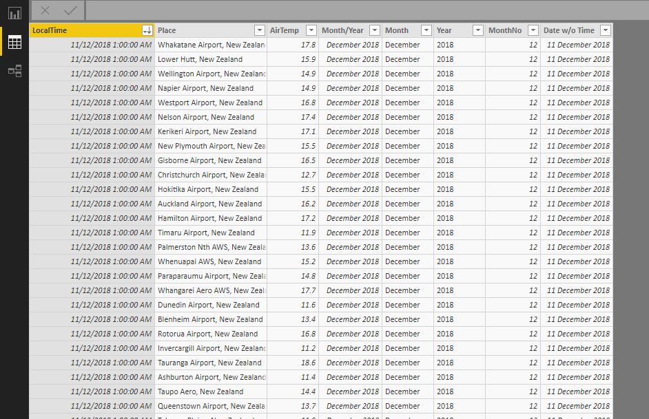
The data I have is temperature data for New Zealand for serval weather station across the country updated every hour for the past several years.
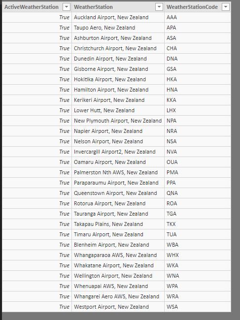
I have another table of GXP's, grid exit points (nodes where electricity leaves the distribution grid and is then sent to residences and businesses), and each GXP is assigned a weather station.
Another table I have assigns each GXP to one of 14 grid zones accross the country.
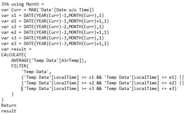
Using this I have created a measure using a disconnect date table to calculate the 3 year average for a selected month by take the average for the same month from the previous 3 years.
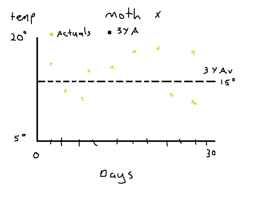
So what I have so far this 3 year average for each month, and I want to use it as a constantline for each month, so I will have graphed each days actual temp with this constant line temp so as to compare variance.
Crappy paint mock up.
So I eventally want to be able to select a region and a month.
I was think of adding an extra column to my temperature data that checks the month and weather station and then calculates an average for that month, but with 40ish stations and and each month being different, Im not sure how I go about this.
Heres a copy of the report currently:
https://drive.google.com/open?id=10Q-dJUaazkWb6gfrhb-hUuZkLEUMA0Wx
- Mark as New
- Bookmark
- Subscribe
- Mute
- Subscribe to RSS Feed
- Permalink
- Report Inappropriate Content
Hi @Anonymous
I cannot fully understand it. It seems you may use drill down and date hierarchy for visual. Please check the visual on page 3. If it is not your case, please simplified the sample data and provide the expected output if you need a measure.
Regards,
Cherie
If this post helps, then please consider Accept it as the solution to help the other members find it more quickly.
- Mark as New
- Bookmark
- Subscribe
- Mute
- Subscribe to RSS Feed
- Permalink
- Report Inappropriate Content
Thanks again @v-cherch-msft
When I use the drill down, I want to drill down on the current year data, and when I do that, I can't get the I can use the past 3 years to create an average line as the data gets filtered.
In the above photo, once I drilled into the current month, the dashed average line stops working.
It's quite late for me now, I'll try and make a more detailed example of what I'm hoping to achieve in the morning.
Helpful resources

Fabric Data Days
Advance your Data & AI career with 50 days of live learning, contests, hands-on challenges, study groups & certifications and more!

Power BI Monthly Update - October 2025
Check out the October 2025 Power BI update to learn about new features.

