FabCon is coming to Atlanta
Join us at FabCon Atlanta from March 16 - 20, 2026, for the ultimate Fabric, Power BI, AI and SQL community-led event. Save $200 with code FABCOMM.
Register now!- Power BI forums
- Get Help with Power BI
- Desktop
- Service
- Report Server
- Power Query
- Mobile Apps
- Developer
- DAX Commands and Tips
- Custom Visuals Development Discussion
- Health and Life Sciences
- Power BI Spanish forums
- Translated Spanish Desktop
- Training and Consulting
- Instructor Led Training
- Dashboard in a Day for Women, by Women
- Galleries
- Data Stories Gallery
- Themes Gallery
- Contests Gallery
- QuickViz Gallery
- Quick Measures Gallery
- Visual Calculations Gallery
- Notebook Gallery
- Translytical Task Flow Gallery
- TMDL Gallery
- R Script Showcase
- Webinars and Video Gallery
- Ideas
- Custom Visuals Ideas (read-only)
- Issues
- Issues
- Events
- Upcoming Events
View all the Fabric Data Days sessions on demand. View schedule
- Power BI forums
- Forums
- Get Help with Power BI
- Desktop
- Filter values by company
- Subscribe to RSS Feed
- Mark Topic as New
- Mark Topic as Read
- Float this Topic for Current User
- Bookmark
- Subscribe
- Printer Friendly Page
- Mark as New
- Bookmark
- Subscribe
- Mute
- Subscribe to RSS Feed
- Permalink
- Report Inappropriate Content
Filter values by company
Hello!
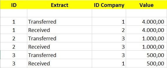
I'm having trouble solving the following problem: I need to create a filter and graph to demonstrate how much each company has transferred and received from each other. For example: company 1 transferred to the company 2 US $ 4,000.00 and received the 3 US $ 500.00.
Thank you.
Solved! Go to Solution.
- Mark as New
- Bookmark
- Subscribe
- Mute
- Subscribe to RSS Feed
- Permalink
- Report Inappropriate Content
My bad =oP applying Filter will solve the issue:
- Received = CALCULATE(SUM(Sheet6[Sales]),FILTER(Sheet6,Sheet6[Extract] = "Received"))
- Transferred = CALCULATE(SUM(Sheet6[Sales]),FILTER(Sheet6,Sheet6[Extract] = "Transferred"))
Regards
Abduvali
- Mark as New
- Bookmark
- Subscribe
- Mute
- Subscribe to RSS Feed
- Permalink
- Report Inappropriate Content
Hi @Gelain,
Just create 2 new calculated measures:
- Transferred = Calculate(SUM(YourTableName[Value]),YourTableName[Extract] = "Transferred")
- Received = Calculate(SUM(YourTableName[Value]),YourTableName[Extract] = "Received")
And drop them into your table chart.
Let me know if its what you were looking for.
Regards
Abduvali
- Mark as New
- Bookmark
- Subscribe
- Mute
- Subscribe to RSS Feed
- Permalink
- Report Inappropriate Content
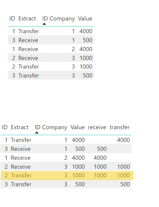
According to your solution I see some extra data. Looking at this below image
Table1 is raw data. By applying your formula and making the data into a table,
The yellow marked Row seems to be an extra one becuase, take an example with ID Company 3::
ID Compnay 3 has
Receive 1000 which is row #4 GOOD.
Transfer of 1000 and 500 which are row #4 and row #6 GOOD.
But I don't understand the Row#5 which says Receive 1000 and transfer 1000 NOT GOOD.
- Mark as New
- Bookmark
- Subscribe
- Mute
- Subscribe to RSS Feed
- Permalink
- Report Inappropriate Content
- Mark as New
- Bookmark
- Subscribe
- Mute
- Subscribe to RSS Feed
- Permalink
- Report Inappropriate Content
- Mark as New
- Bookmark
- Subscribe
- Mute
- Subscribe to RSS Feed
- Permalink
- Report Inappropriate Content
Hello @pxg08680 and @Abduvali!
Thank you for helping me.
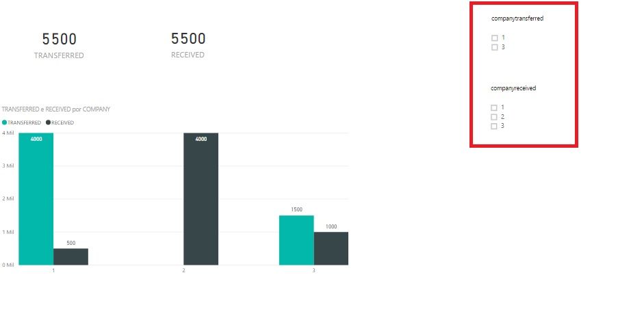
I was able to correctly generate the value sent and received by company. To finish, I need to create two filters: one for the company that transferred and another filter for the company that received the values, that is, to detail the destination of the resources transferred by company. I made a few attempts, but could not solve.
- Mark as New
- Bookmark
- Subscribe
- Mute
- Subscribe to RSS Feed
- Permalink
- Report Inappropriate Content
Helpful resources

Power BI Monthly Update - November 2025
Check out the November 2025 Power BI update to learn about new features.

Fabric Data Days
Advance your Data & AI career with 50 days of live learning, contests, hands-on challenges, study groups & certifications and more!


