FabCon is coming to Atlanta
Join us at FabCon Atlanta from March 16 - 20, 2026, for the ultimate Fabric, Power BI, AI and SQL community-led event. Save $200 with code FABCOMM.
Register now!- Power BI forums
- Get Help with Power BI
- Desktop
- Service
- Report Server
- Power Query
- Mobile Apps
- Developer
- DAX Commands and Tips
- Custom Visuals Development Discussion
- Health and Life Sciences
- Power BI Spanish forums
- Translated Spanish Desktop
- Training and Consulting
- Instructor Led Training
- Dashboard in a Day for Women, by Women
- Galleries
- Data Stories Gallery
- Themes Gallery
- Contests Gallery
- QuickViz Gallery
- Quick Measures Gallery
- Visual Calculations Gallery
- Notebook Gallery
- Translytical Task Flow Gallery
- TMDL Gallery
- R Script Showcase
- Webinars and Video Gallery
- Ideas
- Custom Visuals Ideas (read-only)
- Issues
- Issues
- Events
- Upcoming Events
The Power BI Data Visualization World Championships is back! Get ahead of the game and start preparing now! Learn more
- Power BI forums
- Forums
- Get Help with Power BI
- Desktop
- Re: Filter values by company
- Subscribe to RSS Feed
- Mark Topic as New
- Mark Topic as Read
- Float this Topic for Current User
- Bookmark
- Subscribe
- Printer Friendly Page
- Mark as New
- Bookmark
- Subscribe
- Mute
- Subscribe to RSS Feed
- Permalink
- Report Inappropriate Content
Filter values by company
Hello!
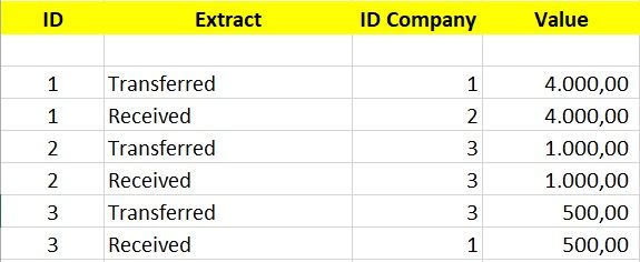
I'm having trouble solving the following problem: I need to create a filter and graph to demonstrate how much each company has transferred and received from each other. For example: company 1 transferred to the company 2 US $ 4,000.00 and received the 3 US $ 500.00.
Thank you.
Solved! Go to Solution.
- Mark as New
- Bookmark
- Subscribe
- Mute
- Subscribe to RSS Feed
- Permalink
- Report Inappropriate Content
My bad =oP applying Filter will solve the issue:
- Received = CALCULATE(SUM(Sheet6[Sales]),FILTER(Sheet6,Sheet6[Extract] = "Received"))
- Transferred = CALCULATE(SUM(Sheet6[Sales]),FILTER(Sheet6,Sheet6[Extract] = "Transferred"))
Regards
Abduvali
- Mark as New
- Bookmark
- Subscribe
- Mute
- Subscribe to RSS Feed
- Permalink
- Report Inappropriate Content
Hi @Gelain,
Just create 2 new calculated measures:
- Transferred = Calculate(SUM(YourTableName[Value]),YourTableName[Extract] = "Transferred")
- Received = Calculate(SUM(YourTableName[Value]),YourTableName[Extract] = "Received")
And drop them into your table chart.
Let me know if its what you were looking for.
Regards
Abduvali
- Mark as New
- Bookmark
- Subscribe
- Mute
- Subscribe to RSS Feed
- Permalink
- Report Inappropriate Content
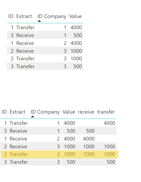
According to your solution I see some extra data. Looking at this below image
Table1 is raw data. By applying your formula and making the data into a table,
The yellow marked Row seems to be an extra one becuase, take an example with ID Company 3::
ID Compnay 3 has
Receive 1000 which is row #4 GOOD.
Transfer of 1000 and 500 which are row #4 and row #6 GOOD.
But I don't understand the Row#5 which says Receive 1000 and transfer 1000 NOT GOOD.
- Mark as New
- Bookmark
- Subscribe
- Mute
- Subscribe to RSS Feed
- Permalink
- Report Inappropriate Content
- Mark as New
- Bookmark
- Subscribe
- Mute
- Subscribe to RSS Feed
- Permalink
- Report Inappropriate Content
- Mark as New
- Bookmark
- Subscribe
- Mute
- Subscribe to RSS Feed
- Permalink
- Report Inappropriate Content
Hello @pxg08680 and @Abduvali!
Thank you for helping me.
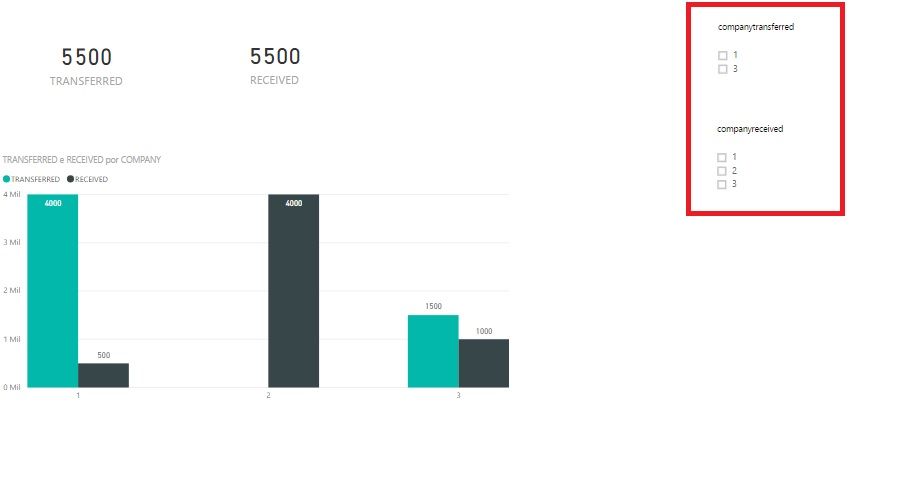
I was able to correctly generate the value sent and received by company. To finish, I need to create two filters: one for the company that transferred and another filter for the company that received the values, that is, to detail the destination of the resources transferred by company. I made a few attempts, but could not solve.
- Mark as New
- Bookmark
- Subscribe
- Mute
- Subscribe to RSS Feed
- Permalink
- Report Inappropriate Content
Helpful resources

Power BI Dataviz World Championships
The Power BI Data Visualization World Championships is back! Get ahead of the game and start preparing now!

Power BI Monthly Update - November 2025
Check out the November 2025 Power BI update to learn about new features.

| User | Count |
|---|---|
| 59 | |
| 43 | |
| 42 | |
| 23 | |
| 17 |
| User | Count |
|---|---|
| 190 | |
| 122 | |
| 96 | |
| 66 | |
| 47 |


