Fabric Data Days starts November 4th!
Advance your Data & AI career with 50 days of live learning, dataviz contests, hands-on challenges, study groups & certifications and more!
Get registered- Power BI forums
- Get Help with Power BI
- Desktop
- Service
- Report Server
- Power Query
- Mobile Apps
- Developer
- DAX Commands and Tips
- Custom Visuals Development Discussion
- Health and Life Sciences
- Power BI Spanish forums
- Translated Spanish Desktop
- Training and Consulting
- Instructor Led Training
- Dashboard in a Day for Women, by Women
- Galleries
- Data Stories Gallery
- Themes Gallery
- Contests Gallery
- Quick Measures Gallery
- Visual Calculations Gallery
- Notebook Gallery
- Translytical Task Flow Gallery
- TMDL Gallery
- R Script Showcase
- Webinars and Video Gallery
- Ideas
- Custom Visuals Ideas (read-only)
- Issues
- Issues
- Events
- Upcoming Events
Join us at FabCon Atlanta from March 16 - 20, 2026, for the ultimate Fabric, Power BI, AI and SQL community-led event. Save $200 with code FABCOMM. Register now.
- Power BI forums
- Forums
- Get Help with Power BI
- Desktop
- Re: Filter/DAX function to count occurrence of wor...
- Subscribe to RSS Feed
- Mark Topic as New
- Mark Topic as Read
- Float this Topic for Current User
- Bookmark
- Subscribe
- Printer Friendly Page
- Mark as New
- Bookmark
- Subscribe
- Mute
- Subscribe to RSS Feed
- Permalink
- Report Inappropriate Content
Filter/DAX function to count occurrence of words
Hello everyone,
I am an absolute beginner in Power Bi, so please bear with me if my question seems simple. I am trying to visualize the following:
I have a survey where training participants can describe their profession by selecting one or multiple answers. My data looks something like this:
I would like to visualize the second column, for instance in the form of a pie chart. However, I don't know how to make Power BI "filter" this column, so that I would have pie chart with each category ("Videojournalist", "Correspondent", etc.), rather than - as Power BI currently displays it - categories that are named like this: "Videojournalist,Photojournalist, Cameraperson", etc. I know that this means that certain participants would be counted two, three, four times, but that would be okay.
Is there a way to create a DAX function (or pivot table?) to visualize this? Please let me know if you need further information or a sample dataset/pbix file to answer my question.
Many thanks in advance 🙂
Best,
Marvin
Solved! Go to Solution.
- Mark as New
- Bookmark
- Subscribe
- Mute
- Subscribe to RSS Feed
- Permalink
- Report Inappropriate Content
Hi Marvin,
I have attached a sample PBIX.
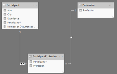
I would suggest setting up the data model as follows:
- Participant is a table with one row per Participant, same as the table you posted but with Profession removed.
- Profession is a table containing distinct values of Profession
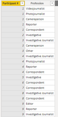
- ParticipantProfession is a "bridge" table containing the valid combinations of Participant and Profession. I created this using the Split function in Power Query and it looks like this:
- Relationships are as in diagram above.
- Participant has 1:* relationship with ParticipantProfession (bidirectional)
- Profession has 1:* relationship with ParticipantProfession
- Create a measure:
Number of Occurrences of Profession =
COUNTROWS ( ParticipantProfession )
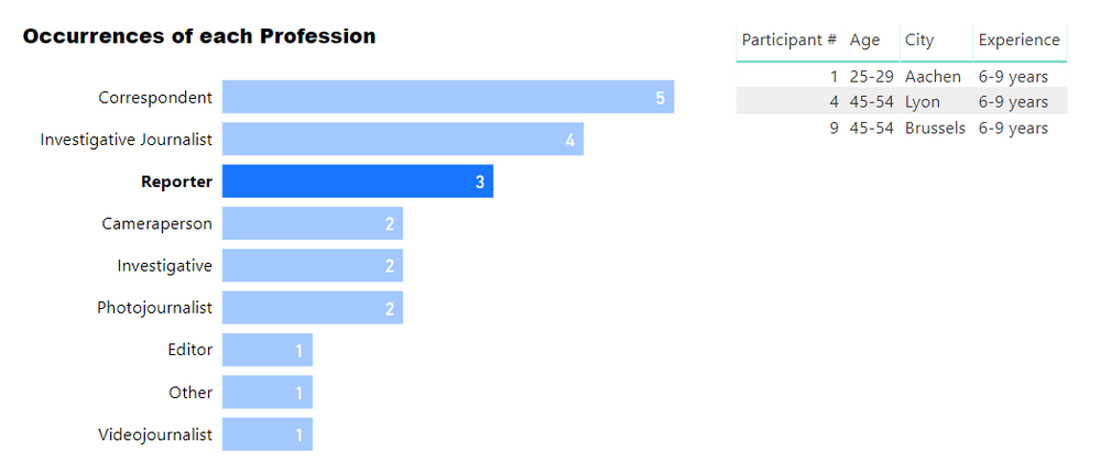
- Then you can create visuals that display this measure filtered by Profession[Profession]. Additionally, filtering on a particular Profession will filter the Participant table.
You can see in the attached PBIX how this is set up, but please post back if needed.
Regards,
Owen


