FabCon is coming to Atlanta
Join us at FabCon Atlanta from March 16 - 20, 2026, for the ultimate Fabric, Power BI, AI and SQL community-led event. Save $200 with code FABCOMM.
Register now!- Power BI forums
- Get Help with Power BI
- Desktop
- Service
- Report Server
- Power Query
- Mobile Apps
- Developer
- DAX Commands and Tips
- Custom Visuals Development Discussion
- Health and Life Sciences
- Power BI Spanish forums
- Translated Spanish Desktop
- Training and Consulting
- Instructor Led Training
- Dashboard in a Day for Women, by Women
- Galleries
- Data Stories Gallery
- Themes Gallery
- Contests Gallery
- QuickViz Gallery
- Quick Measures Gallery
- Visual Calculations Gallery
- Notebook Gallery
- Translytical Task Flow Gallery
- TMDL Gallery
- R Script Showcase
- Webinars and Video Gallery
- Ideas
- Custom Visuals Ideas (read-only)
- Issues
- Issues
- Events
- Upcoming Events
The Power BI Data Visualization World Championships is back! Get ahead of the game and start preparing now! Learn more
- Power BI forums
- Forums
- Get Help with Power BI
- Desktop
- Re: Filled State Map's Diverging Color Scales with...
- Subscribe to RSS Feed
- Mark Topic as New
- Mark Topic as Read
- Float this Topic for Current User
- Bookmark
- Subscribe
- Printer Friendly Page
- Mark as New
- Bookmark
- Subscribe
- Mute
- Subscribe to RSS Feed
- Permalink
- Report Inappropriate Content
Filled State Map's Diverging Color Scales with Slicer
I’m trying to create a filled map/choropleth with a category slicer controlling three distinct maps with diverging color scales.
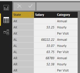
I’ve created a filled map based on state salary data with three salary categories: annual, hourly, and per visit.
The data looks like this:
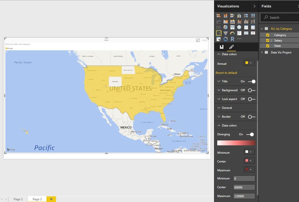
When I add the slicer on Category, all the correct values show up, but there’s no variation in the filled states. Every state is the same solid color, regardless of the value.
Even when I try to change “Diverging” in the Data Color section at the bottom of the Format tab, the Data Color section at the top with a lone color overrides it:
The values in the the annual category are obviously much higher than those in the hourly and per visit categories: values in the ten/hundred thousands vs values in the tens. I’m not sure if this is what’s causing problems.
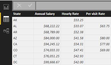
Also, I tried uploading the data with one row per state, and each of the 3 salary categories in different columns, but I’m not sure how I would create the lone category slicer with three separate fields:
Any ideas?
- Mark as New
- Bookmark
- Subscribe
- Mute
- Subscribe to RSS Feed
- Permalink
- Report Inappropriate Content
Try to remove category from legend of the filled map, then the color diverging should work in the first case in your post.
Based on my test and observation, the legend field in a filled map doesn't make sense.
- Mark as New
- Bookmark
- Subscribe
- Mute
- Subscribe to RSS Feed
- Permalink
- Report Inappropriate Content
Thank you, Eric,
I removed Category from the Legend.
My issue is still that I don't know how to create a different diverging color scale for each of the 3 categories in the slicer (I'm not even sure it's possible). Setting the diverging color scale applies to all categories, which is a problem for my data because the annual salary data values are much larger than the hourly and per visit values.
- Mark as New
- Bookmark
- Subscribe
- Mute
- Subscribe to RSS Feed
- Permalink
- Report Inappropriate Content
@ineedham wrote:
Thank you, Eric,
I removed Category from the Legend.
My issue is still that I don't know how to create a different diverging color scale for each of the 3 categories in the slicer (I'm not even sure it's possible). Setting the diverging color scale applies to all categories, which is a problem for my data because the annual salary data values are much larger than the hourly and per visit values.
Based on my test, to get a different diverging color scale, you may have to use 3 individual filled maps, with the color saturation filled by measures as below. A slicer is not necessary in this case.
HourlySal = CALCULATE(MAX(Table[Salary]),Table[Category]="Hourly")

PerVSal = CALCULATE(MAX(Table[Salary]),Table[Category]="Per Visit")

AnnualSal = CALCULATE(MAX(Table[Salary]),Table[Category]="Annual")
- Mark as New
- Bookmark
- Subscribe
- Mute
- Subscribe to RSS Feed
- Permalink
- Report Inappropriate Content
Adding those measures was a great idea, but my ultimate goal was to toggle between maps on one page, without having to create 3 separate tabs/maps. I found a solution: the default Slicer Visual created the problems I mentioned above, but the Custom Chiclet Slicer I downloaded from the PowerBI Visuals pages works perfectly.
Thanks for your help, Eric.
- Mark as New
- Bookmark
- Subscribe
- Mute
- Subscribe to RSS Feed
- Permalink
- Report Inappropriate Content
Thanks for your sharing. 🙂
Just one question to confirm, did you create a different diverging color scale for different categories in one filled map?
- Mark as New
- Bookmark
- Subscribe
- Mute
- Subscribe to RSS Feed
- Permalink
- Report Inappropriate Content
No, I didn't. The scales were automatically adjusted to the min and max of each category's values, and the color scale was the same for all 3.
Helpful resources

Power BI Dataviz World Championships
The Power BI Data Visualization World Championships is back! Get ahead of the game and start preparing now!

| User | Count |
|---|---|
| 41 | |
| 38 | |
| 36 | |
| 31 | |
| 28 |
| User | Count |
|---|---|
| 129 | |
| 88 | |
| 79 | |
| 68 | |
| 63 |


