A new Data Days event is coming soon!
This time we’re going bigger than ever. Fabric, Power BI, SQL, AI and more. We're covering it all. You won't want to miss it.
Learn more- Power BI forums
- Get Help with Power BI
- Desktop
- Service
- Report Server
- Power Query
- Mobile Apps
- Developer
- DAX Commands and Tips
- Custom Visuals Development Discussion
- Health and Life Sciences
- Power BI Spanish forums
- Translated Spanish Desktop
- Training and Consulting
- Instructor Led Training
- Dashboard in a Day for Women, by Women
- Galleries
- Data Stories Gallery
- Themes Gallery
- Contests Gallery
- QuickViz Gallery
- Quick Measures Gallery
- Visual Calculations Gallery
- Notebook Gallery
- Translytical Task Flow Gallery
- TMDL Gallery
- R Script Showcase
- Webinars and Video Gallery
- Ideas
- Custom Visuals Ideas (read-only)
- Issues
- Issues
- Events
- Upcoming Events
Level up your Power BI skills this month - build one visual each week and tell better stories with data! Get started
- Power BI forums
- Forums
- Get Help with Power BI
- Desktop
- Filled Map: Colour coding countries based on value...
- Subscribe to RSS Feed
- Mark Topic as New
- Mark Topic as Read
- Float this Topic for Current User
- Bookmark
- Subscribe
- Printer Friendly Page
- Mark as New
- Bookmark
- Subscribe
- Mute
- Subscribe to RSS Feed
- Permalink
- Report Inappropriate Content
Filled Map: Colour coding countries based on values
Hi all,
I'm trying to create a regulation heatmap of Asia using the filled map visual. The idea is to create a heatmap based on regulation for different topics in different levels of details, such as this:
What I want to do is as follows:
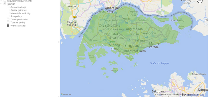
I want to create a filled map that shows the regulatory heatmap. So for instance, I have a slicer on level withholding tax and i would like it to show the colours in a certain order if they are contained. So if in withholding tax any of the activities is coded as yellow or red, i would want the map to display this.
Currently, it shows it as green like so:
So i guess i want to be able to rank the colours.
Thank you very much, any help is greatly appreciated 🙂
- Mark as New
- Bookmark
- Subscribe
- Mute
- Subscribe to RSS Feed
- Permalink
- Report Inappropriate Content
Hi @Anonymous ,
Could you pls provided sample data and expected output, remember to remove confidential data.
Best Regards
Lucien
- Mark as New
- Bookmark
- Subscribe
- Mute
- Subscribe to RSS Feed
- Permalink
- Report Inappropriate Content
Hi, thanks for your response!
Sample data looks like this: (I've created a sample data set for this)
Country | Category | Activity | Heatmap | Explanation |
| Hong Kong | Cash Management | Domestic Pooling | Green | Green becauese no restrictions |
| Hong Kong | Cash Management | Cross Border Pooling | Yellow | Yellow because some restrictions |
| Hong Kong | Bank Account Management | Resident Entities | Yellow | Yellow because some restrictions |
| Hong Kong | Bank Account Management | Non-Resident Entities | Red | Red because impossible |
My goal would be to have a page on which I could have a slicer on level "Category", with "Heatmap" as legend to fill the countries with the respective countries. Additionally I have made a drill-through for explanation of colour.
So in the above case expected outcome would be:
If i set the slicer to Cash management, HK would be yellow on the map, because yellow is "more important" than green, and the same for Bank account management: HK would be red because red is more important.
I hope this makes sense t oyou and I was ble to correctly explain myself 🙂
Thanks for any help 🙂
Helpful resources

Power BI Monthly Update - April 2026
Check out the April 2026 Power BI update to learn about new features.

Data Days 2026 coming soon!
Sign up to receive a private message when registration opens and key events begin.

New to Fabric Survey
If you have recently started exploring Fabric, we'd love to hear how it's going. Your feedback can help with product improvements.

| User | Count |
|---|---|
| 36 | |
| 29 | |
| 29 | |
| 21 | |
| 18 |
| User | Count |
|---|---|
| 69 | |
| 39 | |
| 33 | |
| 24 | |
| 23 |


