FabCon is coming to Atlanta
Join us at FabCon Atlanta from March 16 - 20, 2026, for the ultimate Fabric, Power BI, AI and SQL community-led event. Save $200 with code FABCOMM.
Register now!- Power BI forums
- Get Help with Power BI
- Desktop
- Service
- Report Server
- Power Query
- Mobile Apps
- Developer
- DAX Commands and Tips
- Custom Visuals Development Discussion
- Health and Life Sciences
- Power BI Spanish forums
- Translated Spanish Desktop
- Training and Consulting
- Instructor Led Training
- Dashboard in a Day for Women, by Women
- Galleries
- Data Stories Gallery
- Themes Gallery
- Contests Gallery
- QuickViz Gallery
- Quick Measures Gallery
- Visual Calculations Gallery
- Notebook Gallery
- Translytical Task Flow Gallery
- TMDL Gallery
- R Script Showcase
- Webinars and Video Gallery
- Ideas
- Custom Visuals Ideas (read-only)
- Issues
- Issues
- Events
- Upcoming Events
The Power BI Data Visualization World Championships is back! It's time to submit your entry. Live now!
- Power BI forums
- Forums
- Get Help with Power BI
- Desktop
- Re: Filled Map: Colour coding countries based on v...
- Subscribe to RSS Feed
- Mark Topic as New
- Mark Topic as Read
- Float this Topic for Current User
- Bookmark
- Subscribe
- Printer Friendly Page
- Mark as New
- Bookmark
- Subscribe
- Mute
- Subscribe to RSS Feed
- Permalink
- Report Inappropriate Content
Filled Map: Colour coding countries based on values
Hi all,
I'm trying to create a regulation heatmap of Asia using the filled map visual. The idea is to create a heatmap based on regulation for different topics in different levels of details, such as this:
What I want to do is as follows:
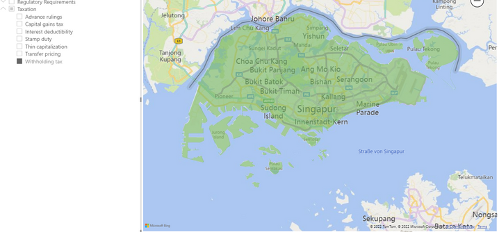
I want to create a filled map that shows the regulatory heatmap. So for instance, I have a slicer on level withholding tax and i would like it to show the colours in a certain order if they are contained. So if in withholding tax any of the activities is coded as yellow or red, i would want the map to display this.
Currently, it shows it as green like so:
So i guess i want to be able to rank the colours.
Thank you very much, any help is greatly appreciated 🙂
- Mark as New
- Bookmark
- Subscribe
- Mute
- Subscribe to RSS Feed
- Permalink
- Report Inappropriate Content
Hi @Anonymous ,
Could you pls provided sample data and expected output, remember to remove confidential data.
Best Regards
Lucien
- Mark as New
- Bookmark
- Subscribe
- Mute
- Subscribe to RSS Feed
- Permalink
- Report Inappropriate Content
Hi, thanks for your response!
Sample data looks like this: (I've created a sample data set for this)
Country | Category | Activity | Heatmap | Explanation |
| Hong Kong | Cash Management | Domestic Pooling | Green | Green becauese no restrictions |
| Hong Kong | Cash Management | Cross Border Pooling | Yellow | Yellow because some restrictions |
| Hong Kong | Bank Account Management | Resident Entities | Yellow | Yellow because some restrictions |
| Hong Kong | Bank Account Management | Non-Resident Entities | Red | Red because impossible |
My goal would be to have a page on which I could have a slicer on level "Category", with "Heatmap" as legend to fill the countries with the respective countries. Additionally I have made a drill-through for explanation of colour.
So in the above case expected outcome would be:
If i set the slicer to Cash management, HK would be yellow on the map, because yellow is "more important" than green, and the same for Bank account management: HK would be red because red is more important.
I hope this makes sense t oyou and I was ble to correctly explain myself 🙂
Thanks for any help 🙂
Helpful resources

Power BI Dataviz World Championships
The Power BI Data Visualization World Championships is back! It's time to submit your entry.

Power BI Monthly Update - January 2026
Check out the January 2026 Power BI update to learn about new features.

| User | Count |
|---|---|
| 60 | |
| 47 | |
| 30 | |
| 25 | |
| 23 |
| User | Count |
|---|---|
| 141 | |
| 110 | |
| 65 | |
| 38 | |
| 33 |


