FabCon is coming to Atlanta
Join us at FabCon Atlanta from March 16 - 20, 2026, for the ultimate Fabric, Power BI, AI and SQL community-led event. Save $200 with code FABCOMM.
Register now!- Power BI forums
- Get Help with Power BI
- Desktop
- Service
- Report Server
- Power Query
- Mobile Apps
- Developer
- DAX Commands and Tips
- Custom Visuals Development Discussion
- Health and Life Sciences
- Power BI Spanish forums
- Translated Spanish Desktop
- Training and Consulting
- Instructor Led Training
- Dashboard in a Day for Women, by Women
- Galleries
- Data Stories Gallery
- Themes Gallery
- Contests Gallery
- QuickViz Gallery
- Quick Measures Gallery
- Visual Calculations Gallery
- Notebook Gallery
- Translytical Task Flow Gallery
- TMDL Gallery
- R Script Showcase
- Webinars and Video Gallery
- Ideas
- Custom Visuals Ideas (read-only)
- Issues
- Issues
- Events
- Upcoming Events
The Power BI Data Visualization World Championships is back! Get ahead of the game and start preparing now! Learn more
- Power BI forums
- Forums
- Get Help with Power BI
- Desktop
- FAQ: Ask Amanda Anything Questions & Answers
- Subscribe to RSS Feed
- Mark Topic as New
- Mark Topic as Read
- Float this Topic for Current User
- Bookmark
- Subscribe
- Printer Friendly Page
- Mark as New
- Bookmark
- Subscribe
- Mute
- Subscribe to RSS Feed
- Permalink
- Report Inappropriate Content
FAQ: Ask Amanda Anything Questions & Answers
If you were among the many attendees of the recent Ask Amanda Anything sneak peek, you know there were terrific questions being asked! We've captured those questions and responses from the team and made them available (see attachment). You'll notice quite a few indicate "see roadmap," and we'll continue to provide updated responses to these questions over time. Make sure to subscribe to this thread so you get updated and official information!
Have a great day,
PBI Community Team
Solved! Go to Solution.
- Mark as New
- Bookmark
- Subscribe
- Mute
- Subscribe to RSS Feed
- Permalink
- Report Inappropriate Content
Hey @RobbeVL ,
this is the link to the online version (the most current) of the Power BI roadmap:
https://docs.microsoft.com/en-us/power-platform-release-plan/2019wave2/business-intelligence/
Regards,
Tom
Did I answer your question? Mark my post as a solution, this will help others!
Proud to be a Super User!
I accept Kudos 😉
Hamburg, Germany
- Mark as New
- Bookmark
- Subscribe
- Mute
- Subscribe to RSS Feed
- Permalink
- Report Inappropriate Content
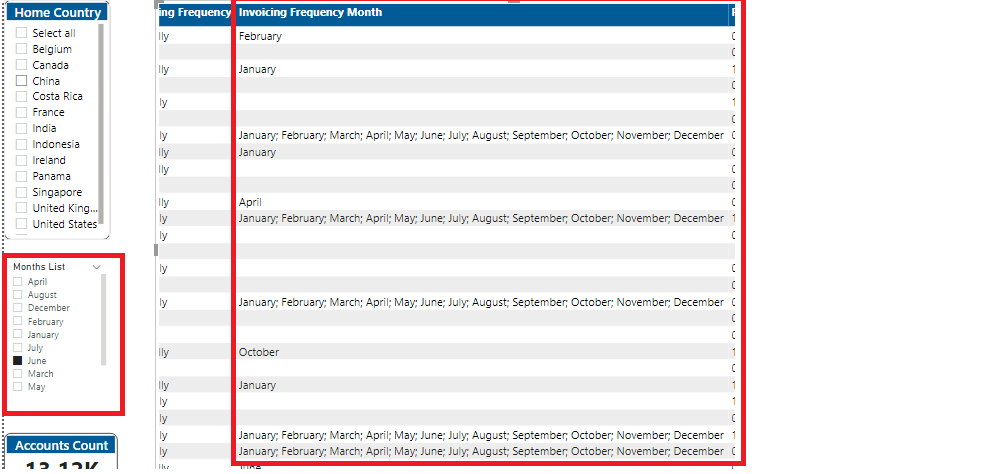
The Table has a column, Invoicing Frequency Month. It is a semi colon separated list of month or it can be just single month. I need a slicer with list of 12 months and based on the slicer selection, the table needs to be filter the Invoicing Frequency Month. How do I achieve this?
- Mark as New
- Bookmark
- Subscribe
- Mute
- Subscribe to RSS Feed
- Permalink
- Report Inappropriate Content
Hi Amanda,
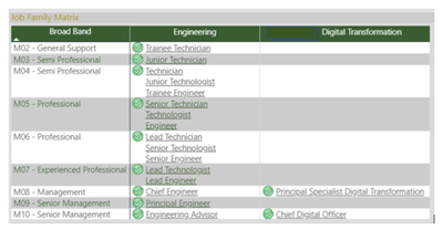
I inserted a matrix in my report with text as values and activated the Web URL via conditional formatting. I used the combination of concatenex, values and Unicar(10) dax formula to make the text item with url values to flow in different lines in a single cell. However, if there are two or more values with different Web Url links, only one similar link is working and applied to all the multiple items in a cell. Is there another way to make the related Url/web links assigned to different items as contained in the single cell work in the matrix? I attached also the screenshot of my work to help explain further. The text values with assigned url link I am referring to are the job titles by Broadband and Job Family (Engineering or Digital Transformation).
Thank you so much in advance. I greatly appreciate everything you do and your team in the Power Bi space.
- Mark as New
- Bookmark
- Subscribe
- Mute
- Subscribe to RSS Feed
- Permalink
- Report Inappropriate Content
Is it possible to create a column where the user is prompted for a date constant that goes in each row?
- Mark as New
- Bookmark
- Subscribe
- Mute
- Subscribe to RSS Feed
- Permalink
- Report Inappropriate Content
How do I initiate a question in this forum to get help from members and users?
- Mark as New
- Bookmark
- Subscribe
- Mute
- Subscribe to RSS Feed
- Permalink
- Report Inappropriate Content
- Mark as New
- Bookmark
- Subscribe
- Mute
- Subscribe to RSS Feed
- Permalink
- Report Inappropriate Content
Hi Amanda,
Is it possible now to do Forecasting using ARIMA model in DAX for Power BI Desktop? So far I am directed to using R script from this thread: https://community.powerbi.com/t5/Desktop/quot-Forecasting-with-ARIMA-quot-in-Table-Visual/td-p/88666....
What I want to do is as follows:
1. Show 60 days worth of data in a bar graph.
2. In the same graph as #1, draw a line for the moving average for 10 days of actual data.
3. Forecast the future next 10 days using the 60 days data and using ARIMA model, then show the results as extension to the line drawn in #2.
Currently, I am already able to achieve #1 and #2 above using DAX and "Line and clustered column chart" Visual. I already was able to get the forecast values using R script. My problem is I cannot transform the resulting data from R and load it as Modelling Data in Power BI so I can use the results in Dax. If I won't be able to do #3 via DAX, then I have to proceed doing everything in R script. That's where I am currently.
Any advice or feedback will be much appreciated.
- Mark as New
- Bookmark
- Subscribe
- Mute
- Subscribe to RSS Feed
- Permalink
- Report Inappropriate Content
Hi,
is there any way to remove data from a created chart?
I mean, I created a pie chart and it shows the values and the %-es. Is there a way to show either the values (and format them as needed) or just the %-es, but not both?
Many thanks and best regards
- Mark as New
- Bookmark
- Subscribe
- Mute
- Subscribe to RSS Feed
- Permalink
- Report Inappropriate Content
Hi Amanda,
I have set up a report which has a preset filter on geography (eg England)
On page 3 of the report I want to show where England ranks out of all the countries in Europe so I have turned off the relationship from the filter to the bar chart.
Is there a way to use conditional filtering to change the colour for England so it stands out?
FYI the "England" filter is changeable so I can't put direct text into the conditional format
Any help would be great - I am currently looking at the isfiltered dax function
Chris
- Mark as New
- Bookmark
- Subscribe
- Mute
- Subscribe to RSS Feed
- Permalink
- Report Inappropriate Content
Dear Amanda
I have used TotalYTD to calculate accumulative revenue by month.
But Unfortunately, the result is not correct. YTD amount is as same as MTD amount.
The relationship with calendar table is already established.
I would like to attached file in below link.
Can you help me to fix this error.
https://drive.google.com/open?id=1ubYox2s3f1LvsryML93GLgkL_A52iqC3
- Mark as New
- Bookmark
- Subscribe
- Mute
- Subscribe to RSS Feed
- Permalink
- Report Inappropriate Content
Hi Amanda or anyone who can help me!
I want to use a stacked area chart visualization with a total amount value vs. date axis. The problem is that when I apply a date axis , it only shows data for a minor total amount. My total is 40 thousand, and once applied the date it turns down to 16. This happens with different dates and it turns down different quantities.
How is that possible?
Thanks in advance!
Agustín
- Mark as New
- Bookmark
- Subscribe
- Mute
- Subscribe to RSS Feed
- Permalink
- Report Inappropriate Content
Hi @Anonymous ,
It could be any number of things if the numbers don't match up as you expect, depends on how the tabular data/schema is built as much as anything. Do you have a small data sample you could share to see if I (or anyone else for that matter) can replicate the problem with the same content? You can fudge the numbers/categories somewhat if there's any IP/data security concerns, thanks. (For example, rename the categories to Cat1, Cat2, Cat3 etc.)
- Mark as New
- Bookmark
- Subscribe
- Mute
- Subscribe to RSS Feed
- Permalink
- Report Inappropriate Content
Hi,
The link to the roadmap brings me to the release notes of Oktober 2018?
Cant seem to find that roadmap myself. Any working link ?
Robbe
- Mark as New
- Bookmark
- Subscribe
- Mute
- Subscribe to RSS Feed
- Permalink
- Report Inappropriate Content
Hey @RobbeVL ,
this is the link to the online version (the most current) of the Power BI roadmap:
https://docs.microsoft.com/en-us/power-platform-release-plan/2019wave2/business-intelligence/
Regards,
Tom
Did I answer your question? Mark my post as a solution, this will help others!
Proud to be a Super User!
I accept Kudos 😉
Hamburg, Germany
- Mark as New
- Bookmark
- Subscribe
- Mute
- Subscribe to RSS Feed
- Permalink
- Report Inappropriate Content
Thanks for this @EStieg, very helpful to have this as a file to share/be able to search through after the event.
- Mark as New
- Bookmark
- Subscribe
- Mute
- Subscribe to RSS Feed
- Permalink
- Report Inappropriate Content
Hi ESteig,
I was on the Ask Amanda Anything call, but was not able to submit questions. It seems in the forums like others were having this issue. Just want you to be aware so that hopefully it can be corrected for the Ask Amir Anything.
Thanks,
Scott
- Mark as New
- Bookmark
- Subscribe
- Mute
- Subscribe to RSS Feed
- Permalink
- Report Inappropriate Content
Hi @EStieg ,
It is helpful, and thank you for sharing.
Best Regards,
Amy
Community Support Team _ Amy
If this post helps, then please consider Accept it as the solution to help the other members find it more quickly.
Helpful resources

Power BI Dataviz World Championships
The Power BI Data Visualization World Championships is back! Get ahead of the game and start preparing now!

| User | Count |
|---|---|
| 39 | |
| 37 | |
| 33 | |
| 33 | |
| 29 |
| User | Count |
|---|---|
| 132 | |
| 90 | |
| 78 | |
| 66 | |
| 65 |


