Huge last-minute discounts for FabCon Vienna from September 15-18, 2025
Supplies are limited. Contact info@espc.tech right away to save your spot before the conference sells out.
Get your discount- Power BI forums
- Get Help with Power BI
- Desktop
- Service
- Report Server
- Power Query
- Mobile Apps
- Developer
- DAX Commands and Tips
- Custom Visuals Development Discussion
- Health and Life Sciences
- Power BI Spanish forums
- Translated Spanish Desktop
- Training and Consulting
- Instructor Led Training
- Dashboard in a Day for Women, by Women
- Galleries
- Data Stories Gallery
- Themes Gallery
- Contests Gallery
- Quick Measures Gallery
- Notebook Gallery
- Translytical Task Flow Gallery
- TMDL Gallery
- R Script Showcase
- Webinars and Video Gallery
- Ideas
- Custom Visuals Ideas (read-only)
- Issues
- Issues
- Events
- Upcoming Events
Score big with last-minute savings on the final tickets to FabCon Vienna. Secure your discount
- Power BI forums
- Forums
- Get Help with Power BI
- Desktop
- Re: Excel Line graph possible to PBI?
- Subscribe to RSS Feed
- Mark Topic as New
- Mark Topic as Read
- Float this Topic for Current User
- Bookmark
- Subscribe
- Printer Friendly Page
- Mark as New
- Bookmark
- Subscribe
- Mute
- Subscribe to RSS Feed
- Permalink
- Report Inappropriate Content
Excel Line graph possible to PBI?
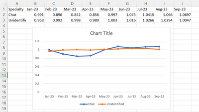
Anyone knows how to make this excel graph to PBI? Everytime I place specialty on Y axis, it turns to count.
Solved! Go to Solution.
- Mark as New
- Bookmark
- Subscribe
- Mute
- Subscribe to RSS Feed
- Permalink
- Report Inappropriate Content
Hi @HCBD13
Yes
you need to put a date on the X axis
numeric value on Y axis
specialty on the legend
if your table looks like on the picture (horizontal )
You need to transpose it with pq , please refer to the linked tutorial:
https://www.youtube.com/watch?v=Jyl4UPnuJyI
If this post helps, then please consider Accepting it as the solution to help the other members find it more quickly.
Rita Fainshtein | Microsoft MVP
https://www.linkedin.com/in/rita-fainshtein/
Blog : https://www.madeiradata.com/profile/ritaf/profile
- Mark as New
- Bookmark
- Subscribe
- Mute
- Subscribe to RSS Feed
- Permalink
- Report Inappropriate Content
Hi @HCBD13
If I understand correctly, you need to unpivot your table in Power Query.
In PQ:
- select the [Specialty] column
- right-click and select "Unpivot other columns"
In my example, I also had to convert the date.
Proud to be a Super User!
daxformatter.com makes life EASIER!
- Mark as New
- Bookmark
- Subscribe
- Mute
- Subscribe to RSS Feed
- Permalink
- Report Inappropriate Content
This worked. Thank you.
- Mark as New
- Bookmark
- Subscribe
- Mute
- Subscribe to RSS Feed
- Permalink
- Report Inappropriate Content
Hi @HCBD13
Yes
you need to put a date on the X axis
numeric value on Y axis
specialty on the legend
if your table looks like on the picture (horizontal )
You need to transpose it with pq , please refer to the linked tutorial:
https://www.youtube.com/watch?v=Jyl4UPnuJyI
If this post helps, then please consider Accepting it as the solution to help the other members find it more quickly.
Rita Fainshtein | Microsoft MVP
https://www.linkedin.com/in/rita-fainshtein/
Blog : https://www.madeiradata.com/profile/ritaf/profile


