Join us at the 2025 Microsoft Fabric Community Conference
Microsoft Fabric Community Conference 2025, March 31 - April 2, Las Vegas, Nevada. Use code FABINSIDER for a $400 discount.
Register now- Power BI forums
- Get Help with Power BI
- Desktop
- Service
- Report Server
- Power Query
- Mobile Apps
- Developer
- DAX Commands and Tips
- Custom Visuals Development Discussion
- Health and Life Sciences
- Power BI Spanish forums
- Translated Spanish Desktop
- Training and Consulting
- Instructor Led Training
- Dashboard in a Day for Women, by Women
- Galleries
- Webinars and Video Gallery
- Data Stories Gallery
- Themes Gallery
- Power BI DataViz World Championships Gallery
- Quick Measures Gallery
- R Script Showcase
- COVID-19 Data Stories Gallery
- Community Connections & How-To Videos
- 2021 MSBizAppsSummit Gallery
- 2020 MSBizAppsSummit Gallery
- 2019 MSBizAppsSummit Gallery
- Events
- Ideas
- Custom Visuals Ideas
- Issues
- Issues
- Events
- Upcoming Events
The Power BI DataViz World Championships are on! With four chances to enter, you could win a spot in the LIVE Grand Finale in Las Vegas. Show off your skills.
- Power BI forums
- Forums
- Get Help with Power BI
- Desktop
- Re: Excel Combo Chart in POWER BI which contains C...
- Subscribe to RSS Feed
- Mark Topic as New
- Mark Topic as Read
- Float this Topic for Current User
- Bookmark
- Subscribe
- Printer Friendly Page
- Mark as New
- Bookmark
- Subscribe
- Mute
- Subscribe to RSS Feed
- Permalink
- Report Inappropriate Content
Excel Combo Chart in POWER BI which contains Cluster Column and Line
Dear All,
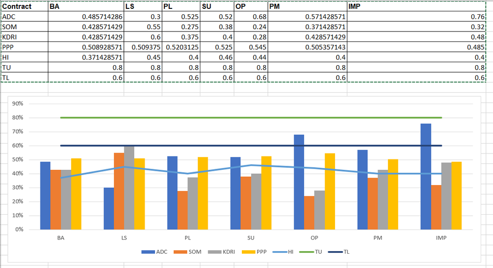
Is there any way we can get a Power BI chart as below. I built it in Excel.
| Contract | BA | LS | PL | SU | OP | PM | IMP |
| ADC | 0.485714286 | 0.3 | 0.525 | 0.52 | 0.68 | 0.571428571 | 0.76 |
| SOM | 0.428571429 | 0.55 | 0.275 | 0.38 | 0.24 | 0.371428571 | 0.32 |
| KDRI | 0.428571429 | 0.6 | 0.375 | 0.4 | 0.28 | 0.428571429 | 0.48 |
| PPP | 0.508928571 | 0.509375 | 0.5203125 | 0.525 | 0.545 | 0.505357143 | 0.485 |
| HI | 0.371428571 | 0.45 | 0.4 | 0.46 | 0.44 | 0.4 | 0.4 |
| TU | 0.8 | 0.8 | 0.8 | 0.8 | 0.8 | 0.8 | 0.8 |
| TL | 0.6 | 0.6 | 0.6 | 0.6 | 0.6 | 0.6 | 0.6 |
Regards,
Venkat
Solved! Go to Solution.
- Mark as New
- Bookmark
- Subscribe
- Mute
- Subscribe to RSS Feed
- Permalink
- Report Inappropriate Content
Hi @Anonymous ,
Check the following steps.
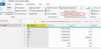
1# Select Contract column and click unpivot other columns in Query Editor then click close and apply.
2# Create measures as below.
column = CALCULATE(SUM('Table'[Value]),FILTER('Table','Table'[Contract] in {"ADC","KDRI","PPP","SOM"}))

HI = CALCULATE(SUM('Table'[Value]),FILTER('Table','Table'[Contract] = "HI"))

TL = CALCULATE(SUM('Table'[Value]),FILTER('Table','Table'[Contract] = "TL"))

TU = CALCULATE(SUM('Table'[Value]),FILTER('Table','Table'[Contract] = "TU"))
3# Create visual as below and use Contract as slicer.
Pbix as attached.
Best Regards,
Jay
Community Support Team _ Jay Wang
If this post helps, then please consider Accept it as the solution to help the other members find it more quickly.
If this post helps, then please consider Accept it as the solution to help the other members find it.
- Mark as New
- Bookmark
- Subscribe
- Mute
- Subscribe to RSS Feed
- Permalink
- Report Inappropriate Content
Good
Is there a way in a graph of stacked columns and lines, indicate which axis one of the lines refers to? I attach a graph created in Excel where the Ppto line refers to the axis on the left and the rest of the lines to the axis on the right.
But in Power Bi I'm not able to represent information in the same way because the PPTO line aligns to the right axis. Attachment capture without the ppto line:
Data table attachment:
- Mark as New
- Bookmark
- Subscribe
- Mute
- Subscribe to RSS Feed
- Permalink
- Report Inappropriate Content
Most nearest is the line and clustered chart. refer
https://docs.microsoft.com/en-us/power-bi/visuals/power-bi-visualization-combo-chart
https://community.powerbi.com/t5/Desktop/Line-amp-Clustered-Column-chart/td-p/501597
- Mark as New
- Bookmark
- Subscribe
- Mute
- Subscribe to RSS Feed
- Permalink
- Report Inappropriate Content
Hi Amit,
Thanks for the information. I tried to use Clustered Column Chart but unable to replicate the same chart.
Regards,
Venkat
- Mark as New
- Bookmark
- Subscribe
- Mute
- Subscribe to RSS Feed
- Permalink
- Report Inappropriate Content
Hi @Anonymous ,
You can use Line and clustered column chart in Power BI but before you create the visual you need to do some pivot operations in Query Editor.
Please check the following steps as below.
1# Select Contract column and click Transform -> Unpivot other columns.
2# Select Contract column and click pivot column as below.
3# Create Line and clustered column chart as below.
Best Regards,
Jay
Community Support Team _ Jay Wang
If this post helps, then please consider Accept it as the solution to help the other members find it more quickly.
If this post helps, then please consider Accept it as the solution to help the other members find it.
- Mark as New
- Bookmark
- Subscribe
- Mute
- Subscribe to RSS Feed
- Permalink
- Report Inappropriate Content
Hi Jay,
It worked like a charm.
You are absolutely a gem.
Thanks,
Venkat
- Mark as New
- Bookmark
- Subscribe
- Mute
- Subscribe to RSS Feed
- Permalink
- Report Inappropriate Content
Hi Jay,
Can we have a Slicer based on the Column Value
Example : ADC, SOM, KDRI, PPP, HI, TU, TL
Regards,
Venkat
- Mark as New
- Bookmark
- Subscribe
- Mute
- Subscribe to RSS Feed
- Permalink
- Report Inappropriate Content
Hi @Anonymous ,
Check the following steps.
1# Select Contract column and click unpivot other columns in Query Editor then click close and apply.
2# Create measures as below.
column = CALCULATE(SUM('Table'[Value]),FILTER('Table','Table'[Contract] in {"ADC","KDRI","PPP","SOM"}))

HI = CALCULATE(SUM('Table'[Value]),FILTER('Table','Table'[Contract] = "HI"))

TL = CALCULATE(SUM('Table'[Value]),FILTER('Table','Table'[Contract] = "TL"))

TU = CALCULATE(SUM('Table'[Value]),FILTER('Table','Table'[Contract] = "TU"))
3# Create visual as below and use Contract as slicer.
Pbix as attached.
Best Regards,
Jay
Community Support Team _ Jay Wang
If this post helps, then please consider Accept it as the solution to help the other members find it more quickly.
If this post helps, then please consider Accept it as the solution to help the other members find it.
Helpful resources

Join us at the Microsoft Fabric Community Conference
March 31 - April 2, 2025, in Las Vegas, Nevada. Use code MSCUST for a $150 discount!

Power BI Monthly Update - February 2025
Check out the February 2025 Power BI update to learn about new features.

Join our Community Sticker Challenge 2025
If you love stickers, then you will definitely want to check out our Community Sticker Challenge!

| User | Count |
|---|---|
| 84 | |
| 69 | |
| 68 | |
| 39 | |
| 37 |


