Join us at FabCon Vienna from September 15-18, 2025
The ultimate Fabric, Power BI, SQL, and AI community-led learning event. Save €200 with code FABCOMM.
Get registered- Power BI forums
- Get Help with Power BI
- Desktop
- Service
- Report Server
- Power Query
- Mobile Apps
- Developer
- DAX Commands and Tips
- Custom Visuals Development Discussion
- Health and Life Sciences
- Power BI Spanish forums
- Translated Spanish Desktop
- Training and Consulting
- Instructor Led Training
- Dashboard in a Day for Women, by Women
- Galleries
- Data Stories Gallery
- Themes Gallery
- Contests Gallery
- Quick Measures Gallery
- Notebook Gallery
- Translytical Task Flow Gallery
- TMDL Gallery
- R Script Showcase
- Webinars and Video Gallery
- Ideas
- Custom Visuals Ideas (read-only)
- Issues
- Issues
- Events
- Upcoming Events
Enhance your career with this limited time 50% discount on Fabric and Power BI exams. Ends August 31st. Request your voucher.
- Power BI forums
- Forums
- Get Help with Power BI
- Desktop
- Re: Error with Other category in Waterfall chart
- Subscribe to RSS Feed
- Mark Topic as New
- Mark Topic as Read
- Float this Topic for Current User
- Bookmark
- Subscribe
- Printer Friendly Page
- Mark as New
- Bookmark
- Subscribe
- Mute
- Subscribe to RSS Feed
- Permalink
- Report Inappropriate Content
Error with Other category in Waterfall chart
Hey
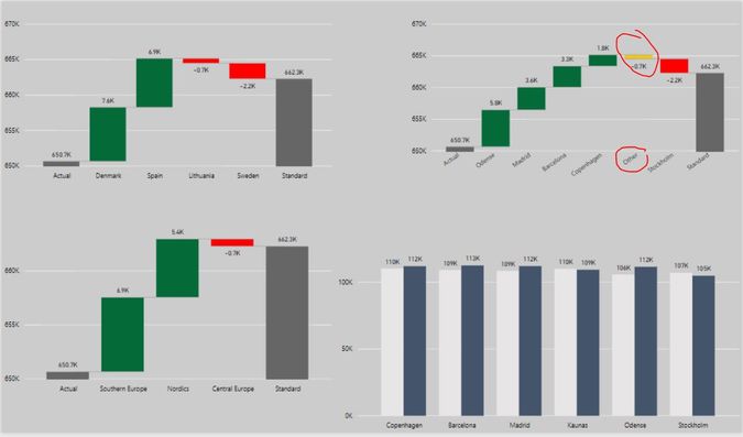
I cannot understand why instead of one city it show *Other* then there is city selected as Breakdown.
Here is the workbook on Onedrive: https://1drv.ms/u/s!ApPjjxMw3nlvwyOAk_Lv69Mh3P0k
Ignas
Solved! Go to Solution.
- Mark as New
- Bookmark
- Subscribe
- Mute
- Subscribe to RSS Feed
- Permalink
- Report Inappropriate Content
- Mark as New
- Bookmark
- Subscribe
- Mute
- Subscribe to RSS Feed
- Permalink
- Report Inappropriate Content
Power BI automatically detects the Top 5 biggest contributors to your increase or decrease. In your case the top 5 cities. Whereas the rest is grouped in a category called "Other". You can modify this by changing the maximum breakdown number.
Check this video for more detail: https://docs.microsoft.com/en-us/power-bi/visuals/power-bi-visualization-waterfall-charts
- Mark as New
- Bookmark
- Subscribe
- Mute
- Subscribe to RSS Feed
- Permalink
- Report Inappropriate Content
I have found the problem. We need to change the MAX breakdown:
- Mark as New
- Bookmark
- Subscribe
- Mute
- Subscribe to RSS Feed
- Permalink
- Report Inappropriate Content
Thank you!
- Mark as New
- Bookmark
- Subscribe
- Mute
- Subscribe to RSS Feed
- Permalink
- Report Inappropriate Content
HI @ignas,
I can't reproduce your issue with other data, I also not sure why it will generate 'other' category.
Maybe you can contact to power bi team with sample file to confirm if it related internal calculation of dax formula.
Regards,
Xiaoxin Sheng
- Mark as New
- Bookmark
- Subscribe
- Mute
- Subscribe to RSS Feed
- Permalink
- Report Inappropriate Content
Hey @Anonymous
Thanks for the try. How can I contact PBI team?
Helpful resources
| User | Count |
|---|---|
| 77 | |
| 76 | |
| 36 | |
| 31 | |
| 29 |
| User | Count |
|---|---|
| 93 | |
| 81 | |
| 57 | |
| 48 | |
| 48 |


