FabCon is coming to Atlanta
Join us at FabCon Atlanta from March 16 - 20, 2026, for the ultimate Fabric, Power BI, AI and SQL community-led event. Save $200 with code FABCOMM.
Register now!- Power BI forums
- Get Help with Power BI
- Desktop
- Service
- Report Server
- Power Query
- Mobile Apps
- Developer
- DAX Commands and Tips
- Custom Visuals Development Discussion
- Health and Life Sciences
- Power BI Spanish forums
- Translated Spanish Desktop
- Training and Consulting
- Instructor Led Training
- Dashboard in a Day for Women, by Women
- Galleries
- Data Stories Gallery
- Themes Gallery
- Contests Gallery
- QuickViz Gallery
- Quick Measures Gallery
- Visual Calculations Gallery
- Notebook Gallery
- Translytical Task Flow Gallery
- TMDL Gallery
- R Script Showcase
- Webinars and Video Gallery
- Ideas
- Custom Visuals Ideas (read-only)
- Issues
- Issues
- Events
- Upcoming Events
The Power BI Data Visualization World Championships is back! Get ahead of the game and start preparing now! Learn more
- Power BI forums
- Forums
- Get Help with Power BI
- Desktop
- Re: Error in Scatter plot while bringing two sets ...
- Subscribe to RSS Feed
- Mark Topic as New
- Mark Topic as Read
- Float this Topic for Current User
- Bookmark
- Subscribe
- Printer Friendly Page
- Mark as New
- Bookmark
- Subscribe
- Mute
- Subscribe to RSS Feed
- Permalink
- Report Inappropriate Content
Error in Scatter plot while bringing two sets of Data in X-axis while Y-Axis is having one data set
Hello Team,
It would be great if somebody can guide me on the Scatter Plot requirement.
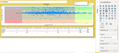
In Scatter plot visualisation i want to show Active Time and Total time based on slicer selection for same set of users.
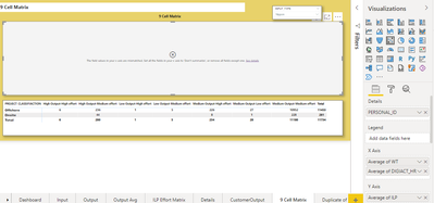
Here in X-axis i want to bring both Active time and Total time, but it is throwing some error. But if i will drag one data set at a time, it is working fine.
Is there any way how can i bring both the value in X-axis and based on slicer selection it will display the value accordingly and also in the below of Scatter plot, the matrix table should represent the value of above scatter plot.
In this above right top, the slicer is there. I want to bring the plot and below table dynamically chnaged based on the Slicer selection. If you look at the right side details of Scatter plot, it is showing me data when i have one selection in X-axis. If i will bring two values in X-axis the error is coming like below.
Can anyone help me on this!
Regards,
Sagar
Solved! Go to Solution.
- Mark as New
- Bookmark
- Subscribe
- Mute
- Subscribe to RSS Feed
- Permalink
- Report Inappropriate Content
Hi @sagarsahoo_123 ,
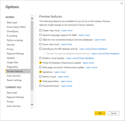
To get started you first need to enable the Field parameters preview feature.
-
In Power BI Desktop, go to File > Options and settings > Options > Preview features.
-
Select the Field parameters checkbox
Best Regards,
Jianbo Li
If this post helps, then please consider Accept it as the solution to help the other members find it more quickly.
- Mark as New
- Bookmark
- Subscribe
- Mute
- Subscribe to RSS Feed
- Permalink
- Report Inappropriate Content
Hi @sagarsahoo_123 ,
Field parameters allow users to dynamically change the measures or dimensions being analyzed within a report. This feature can help your report readers explore and customize the analysis of the report by selecting the different measures or dimensions they're interested in.
You can use field parameters to replace X-axis data
For more details, please refer to:
Let report readers use field parameters to change visuals (preview) - Power BI | Microsoft Learn
Best Regards,
Jianbo Li
If this post helps, then please consider Accept it as the solution to help the other members find it more quickly.
- Mark as New
- Bookmark
- Subscribe
- Mute
- Subscribe to RSS Feed
- Permalink
- Report Inappropriate Content
Hello,
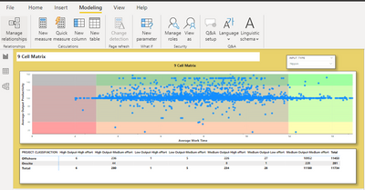
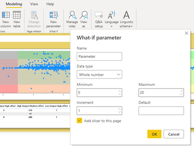
I followed your suggestion but could not able to find the Field option in New parameter of my Power BI. Am i missing something here. Please check the image below and suggest me. There is no drop down option in New Parameter as i saw in your video. If i click into it, it is showing me like...
Regards,
Sagar
Helpful resources

Power BI Dataviz World Championships
The Power BI Data Visualization World Championships is back! Get ahead of the game and start preparing now!

| User | Count |
|---|---|
| 67 | |
| 45 | |
| 41 | |
| 36 | |
| 23 |
| User | Count |
|---|---|
| 191 | |
| 127 | |
| 106 | |
| 78 | |
| 53 |
